Thread: Fwd: Slonik!
Hello PostgreSQL advocacy group,
I recently contacted the core team about a logo design I came up with. Bruce kindly directed me towards this group.
As you can see in the forwarded message below, logo design is a bit of a hobby for me. If you and the community agree that the design has potential, I would be happy to iterate on the design based on your feedback.
If not, it was a fun project for me anyway.
Thank you,
Bryan Farrell
Begin forwarded message:From: Bruce Momjian <bruce@momjian.us>Subject: Re: Slonik!Date: November 26, 2019 at 20:26:11 ESTTo: BFarrell915 <bfarrell915@gmail.com>
I would email the Postgres advocacy list, pgsql-advocacy@postgresql.org,
and see what they think about it. It is certainly a new direction in
design and has potential.
---------------------------------------------------------------------------
On Fri, Nov 22, 2019 at 12:37:29AM -0500, BFarrell915 wrote:Hello PostgreSQL Core Team,
My name is Bryan, I’m a developer by trade, and I recently started using PostgreSQL in a Django project I’m working on!
Logo design is also somewhat of a hobby for me, and I enjoy researching the history behind logos and the like. Naturally, I started researching the history behind the PostgreSQL logo soon after I started using it. I came across this article <https://www.vertabelo.com/blog/the-history-of-slonik-the-postgresql-elephant-logo> which gives a fairly detailed history of Slonik and the choices behind its creation. In that article, I also came across this gem (pun intended).

While not what I would consider an outstanding logo, I really liked the idea of using a diamond to reinforce the notion of a strong, reliable product. So I wondered how I might design a logo that looked modern and sleek, while also incorporating that idea.
Here is what I came up with.
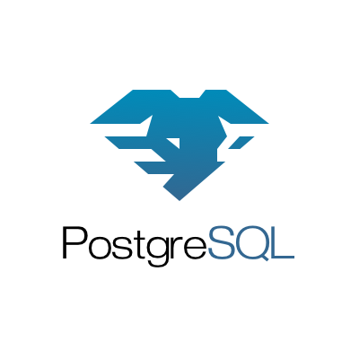
While definitely more abstract than the current logo, I think the elephant is easily recognizable. The rigid shapes were designed to mimic the luster of a diamond, and they further reinforce that solid, dependable feeling. The horizontal striations outline the shape of the elephant’s ears and are also somewhat reminiscent of common database icons <https://commons.wikimedia.org/wiki/Category:Database_icons>. I don’t dislike the current design of Slonik, but it does seem a bit outdated (16 years old!) and it does lose some of its detail at smaller sizes.
I know this is a bit unusual, the community is probably fairly attached to the current iteration of Slonik, and a logo redesign is most likely not on your minds. But if you (and the community) like the design, it’s yours. I won’t ask for any kind of compensation; all I'll ask is attribution.
I’d be happy to hear your thoughts, and would be open to iterating on the design based on your and/or the community's feedback. I can also provide high quality vector assets and variations on the logo (monochrome, various sizes, horizontal lockup, etc.). Please feel free to email me back at your convenience.
Sincerely,
Bryan Farrell
--
Bruce Momjian <bruce@momjian.us> http://momjian.us
EnterpriseDB http://enterprisedb.com
+ As you are, so once was I. As I am, so you will be. +
+ Ancient Roman grave inscription +
Attachment
On 06/12/2019 04:38, BFarrell915 wrote:
> Hello PostgreSQL advocacy group,
>
> I recently contacted the core team about a logo design I came up with.
> Bruce kindly directed me towards this group.
>
> As you can see in the forwarded message below, logo design is a bit of a
> hobby for me. If you and the community agree that the design has
> potential, I would be happy to iterate on the design based on your feedback.
>
> If not, it was a fun project for me anyway.

I really like your logo; it's useful too in that it would work equally
well in colour and black-and-white contexts.

I wouldn't mind seeing a little more contrast in the logo, perhaps some
subtle areas of darker tone that would make the elephant more obvious.
Though I'm not a design expert...!

Ray.

--
Raymond O'Donnell // Galway // Ireland
ray@rodonnell.ie
Would we see this as an additional logo the the stylist elephant we have now?
As we could have two different ones, I guess.
Mit freundlichem Gruß, kind regards,

Jan Karremans
Director of Sales Engineering, EMEA
Mit freundlichem Gruß, kind regards,
Jan Karremans
Director of Sales Engineering, EMEA
Senior Sales Engineer DACH-Region
- Deutsch ist nicht meine Muttersprache, bitte verzeihen Sie Verstöße gegen die Rechtschreibung -
Office: +49-(0)3222-1097 907
Mobile: +31-(0)6-1638 9607
http://www.enterprisedb.com/
EDB Postgres Advanced Server Professional
-- Postgres Everywhere --
- Deutsch ist nicht meine Muttersprache, bitte verzeihen Sie Verstöße gegen die Rechtschreibung -
Office: +49-(0)3222-1097 907
Mobile: +31-(0)6-1638 9607
http://www.enterprisedb.com/
Don't walk behind me; I may not lead.
Don't walk in front of me; I may not follow.
Just walk beside me and be my friend.
+*+ Albert Camus +*+
On 6 Dec 2019, at 10:31, Ray O'Donnell <ray@rodonnell.ie> wrote:On 06/12/2019 04:38, BFarrell915 wrote:Hello PostgreSQL advocacy group,
I recently contacted the core team about a logo design I came up with.
Bruce kindly directed me towards this group.
As you can see in the forwarded message below, logo design is a bit of a
hobby for me. If you and the community agree that the design has
potential, I would be happy to iterate on the design based on your feedback.
If not, it was a fun project for me anyway.
I really like your logo; it's useful too in that it would work equally
well in colour and black-and-white contexts.
I wouldn't mind seeing a little more contrast in the logo, perhaps some
subtle areas of darker tone that would make the elephant more obvious.
Though I'm not a design expert...!
Ray.
--
Raymond O'Donnell // Galway // Ireland
ray@rodonnell.ie
Attachment
Hi Bryan,
If you hadn't posted that logo of yours to this group, including the current one, I wouldn't have recognised it as a stylised elephant,
which, to me, implies that it may not be a good representation of an elephant. Actually - even seeing them side by side I still don't
recognise it as an elephant. It looks like a stylised rendition of the old logo.
Kind regards,
Andrej
On Fri, 6 Dec 2019 at 22:13, BFarrell915 <bfarrell915@gmail.com> wrote:
Hello PostgreSQL advocacy group,I recently contacted the core team about a logo design I came up with. Bruce kindly directed me towards this group.As you can see in the forwarded message below, logo design is a bit of a hobby for me. If you and the community agree that the design has potential, I would be happy to iterate on the design based on your feedback.If not, it was a fun project for me anyway.Thank you,Bryan FarrellBegin forwarded message:From: Bruce Momjian <bruce@momjian.us>Subject: Re: Slonik!Date: November 26, 2019 at 20:26:11 ESTTo: BFarrell915 <bfarrell915@gmail.com>
I would email the Postgres advocacy list, pgsql-advocacy@postgresql.org,
and see what they think about it. It is certainly a new direction in
design and has potential.
---------------------------------------------------------------------------
On Fri, Nov 22, 2019 at 12:37:29AM -0500, BFarrell915 wrote:Hello PostgreSQL Core Team,
My name is Bryan, I’m a developer by trade, and I recently started using PostgreSQL in a Django project I’m working on!
Logo design is also somewhat of a hobby for me, and I enjoy researching the history behind logos and the like. Naturally, I started researching the history behind the PostgreSQL logo soon after I started using it. I came across this article <https://www.vertabelo.com/blog/the-history-of-slonik-the-postgresql-elephant-logo> which gives a fairly detailed history of Slonik and the choices behind its creation. In that article, I also came across this gem (pun intended).
While not what I would consider an outstanding logo, I really liked the idea of using a diamond to reinforce the notion of a strong, reliable product. So I wondered how I might design a logo that looked modern and sleek, while also incorporating that idea.
Here is what I came up with.While definitely more abstract than the current logo, I think the elephant is easily recognizable. The rigid shapes were designed to mimic the luster of a diamond, and they further reinforce that solid, dependable feeling. The horizontal striations outline the shape of the elephant’s ears and are also somewhat reminiscent of common database icons <https://commons.wikimedia.org/wiki/Category:Database_icons>. I don’t dislike the current design of Slonik, but it does seem a bit outdated (16 years old!) and it does lose some of its detail at smaller sizes.
I know this is a bit unusual, the community is probably fairly attached to the current iteration of Slonik, and a logo redesign is most likely not on your minds. But if you (and the community) like the design, it’s yours. I won’t ask for any kind of compensation; all I'll ask is attribution.
I’d be happy to hear your thoughts, and would be open to iterating on the design based on your and/or the community's feedback. I can also provide high quality vector assets and variations on the logo (monochrome, various sizes, horizontal lockup, etc.). Please feel free to email me back at your convenience.
Sincerely,
Bryan Farrell
--
Bruce Momjian <bruce@momjian.us> http://momjian.us
EnterpriseDB http://enterprisedb.com
+ As you are, so once was I. As I am, so you will be. +
+ Ancient Roman grave inscription +


Please don't top post, and don't use HTML e-Mail :} Make your quotes concise.
http://www.georgedillon.com/web/html_email_is_evil.shtml
http://www.catb.org/jargon/html/email-style.html
http://www.georgedillon.com/web/html_email_is_evil.shtml
http://www.catb.org/jargon/html/email-style.html
Attachment
To me, it looks like the Ruby logo, but blue. At least that’s my first impression - and I’m not a Rubyist.
I’m not certain that a diamond represents strength or reliability in a logo. I’d assume that diamond would represent something like elegance or beauty. I could be wrong.
On Dec 6, 2019, at 8:40 AM, Andrej <andrej.groups@gmail.com> wrote:Hi Bryan,
If you hadn't posted that logo of yours to this group, including the current one, I wouldn't have recognised it as a stylised elephant,
which, to me, implies that it may not be a good representation of an elephant. Actually - even seeing them side by side I still don't
recognise it as an elephant. It looks like a stylised rendition of the old logo.
Kind regards,AndrejOn Fri, 6 Dec 2019 at 22:13, BFarrell915 <bfarrell915@gmail.com> wrote:Hello PostgreSQL advocacy group,I recently contacted the core team about a logo design I came up with. Bruce kindly directed me towards this group.As you can see in the forwarded message below, logo design is a bit of a hobby for me. If you and the community agree that the design has potential, I would be happy to iterate on the design based on your feedback.If not, it was a fun project for me anyway.Thank you,Bryan FarrellBegin forwarded message:From: Bruce Momjian <bruce@momjian.us>Subject: Re: Slonik!Date: November 26, 2019 at 20:26:11 ESTTo: BFarrell915 <bfarrell915@gmail.com>
I would email the Postgres advocacy list, pgsql-advocacy@postgresql.org,
and see what they think about it. It is certainly a new direction in
design and has potential.
---------------------------------------------------------------------------
On Fri, Nov 22, 2019 at 12:37:29AM -0500, BFarrell915 wrote:Hello PostgreSQL Core Team,
My name is Bryan, I’m a developer by trade, and I recently started using PostgreSQL in a Django project I’m working on!
Logo design is also somewhat of a hobby for me, and I enjoy researching the history behind logos and the like. Naturally, I started researching the history behind the PostgreSQL logo soon after I started using it. I came across this article <https://www.vertabelo.com/blog/the-history-of-slonik-the-postgresql-elephant-logo> which gives a fairly detailed history of Slonik and the choices behind its creation. In that article, I also came across this gem (pun intended).
<dcb3cdea445cd570ae69e35c0ab683f9.png>
While not what I would consider an outstanding logo, I really liked the idea of using a diamond to reinforce the notion of a strong, reliable product. So I wondered how I might design a logo that looked modern and sleek, while also incorporating that idea.
Here is what I came up with.
<0592425E-7721-4057-B83F-ACB9CFF78E23.png>While definitely more abstract than the current logo, I think the elephant is easily recognizable. The rigid shapes were designed to mimic the luster of a diamond, and they further reinforce that solid, dependable feeling. The horizontal striations outline the shape of the elephant’s ears and are also somewhat reminiscent of common database icons <https://commons.wikimedia.org/wiki/Category:Database_icons>. I don’t dislike the current design of Slonik, but it does seem a bit outdated (16 years old!) and it does lose some of its detail at smaller sizes.
I know this is a bit unusual, the community is probably fairly attached to the current iteration of Slonik, and a logo redesign is most likely not on your minds. But if you (and the community) like the design, it’s yours. I won’t ask for any kind of compensation; all I'll ask is attribution.
I’d be happy to hear your thoughts, and would be open to iterating on the design based on your and/or the community's feedback. I can also provide high quality vector assets and variations on the logo (monochrome, various sizes, horizontal lockup, etc.). Please feel free to email me back at your convenience.
Sincerely,
Bryan Farrell
--
Bruce Momjian <bruce@momjian.us> http://momjian.us
EnterpriseDB http://enterprisedb.com
+ As you are, so once was I. As I am, so you will be. +
+ Ancient Roman grave inscription +--Please don't top post, and don't use HTML e-Mail :} Make your quotes concise.
http://www.georgedillon.com/web/html_email_is_evil.shtml
http://www.catb.org/jargon/html/email-style.html
>e On 06/12/2019 04:38, BFarrell915 wrote:
>>> Hello PostgreSQL advocacy group,
>>>
>>> I recently contacted the core team about a logo design I came up with.
>>> Bruce kindly directed me towards this group.
>>>
>>> As you can see in the forwarded message below, logo design is a bit of a
>>> hobby for me. If you and the community agree that the design has
>>> potential, I would be happy to iterate on the design based on your feedback.
>>>
>>> If not, it was a fun project for me anyway.

I don't think the project is in need for a new logo, but I like
the approach in the first logo. It is not cheesy as many modern
designs today.

The first logo is something to work on. I think I have difficulty
decognizing an elephant if it had not appeared in the Postres context.
But I like the added velocity - it almost feels like the elephantlike
creature is running waving ears. Its trunk somehow does not fit well.

On Fri, 6 Dec 2019, Jan Karremans wrote:

> Would we see this as an additional logo the the stylist elephant we have now?
> As we could have two different ones, I guess.

The whole point of a logo is to have only one ...

If like bitmap work, I have published 32x32 and 48x48 favicons
based on the current logo, but they are not very good apparently:


https://www.postgresql.org/message-id/flat/CABUevEysZcNLFSp9UmYDSZbdyVto2Be3A_OrXXYPbeHmK_e%3DbQ%40mail.gmail.com#015011ff72739f78685c41d87958a421


Here are scripts I have used to generate them:

https://repo.or.cz/pgweb-favicon.git/

Marcin
Attachment
Thank you for developing it, Bryan!
The first question I had seeing this, what are we trying to achieve by creating a new logo for Postgres. I think current logo established itself well and is very recognisable among other logos in the industry. Changing it would mean that we might risk losing this recognition, especially when many Postgres initiatives have logos based on the official Postgres elephant (attached).
Overall, I think that if there is a feeling in the community that we need to address a particular issue in Postgres perception and this logo would be part of a larger change (in the community or the database itself) then a revision of the logo may be justified.
Kind regards,
Valeria


On Fri, Dec 6, 2019 at 11:46 AM Jan Karremans <jan.karremans@enterprisedb.com> wrote:
Would we see this as an additional logo the the stylist elephant we have now?As we could have two different ones, I guess.
Mit freundlichem Gruß, kind regards,
Jan Karremans
Director of Sales Engineering, EMEASenior Sales Engineer DACH-RegionEDB Postgres Advanced Server Professional-- Postgres Everywhere --
- Deutsch ist nicht meine Muttersprache, bitte verzeihen Sie Verstöße gegen die Rechtschreibung -
Office: +49-(0)3222-1097 907
Mobile: +31-(0)6-1638 9607
http://www.enterprisedb.com/Don't walk behind me; I may not lead.Don't walk in front of me; I may not follow.Just walk beside me and be my friend.+*+ Albert Camus +*+On 6 Dec 2019, at 10:31, Ray O'Donnell <ray@rodonnell.ie> wrote:On 06/12/2019 04:38, BFarrell915 wrote:Hello PostgreSQL advocacy group,
I recently contacted the core team about a logo design I came up with.
Bruce kindly directed me towards this group.
As you can see in the forwarded message below, logo design is a bit of a
hobby for me. If you and the community agree that the design has
potential, I would be happy to iterate on the design based on your feedback.
If not, it was a fun project for me anyway.
I really like your logo; it's useful too in that it would work equally
well in colour and black-and-white contexts.
I wouldn't mind seeing a little more contrast in the logo, perhaps some
subtle areas of darker tone that would make the elephant more obvious.
Though I'm not a design expert...!
Ray.
--
Raymond O'Donnell // Galway // Ireland
ray@rodonnell.ie

Attachment
Hi,

On Thu, 2019-12-05 at 23:38 -0500, BFarrell915 wrote:
> As you can see in the forwarded message below, logo design is a bit of a
> hobby for me. If you and the community agree that the design has potential, I
> would be happy to iterate on the design based on your feedback.

Please, please no. I don't want to have another tattoo in my arm. Our elephant
is already good, has a meaning, and that is enough.

Regards,
--
Devrim Gündüz
Open Source Solution Architect, Red Hat Certified Engineer
Twitter: @DevrimGunduz , @DevrimGunduzTR
Attachment
Hi Valeria,
My goal is just to have some fun and test my skills! I saw that old diamond logo and the idea popped into my head. I thought it was at least an interesting idea so I thought I would share.
It may very well be that there is no need for a logo redesign! But I do feel my design does have some advantages over the current logo, namely scalability. The design also has a more modern and sleek look; which may not be the direction PostreSQL wants to take, but I don’t think it can hurt to spark a conversation.
Reguards,
Bryan
On Dec 6, 2019, at 15:24, Valeria Kaplan <vk@dataegret.com> wrote:
Thank you for developing it, Bryan!The first question I had seeing this, what are we trying to achieve by creating a new logo for Postgres. I think current logo established itself well and is very recognisable among other logos in the industry. Changing it would mean that we might risk losing this recognition, especially when many Postgres initiatives have logos based on the official Postgres elephant (attached).Overall, I think that if there is a feeling in the community that we need to address a particular issue in Postgres perception and this logo would be part of a larger change (in the community or the database itself) then a revision of the logo may be justified.Kind regards,Valeria<Screenshot 2019-12-06 at 22.03.01.png><Screenshot 2019-12-06 at 22.04.59.png><Screenshot 2019-12-06 at 22.00.05.png><Screenshot 2019-12-06 at 21.57.25.png> On Fri, Dec 6, 2019 at 11:46 AM Jan Karremans <jan.karremans@enterprisedb.com> wrote:Would we see this as an additional logo the the stylist elephant we have now?As we could have two different ones, I guess.
Mit freundlichem Gruß, kind regards,<uc.png>
Jan Karremans
Director of Sales Engineering, EMEASenior Sales Engineer DACH-RegionEDB Postgres Advanced Server Professional-- Postgres Everywhere --
- Deutsch ist nicht meine Muttersprache, bitte verzeihen Sie Verstöße gegen die Rechtschreibung -
Office: +49-(0)3222-1097 907
Mobile: +31-(0)6-1638 9607
http://www.enterprisedb.com/Don't walk behind me; I may not lead.Don't walk in front of me; I may not follow.Just walk beside me and be my friend.+*+ Albert Camus +*+On 6 Dec 2019, at 10:31, Ray O'Donnell <ray@rodonnell.ie> wrote:On 06/12/2019 04:38, BFarrell915 wrote:Hello PostgreSQL advocacy group,
I recently contacted the core team about a logo design I came up with.
Bruce kindly directed me towards this group.
As you can see in the forwarded message below, logo design is a bit of a
hobby for me. If you and the community agree that the design has
potential, I would be happy to iterate on the design based on your feedback.
If not, it was a fun project for me anyway.
I really like your logo; it's useful too in that it would work equally
well in colour and black-and-white contexts.
I wouldn't mind seeing a little more contrast in the logo, perhaps some
subtle areas of darker tone that would make the elephant more obvious.
Though I'm not a design expert...!
Ray.
--
Raymond O'Donnell // Galway // Ireland
ray@rodonnell.ie
Hi Dervrim,

You have a Slonik tattoo?? That’s amazing!

It’s great to see such a passionate community, and I hope to interact with all if you more as I continue to use
PostgreSQL.The last thing I want to do is create any kind of divide.

That being said, the current Slonik logo will always be a part of the history, a logo redesign doesn’t erase anything.
Brandsredesign their logos all the time to create a more modern feel. I think my design (or an iteration upon it) could
providethat feel for PostgreSQL.

At the end of the day, if it’s not something the community wants, no harm done! It was a fun project for me, and
hopefullyat least an interesting conversation!

Reguards,
Bryan

> On Dec 9, 2019, at 06:41, Devrim Gündüz <devrim@gunduz.org> wrote:
>
>
> Hi,
>
>> On Thu, 2019-12-05 at 23:38 -0500, BFarrell915 wrote:
>> As you can see in the forwarded message below, logo design is a bit of a
>> hobby for me. If you and the community agree that the design has potential, I
>> would be happy to iterate on the design based on your feedback.
>
> Please, please no. I don't want to have another tattoo in my arm. Our elephant
> is already good, has a meaning, and that is enough.
>
> Regards,
> --
> Devrim Gündüz
> Open Source Solution Architect, Red Hat Certified Engineer
> Twitter: @DevrimGunduz , @DevrimGunduzTR
Em seg., 9 de dez. de 2019 às 14:42, BFarrell915 <bfarrell915@gmail.com> escreveu:
Hi Valeria,My goal is just to have some fun and test my skills! I saw that old diamond logo and the idea popped into my head. I thought it was at least an interesting idea so I thought I would share.
We like to share our work too. We used to share the logos we make for PGConf.Brasil at https://drive.google.com/drive/u/1/folders/1CUyLN4JbxPewHJchNRZILHjZpyEXA8NI
Maybe it could be useful for someone else.
--
Atenciosamente,
Fábio Telles Rodriguez
blog: http://savepoint.blog.brTimbira - A empresa brasileira de Postgres
Hi Bryan,
I completely understand, and think it is always a good idea to reflect on how Postgres is perceived based on current branding. My point is that the logo is merely a tool that helps a brand to be recognisable and we risk losing that if we switch to your design. It might be that it is the risk the community willing to take but it's important to recognise it and to understand what we would gain from it.
I am not sure what you mean by scalability?
I think in any case, a variation of an elephant logo might be handy for local conferences or events that are looking for a near-Postgres-logo, but don't have the means to develop it themselves (like those cool graphics that Fabio shared from PGConf.Brasil.)
Kind regards,
Valeria
On Mon, Dec 9, 2019 at 4:15 PM BFarrell915 <bfarrell915@gmail.com> wrote:
Hi Valeria,My goal is just to have some fun and test my skills! I saw that old diamond logo and the idea popped into my head. I thought it was at least an interesting idea so I thought I would share.It may very well be that there is no need for a logo redesign! But I do feel my design does have some advantages over the current logo, namely scalability. The design also has a more modern and sleek look; which may not be the direction PostreSQL wants to take, but I don’t think it can hurt to spark a conversation.Reguards,BryanOn Dec 6, 2019, at 15:24, Valeria Kaplan <vk@dataegret.com> wrote:Thank you for developing it, Bryan!The first question I had seeing this, what are we trying to achieve by creating a new logo for Postgres. I think current logo established itself well and is very recognisable among other logos in the industry. Changing it would mean that we might risk losing this recognition, especially when many Postgres initiatives have logos based on the official Postgres elephant (attached).Overall, I think that if there is a feeling in the community that we need to address a particular issue in Postgres perception and this logo would be part of a larger change (in the community or the database itself) then a revision of the logo may be justified.Kind regards,Valeria<Screenshot 2019-12-06 at 22.03.01.png><Screenshot 2019-12-06 at 22.04.59.png><Screenshot 2019-12-06 at 22.00.05.png><Screenshot 2019-12-06 at 21.57.25.png>On Fri, Dec 6, 2019 at 11:46 AM Jan Karremans <jan.karremans@enterprisedb.com> wrote:Would we see this as an additional logo the the stylist elephant we have now?As we could have two different ones, I guess.
Mit freundlichem Gruß, kind regards,<uc.png>
Jan Karremans
Director of Sales Engineering, EMEASenior Sales Engineer DACH-RegionEDB Postgres Advanced Server Professional-- Postgres Everywhere --
- Deutsch ist nicht meine Muttersprache, bitte verzeihen Sie Verstöße gegen die Rechtschreibung -
Office: +49-(0)3222-1097 907
Mobile: +31-(0)6-1638 9607
http://www.enterprisedb.com/Don't walk behind me; I may not lead.Don't walk in front of me; I may not follow.Just walk beside me and be my friend.+*+ Albert Camus +*+On 6 Dec 2019, at 10:31, Ray O'Donnell <ray@rodonnell.ie> wrote:On 06/12/2019 04:38, BFarrell915 wrote:Hello PostgreSQL advocacy group,
I recently contacted the core team about a logo design I came up with.
Bruce kindly directed me towards this group.
As you can see in the forwarded message below, logo design is a bit of a
hobby for me. If you and the community agree that the design has
potential, I would be happy to iterate on the design based on your feedback.
If not, it was a fun project for me anyway.
I really like your logo; it's useful too in that it would work equally
well in colour and black-and-white contexts.
I wouldn't mind seeing a little more contrast in the logo, perhaps some
subtle areas of darker tone that would make the elephant more obvious.
Though I'm not a design expert...!
Ray.
--
Raymond O'Donnell // Galway // Ireland
ray@rodonnell.ie
I have post about the logo, since I am in community since 1995
You canuse google translate to read it.
In short, originally it was made by russians, then diamond was removed and vectorized,
Best regards,
Oleg
On Fri, Dec 6, 2019 at 12:13 PM BFarrell915 <bfarrell915@gmail.com> wrote:
Hello PostgreSQL advocacy group,I recently contacted the core team about a logo design I came up with. Bruce kindly directed me towards this group.As you can see in the forwarded message below, logo design is a bit of a hobby for me. If you and the community agree that the design has potential, I would be happy to iterate on the design based on your feedback.If not, it was a fun project for me anyway.Thank you,Bryan FarrellBegin forwarded message:From: Bruce Momjian <bruce@momjian.us>Subject: Re: Slonik!Date: November 26, 2019 at 20:26:11 ESTTo: BFarrell915 <bfarrell915@gmail.com>
I would email the Postgres advocacy list, pgsql-advocacy@postgresql.org,
and see what they think about it. It is certainly a new direction in
design and has potential.
---------------------------------------------------------------------------
On Fri, Nov 22, 2019 at 12:37:29AM -0500, BFarrell915 wrote:Hello PostgreSQL Core Team,
My name is Bryan, I’m a developer by trade, and I recently started using PostgreSQL in a Django project I’m working on!
Logo design is also somewhat of a hobby for me, and I enjoy researching the history behind logos and the like. Naturally, I started researching the history behind the PostgreSQL logo soon after I started using it. I came across this article <https://www.vertabelo.com/blog/the-history-of-slonik-the-postgresql-elephant-logo> which gives a fairly detailed history of Slonik and the choices behind its creation. In that article, I also came across this gem (pun intended).
While not what I would consider an outstanding logo, I really liked the idea of using a diamond to reinforce the notion of a strong, reliable product. So I wondered how I might design a logo that looked modern and sleek, while also incorporating that idea.
Here is what I came up with.While definitely more abstract than the current logo, I think the elephant is easily recognizable. The rigid shapes were designed to mimic the luster of a diamond, and they further reinforce that solid, dependable feeling. The horizontal striations outline the shape of the elephant’s ears and are also somewhat reminiscent of common database icons <https://commons.wikimedia.org/wiki/Category:Database_icons>. I don’t dislike the current design of Slonik, but it does seem a bit outdated (16 years old!) and it does lose some of its detail at smaller sizes.
I know this is a bit unusual, the community is probably fairly attached to the current iteration of Slonik, and a logo redesign is most likely not on your minds. But if you (and the community) like the design, it’s yours. I won’t ask for any kind of compensation; all I'll ask is attribution.
I’d be happy to hear your thoughts, and would be open to iterating on the design based on your and/or the community's feedback. I can also provide high quality vector assets and variations on the logo (monochrome, various sizes, horizontal lockup, etc.). Please feel free to email me back at your convenience.
Sincerely,
Bryan Farrell
--
Bruce Momjian <bruce@momjian.us> http://momjian.us
EnterpriseDB http://enterprisedb.com
+ As you are, so once was I. As I am, so you will be. +
+ Ancient Roman grave inscription +


--