Thread: [pgadmin-hackers] [Design update] Style guide for pgAdmin4
Hello Hackers,
We've started to work on creating a style guide for pgAdmin4.
Our goals with the style guide are to:
- have a single source of truth for visual design and workflows
- make it easier when adding or updating a section to the app to maintain consistency
How we'll know we're successful:
- conversations about design are more high level, driven by user needs and pains
- decreasing (or at least not adding to) current css bloat due to templating and overwrites
Process for creating a style guide
We're going to start from the smallest building blocks of the site and use that to define larger and larger components. Currently, we're taking inventory of current styles in the app, including colors, typography, buttons, dialogs etc.
Given how the front end is currently structured, we were thinking that static documentation of styles would be a good MVP, at least until we determine what the best documentation for developers on the community would be. Attached is the inventory of styles as of now, including a Sketch file (a tool for creating design mockups, also where I've been keeping track of styles). You can also access files here on Google drive here: https://drive.google.com/drive/folders/0B7jMyxF3NH5lb2JxREUxclp1Unc?usp=sharing
Please feel free to edit the Sketch file- my only ask is new versions hare named accordingly.
If you have worked on front end features in pgAdmin before, we'd like to chat with you about your process and what it was like to implement styles. Let us know some times for a chat!
Thanks,
Shirley
Attachment
Hi,

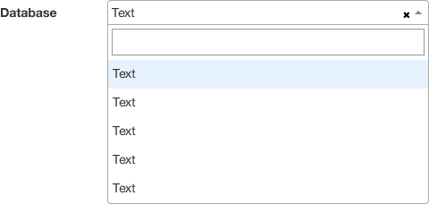
I propose documenting this:
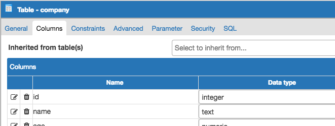
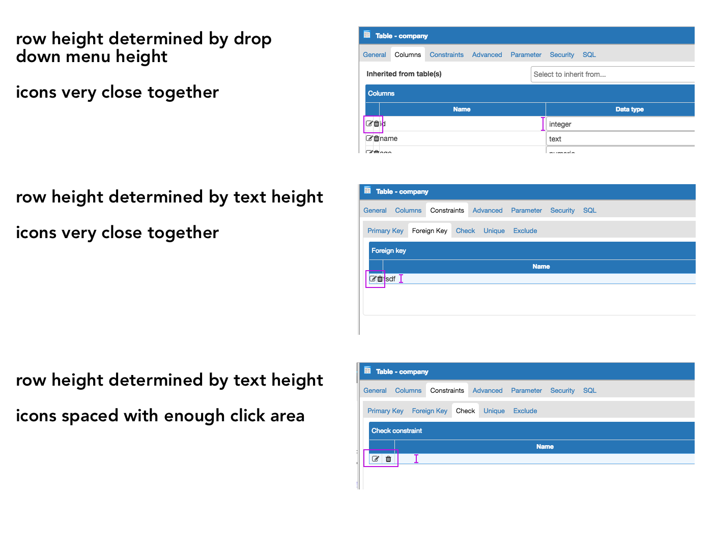
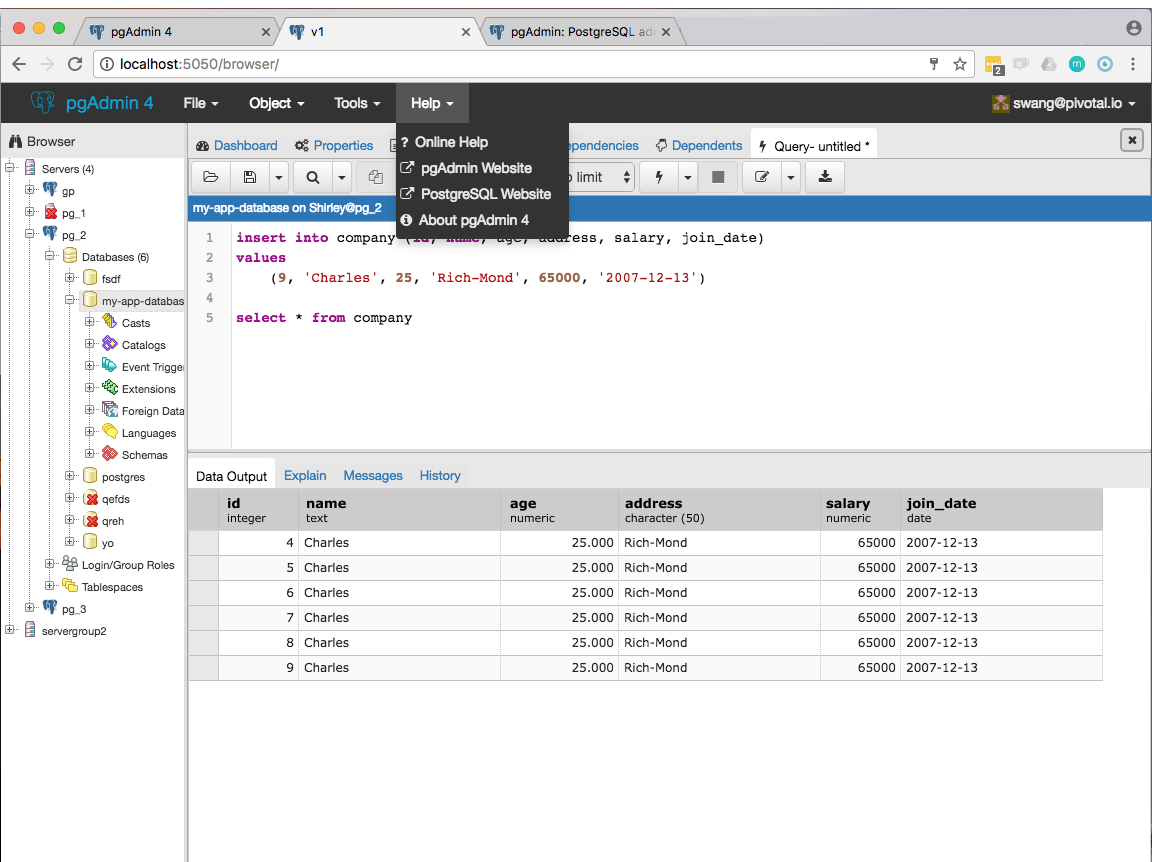
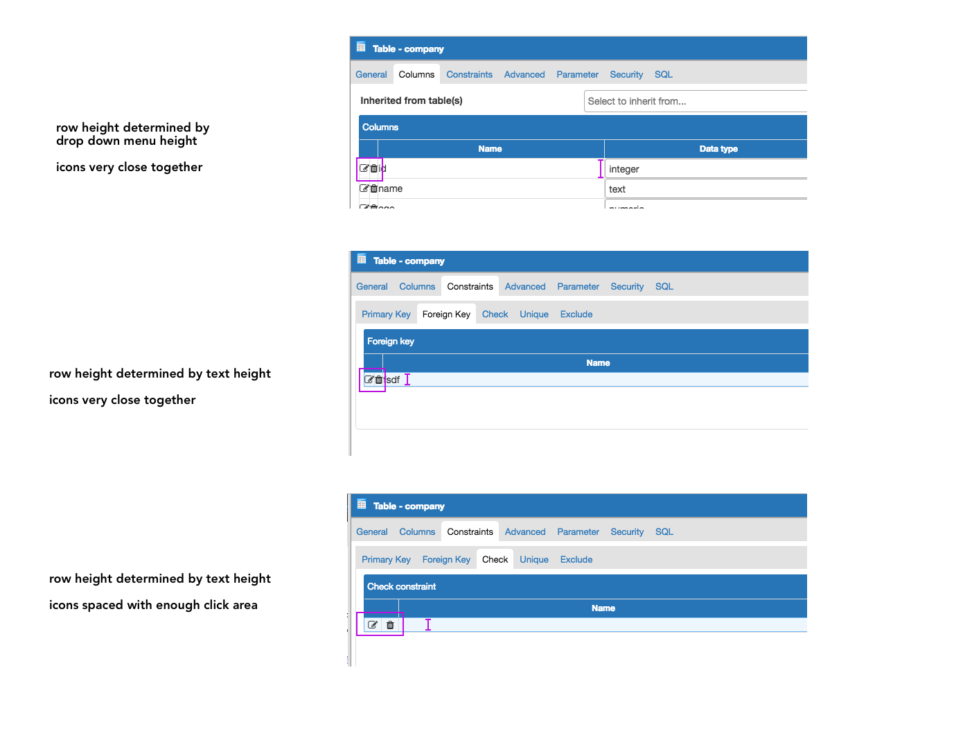
As I was going through the app, I noticed some inconsistencies with tables in popups, namely the height of each row and width between icons.
Unclear as which should be considered the right one.
- Even spacing between icons
- height of each row is always at 28px, regardless if there's a drop down menu or not.
Is there anything I'm missing?
Shirley
On Tue, Apr 18, 2017 at 12:11 PM Shirley Wang <swang@pivotal.io> wrote:
Hello Hackers,We've started to work on creating a style guide for pgAdmin4.Our goals with the style guide are to:- have a single source of truth for visual design and workflows- make it easier when adding or updating a section to the app to maintain consistencyHow we'll know we're successful:- conversations about design are more high level, driven by user needs and pains- decreasing (or at least not adding to) current css bloat due to templating and overwritesProcess for creating a style guideWe're going to start from the smallest building blocks of the site and use that to define larger and larger components. Currently, we're taking inventory of current styles in the app, including colors, typography, buttons, dialogs etc.Given how the front end is currently structured, we were thinking that static documentation of styles would be a good MVP, at least until we determine what the best documentation for developers on the community would be. Attached is the inventory of styles as of now, including a Sketch file (a tool for creating design mockups, also where I've been keeping track of styles). You can also access files here on Google drive here: https://drive.google.com/drive/folders/0B7jMyxF3NH5lb2JxREUxclp1Unc?usp=sharingPlease feel free to edit the Sketch file- my only ask is new versions hare named accordingly.If you have worked on front end features in pgAdmin before, we'd like to chat with you about your process and what it was like to implement styles. Let us know some times for a chat!Thanks,Shirley
Attachment
Hi,
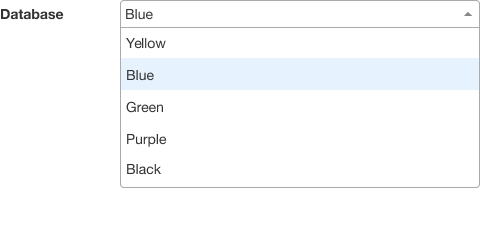
I agree with both the spacing, and the height. Other questions:
- Should icons have a dividing line between them? I think so.
- What determines the light blue shading of a row? I believe it should always be the one with focus (assuming there is one with focus)
On Wed, Apr 19, 2017 at 9:49 PM, Shirley Wang <swang@pivotal.io> wrote:
Hi,As I was going through the app, I noticed some inconsistencies with tables in popups, namely the height of each row and width between icons.Unclear as which should be considered the right one.I propose documenting this:- Even spacing between icons- height of each row is always at 28px, regardless if there's a drop down menu or not.Is there anything I'm missing?ShirleyOn Tue, Apr 18, 2017 at 12:11 PM Shirley Wang <swang@pivotal.io> wrote:Hello Hackers,We've started to work on creating a style guide for pgAdmin4.Our goals with the style guide are to:- have a single source of truth for visual design and workflows- make it easier when adding or updating a section to the app to maintain consistencyHow we'll know we're successful:- conversations about design are more high level, driven by user needs and pains- decreasing (or at least not adding to) current css bloat due to templating and overwritesProcess for creating a style guideWe're going to start from the smallest building blocks of the site and use that to define larger and larger components. Currently, we're taking inventory of current styles in the app, including colors, typography, buttons, dialogs etc.Given how the front end is currently structured, we were thinking that static documentation of styles would be a good MVP, at least until we determine what the best documentation for developers on the community would be. Attached is the inventory of styles as of now, including a Sketch file (a tool for creating design mockups, also where I've been keeping track of styles). You can also access files here on Google drive here: https://drive.google.com/drive/folders/ 0B7jMyxF3NH5lb2JxREUxclp1Unc? usp=sharing Please feel free to edit the Sketch file- my only ask is new versions hare named accordingly.If you have worked on front end features in pgAdmin before, we'd like to chat with you about your process and what it was like to implement styles. Let us know some times for a chat!Thanks,Shirley
Dave Page
Blog: http://pgsnake.blogspot.com
Twitter: @pgsnake
EnterpriseDB UK: http://www.enterprisedb.com
The Enterprise PostgreSQL Company
Blog: http://pgsnake.blogspot.com
Twitter: @pgsnake
EnterpriseDB UK: http://www.enterprisedb.com
The Enterprise PostgreSQL Company
Attachment
Hi
--
On Tue, Apr 18, 2017 at 5:11 PM, Shirley Wang <swang@pivotal.io> wrote:
Hello Hackers,We've started to work on creating a style guide for pgAdmin4.Our goals with the style guide are to:- have a single source of truth for visual design and workflows- make it easier when adding or updating a section to the app to maintain consistency
:-)
How we'll know we're successful:- conversations about design are more high level, driven by user needs and pains- decreasing (or at least not adding to) current css bloat due to templating and overwrites
Sounds good.
Process for creating a style guideWe're going to start from the smallest building blocks of the site and use that to define larger and larger components. Currently, we're taking inventory of current styles in the app, including colors, typography, buttons, dialogs etc.Given how the front end is currently structured, we were thinking that static documentation of styles would be a good MVP, at least until we determine what the best documentation for developers on the community would be. Attached is the inventory of styles as of now, including a Sketch file (a tool for creating design mockups, also where I've been keeping track of styles). You can also access files here on Google drive here: https://drive.google.com/drive/folders/0B7jMyxF3NH5lb2 JxREUxclp1Unc?usp=sharing
Also sounds good.
Please feel free to edit the Sketch file- my only ask is new versions hare named accordingly.
Is this the app you used? https://www.sketchapp.
Some initial thoughts on the inventory:
- Wow, that's a lot of colours. I didn't realise we had so many. I think we need to work that down to a set of a dozen or less primary colours.
- I wouldn't worry about the button colour borders and gradients too much. Those are standard bootstrap colours, so we should document them in terms of bootstrap styles, not colour components.
- We should change the browser list font and standardise on Helvetica Neue.
- Is Helvetica Neue the best font for us? Our previous designer wanted to use Droid Sans, which I wasn't so keen on, but is there a better option to standardise on?
Oh, and an ironic side note: the one style that we have had for 20 years now is the formatting/capitalisation of the "pgAdmin" name. You might want to stop using pg_Admin :-p
Dave Page
Blog: http://pgsnake.blogspot.com
Twitter: @pgsnake
EnterpriseDB UK: http://www.enterprisedb.com
The Enterprise PostgreSQL Company
Blog: http://pgsnake.blogspot.com
Twitter: @pgsnake
EnterpriseDB UK: http://www.enterprisedb.com
The Enterprise PostgreSQL Company
Hi!
On Thu, Apr 20, 2017 at 4:18 AM Dave Page <dpage@pgadmin.org> wrote:
HiOn Tue, Apr 18, 2017 at 5:11 PM, Shirley Wang <swang@pivotal.io> wrote:Hello Hackers,We've started to work on creating a style guide for pgAdmin4.Our goals with the style guide are to:- have a single source of truth for visual design and workflows- make it easier when adding or updating a section to the app to maintain consistency:-)How we'll know we're successful:- conversations about design are more high level, driven by user needs and pains- decreasing (or at least not adding to) current css bloat due to templating and overwritesSounds good.Process for creating a style guideWe're going to start from the smallest building blocks of the site and use that to define larger and larger components. Currently, we're taking inventory of current styles in the app, including colors, typography, buttons, dialogs etc.Given how the front end is currently structured, we were thinking that static documentation of styles would be a good MVP, at least until we determine what the best documentation for developers on the community would be. Attached is the inventory of styles as of now, including a Sketch file (a tool for creating design mockups, also where I've been keeping track of styles). You can also access files here on Google drive here: https://drive.google.com/drive/folders/0B7jMyxF3NH5lb2JxREUxclp1Unc?usp=sharingAlso sounds good.Please feel free to edit the Sketch file- my only ask is new versions hare named accordingly.Is this the app you used? https://www.sketchapp.com/
Yes. Also, I recognize it's probably not the best tool, given that there's a 30 day free trial and then you need to purchase a license. I'm looking into other programs that are free.
Some initial thoughts on the inventory:- Wow, that's a lot of colours. I didn't realise we had so many. I think we need to work that down to a set of a dozen or less primary colours.
Me neither! I'm not so concerned with the number of different colors, but with the number of similar shades of each color.
I can distill those down and send another email shortly.
- I wouldn't worry about the button colour borders and gradients too much. Those are standard bootstrap colours, so we should document them in terms of bootstrap styles, not colour components.
Ok. But are they appropriate for this app?
- We should change the browser list font and standardise on Helvetica Neue.
Ok
- Is Helvetica Neue the best font for us? Our previous designer wanted to use Droid Sans, which I wasn't so keen on, but is there a better option to standardise on?
By standardize, do you mean only Helvetica throughout the app? I like Helvetica because it's a very readable typeface, but I'm not sure it's appropriate as the only typeface to use throughout the app.
The only other place I've noticed that uses a different typeface, ignoring query editor panel, is the data output panel (uses Verdana). I feel like in this case though, a distinction is useful since output data is different from body copy.
Oh, and an ironic side note: the one style that we have had for 20 years now is the formatting/capitalisation of the "pgAdmin" name. You might want to stop using pg_Admin :-p
Ha ok will do
Your other questions, copied and pasted here:
- Should icons have a dividing line between them? I think so.
I agree too. Makes it clear what the click area is. Or do you mean when there's a light blue shading and there should be a light blue line between icons?
- What determines the light blue shading of a row? I believe it should always be the one with focus (assuming there is one with focus)
Yes, the one that's in focus.
Hi
On Thu, Apr 20, 2017 at 7:39 PM, Shirley Wang <swang@pivotal.io> wrote:
Hi!On Thu, Apr 20, 2017 at 4:18 AM Dave Page <dpage@pgadmin.org> wrote:HiOn Tue, Apr 18, 2017 at 5:11 PM, Shirley Wang <swang@pivotal.io> wrote:Hello Hackers,We've started to work on creating a style guide for pgAdmin4.Our goals with the style guide are to:- have a single source of truth for visual design and workflows- make it easier when adding or updating a section to the app to maintain consistency:-)How we'll know we're successful:- conversations about design are more high level, driven by user needs and pains- decreasing (or at least not adding to) current css bloat due to templating and overwritesSounds good.Process for creating a style guideWe're going to start from the smallest building blocks of the site and use that to define larger and larger components. Currently, we're taking inventory of current styles in the app, including colors, typography, buttons, dialogs etc.Given how the front end is currently structured, we were thinking that static documentation of styles would be a good MVP, at least until we determine what the best documentation for developers on the community would be. Attached is the inventory of styles as of now, including a Sketch file (a tool for creating design mockups, also where I've been keeping track of styles). You can also access files here on Google drive here: https://drive.google.com/drive/folders/ 0B7jMyxF3NH5lb2JxREUxclp1Unc? usp=sharing Also sounds good.Please feel free to edit the Sketch file- my only ask is new versions hare named accordingly.Is this the app you used? https://www.sketchapp.com/ Yes. Also, I recognize it's probably not the best tool, given that there's a 30 day free trial and then you need to purchase a license. I'm looking into other programs that are free.
FYI, we use LucidCharts internally. It's a pretty good Google Apps integrated version of Microsoft Visio.
Some initial thoughts on the inventory:- Wow, that's a lot of colours. I didn't realise we had so many. I think we need to work that down to a set of a dozen or less primary colours.Me neither! I'm not so concerned with the number of different colors, but with the number of similar shades of each color.I can distill those down and send another email shortly.- I wouldn't worry about the button colour borders and gradients too much. Those are standard bootstrap colours, so we should document them in terms of bootstrap styles, not colour components.Ok. But are they appropriate for this app?
Personally I think they're fine.
- We should change the browser list font and standardise on Helvetica Neue.Ok- Is Helvetica Neue the best font for us? Our previous designer wanted to use Droid Sans, which I wasn't so keen on, but is there a better option to standardise on?By standardize, do you mean only Helvetica throughout the app? I like Helvetica because it's a very readable typeface, but I'm not sure it's appropriate as the only typeface to use throughout the app.
Maybe, maybe not - what I do believe though is that the treeview doesn't warrant an exception.
The only other place I've noticed that uses a different typeface, ignoring query editor panel, is the data output panel (uses Verdana). I feel like in this case though, a distinction is useful since output data is different from body copy.
That's a good point.
Oh, and an ironic side note: the one style that we have had for 20 years now is the formatting/capitalisation of the "pgAdmin" name. You might want to stop using pg_Admin :-pHa ok will doYour other questions, copied and pasted here:- Should icons have a dividing line between them? I think so.I agree too. Makes it clear what the click area is. Or do you mean when there's a light blue shading and there should be a light blue line between icons?
With or without the shading, I think the light vertical line between those buttons in the grid adds useful definition. They don't have a border like the other various buttons, so it helps frame them (and I don't think they should have a true border, as that would use too much space).
- What determines the light blue shading of a row? I believe it should always be the one with focus (assuming there is one with focus)Yes, the one that's in focus.
Dave Page
Blog: http://pgsnake.blogspot.com
Twitter: @pgsnake
EnterpriseDB UK: http://www.enterprisedb.com
The Enterprise PostgreSQL Company
Blog: http://pgsnake.blogspot.com
Twitter: @pgsnake
EnterpriseDB UK: http://www.enterprisedb.com
The Enterprise PostgreSQL Company
Hello


Please feel free to edit the Sketch file- my only ask is new versions hare named accordingly.Is this the app you used? https://www.sketchapp.com/Yes. Also, I recognize it's probably not the best tool, given that there's a 30 day free trial and then you need to purchase a license. I'm looking into other programs that are free.FYI, we use LucidCharts internally. It's a pretty good Google Apps integrated version of Microsoft Visio.
Ah ok. Do you have any files related to pgAdmin you can share (or put into Google drive folder)?
Some initial thoughts on the inventory:- Wow, that's a lot of colours. I didn't realise we had so many. I think we need to work that down to a set of a dozen or less primary colours.Me neither! I'm not so concerned with the number of different colors, but with the number of similar shades of each color.I can distill those down and send another email shortly.- I wouldn't worry about the button colour borders and gradients too much. Those are standard bootstrap colours, so we should document them in terms of bootstrap styles, not colour components.Ok. But are they appropriate for this app?Personally I think they're fine.
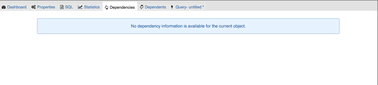
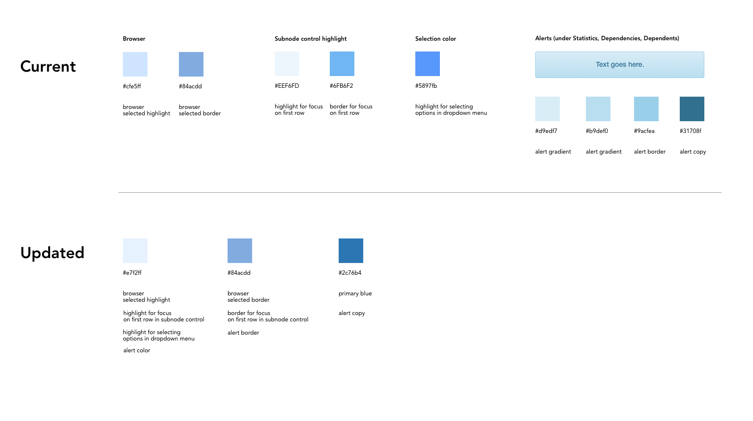
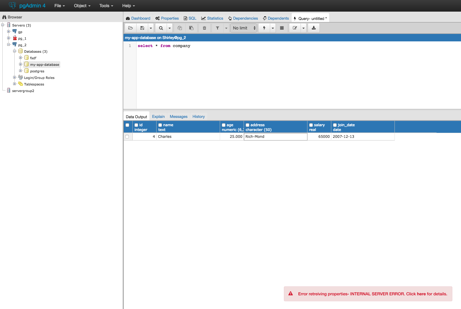
They seem ok for buttons (cancel, save, reset, toolbar). I found the gradient is also on alerts when you click Dependencies, Dependents while selecting Server in the browser.
I think those alerts should not have a gradient to match with the other types of alerts (notifiers and error messages). Since these specific alerts are not success / fail messages, the blue works because it's a neutral color.
Here is what the updated colors would look like in the app.
Focus on text field in nodes
Browser
Highlight in dropdown menu
Alerts 
If this is ok, we will add these changes to our backlog as style changes.
Attachment
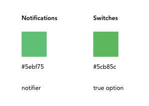
One more thing: there are two very close greens between notifiers and toggle buttons in preferences menus

I recommend documenting the green for switches (#5cb85c), which would change notifiers from this:

to this:
On Fri, Apr 21, 2017 at 2:27 PM Shirley Wang <swang@pivotal.io> wrote:
Hello
Please feel free to edit the Sketch file- my only ask is new versions hare named accordingly.Is this the app you used? https://www.sketchapp.com/Yes. Also, I recognize it's probably not the best tool, given that there's a 30 day free trial and then you need to purchase a license. I'm looking into other programs that are free.FYI, we use LucidCharts internally. It's a pretty good Google Apps integrated version of Microsoft Visio.Ah ok. Do you have any files related to pgAdmin you can share (or put into Google drive folder)?Some initial thoughts on the inventory:- Wow, that's a lot of colours. I didn't realise we had so many. I think we need to work that down to a set of a dozen or less primary colours.Me neither! I'm not so concerned with the number of different colors, but with the number of similar shades of each color.I can distill those down and send another email shortly.- I wouldn't worry about the button colour borders and gradients too much. Those are standard bootstrap colours, so we should document them in terms of bootstrap styles, not colour components.Ok. But are they appropriate for this app?Personally I think they're fine.They seem ok for buttons (cancel, save, reset, toolbar). I found the gradient is also on alerts when you click Dependencies, Dependents while selecting Server in the browser.I think those alerts should not have a gradient to match with the other types of alerts (notifiers and error messages). Since these specific alerts are not success / fail messages, the blue works because it's a neutral color.Here is what the updated colors would look like in the app.Focus on text field in nodesBrowserHighlight in dropdown menuAlertsIf this is ok, we will add these changes to our backlog as style changes.


Attachment
Hi
Sure.
--
On Fri, Apr 21, 2017 at 7:27 PM, Shirley Wang <swang@pivotal.io> wrote:
Hello
Please feel free to edit the Sketch file- my only ask is new versions hare named accordingly.Is this the app you used? https://www.sketchapp.com/ Yes. Also, I recognize it's probably not the best tool, given that there's a 30 day free trial and then you need to purchase a license. I'm looking into other programs that are free.FYI, we use LucidCharts internally. It's a pretty good Google Apps integrated version of Microsoft Visio.Ah ok. Do you have any files related to pgAdmin you can share (or put into Google drive folder)?
Nothing of any relevance now.
Some initial thoughts on the inventory:- Wow, that's a lot of colours. I didn't realise we had so many. I think we need to work that down to a set of a dozen or less primary colours.Me neither! I'm not so concerned with the number of different colors, but with the number of similar shades of each color.I can distill those down and send another email shortly.- I wouldn't worry about the button colour borders and gradients too much. Those are standard bootstrap colours, so we should document them in terms of bootstrap styles, not colour components.Ok. But are they appropriate for this app?Personally I think they're fine.They seem ok for buttons (cancel, save, reset, toolbar). I found the gradient is also on alerts when you click Dependencies, Dependents while selecting Server in the browser.I think those alerts should not have a gradient to match with the other types of alerts (notifiers and error messages). Since these specific alerts are not success / fail messages, the blue works because it's a neutral color.
They're also bootstrap standards. No problem changing them as far as I'm concerned (though - the entire set should be overridden, in case people use them in the future): http://getbootstrap.com/components/#alerts.
Here is what the updated colors would look like in the app.Focus on text field in nodesBrowserHighlight in dropdown menuAlertsIf this is ok, we will add these changes to our backlog as style changes.


Sure.
Dave Page
Blog: http://pgsnake.blogspot.com
Twitter: @pgsnake
EnterpriseDB UK: http://www.enterprisedb.com
The Enterprise PostgreSQL Company
Blog: http://pgsnake.blogspot.com
Twitter: @pgsnake
EnterpriseDB UK: http://www.enterprisedb.com
The Enterprise PostgreSQL Company
Attachment
On Fri, Apr 21, 2017 at 7:36 PM, Shirley Wang <swang@pivotal.io> wrote:
One more thing: there are two very close greens between notifiers and toggle buttons in preferences menusI recommend documenting the green for switches (#5cb85c), which would change notifiers from this:to this:


Wouldn't it be better if it matched the (possibly-recoloured-by-us) Bootstrap alert-success class? I agree that it's silly having two closely matched colours, but I think it makes more sense to have the alerts and notifiers match, than to match the switches.
On Fri, Apr 21, 2017 at 2:27 PM Shirley Wang <swang@pivotal.io> wrote:Hello
Please feel free to edit the Sketch file- my only ask is new versions hare named accordingly.Is this the app you used? https://www.sketchapp.com/ Yes. Also, I recognize it's probably not the best tool, given that there's a 30 day free trial and then you need to purchase a license. I'm looking into other programs that are free.FYI, we use LucidCharts internally. It's a pretty good Google Apps integrated version of Microsoft Visio.Ah ok. Do you have any files related to pgAdmin you can share (or put into Google drive folder)?Some initial thoughts on the inventory:- Wow, that's a lot of colours. I didn't realise we had so many. I think we need to work that down to a set of a dozen or less primary colours.Me neither! I'm not so concerned with the number of different colors, but with the number of similar shades of each color.I can distill those down and send another email shortly.- I wouldn't worry about the button colour borders and gradients too much. Those are standard bootstrap colours, so we should document them in terms of bootstrap styles, not colour components.Ok. But are they appropriate for this app?Personally I think they're fine.They seem ok for buttons (cancel, save, reset, toolbar). I found the gradient is also on alerts when you click Dependencies, Dependents while selecting Server in the browser.I think those alerts should not have a gradient to match with the other types of alerts (notifiers and error messages). Since these specific alerts are not success / fail messages, the blue works because it's a neutral color.Here is what the updated colors would look like in the app.Focus on text field in nodesBrowserHighlight in dropdown menuAlertsIf this is ok, we will add these changes to our backlog as style changes.


Dave Page
Blog: http://pgsnake.blogspot.com
Twitter: @pgsnake
EnterpriseDB UK: http://www.enterprisedb.com
The Enterprise PostgreSQL Company
Blog: http://pgsnake.blogspot.com
Twitter: @pgsnake
EnterpriseDB UK: http://www.enterprisedb.com
The Enterprise PostgreSQL Company
Attachment
On Mon, Apr 24, 2017 at 4:58 AM Dave Page <dpage@pgadmin.org> wrote:
HiOn Fri, Apr 21, 2017 at 7:27 PM, Shirley Wang <swang@pivotal.io> wrote:Hello
Please feel free to edit the Sketch file- my only ask is new versions hare named accordingly.Is this the app you used? https://www.sketchapp.com/Yes. Also, I recognize it's probably not the best tool, given that there's a 30 day free trial and then you need to purchase a license. I'm looking into other programs that are free.FYI, we use LucidCharts internally. It's a pretty good Google Apps integrated version of Microsoft Visio.Ah ok. Do you have any files related to pgAdmin you can share (or put into Google drive folder)?Nothing of any relevance now.Some initial thoughts on the inventory:- Wow, that's a lot of colours. I didn't realise we had so many. I think we need to work that down to a set of a dozen or less primary colours.Me neither! I'm not so concerned with the number of different colors, but with the number of similar shades of each color.I can distill those down and send another email shortly.- I wouldn't worry about the button colour borders and gradients too much. Those are standard bootstrap colours, so we should document them in terms of bootstrap styles, not colour components.Ok. But are they appropriate for this app?Personally I think they're fine.They seem ok for buttons (cancel, save, reset, toolbar). I found the gradient is also on alerts when you click Dependencies, Dependents while selecting Server in the browser.I think those alerts should not have a gradient to match with the other types of alerts (notifiers and error messages). Since these specific alerts are not success / fail messages, the blue works because it's a neutral color.They're also bootstrap standards. No problem changing them as far as I'm concerned (though - the entire set should be overridden, in case people use them in the future): http://getbootstrap.com/components/#alerts.
Will do.
Here is what the updated colors would look like in the app.Focus on text field in nodesBrowserHighlight in dropdown menuAlertsIf this is ok, we will add these changes to our backlog as style changes.
Sure.


On Fri, Apr 21, 2017 at 7:36 PM, Shirley Wang <swang@pivotal.io> wrote:
One more thing: there are two very close greens between notifiers and toggle buttons in preferences menusI recommend documenting the green for switches (#5cb85c), which would change notifiers from this:to this:


Wouldn't it be better if it matched the (possibly-recoloured-by-us) Bootstrap alert-success class? I agree that it's silly having two closely matched colours, but I think it makes more sense to have the alerts and notifiers match, than to match the switches.
Do you mean this?

If so, ok! If there's no good reason to keep the same colors, we should switch.
Attachment
- Screen Shot 2017-04-21 at 12.14.55 PM.png
- highlight_selection color.png
- Screen Shot 2017-04-21 at 11.29.11 AM.png
- Screen Shot 2017-04-21 at 12.13.53 PM.png
- Screen Shot 2017-04-21 at 12.19.51 PM.png
- notifications_switches.png
- Notifiers.png
- Screen Shot 2017-04-20 at 5.28.55 PM.png
- Screen Shot 2017-04-25 at 9.46.03 AM.png
On Tue, Apr 25, 2017 at 2:47 PM, Shirley Wang <swang@pivotal.io> wrote:
I recommend documenting the green for switches (#5cb85c), which would change notifiers from this:to this:Wouldn't it be better if it matched the (possibly-recoloured-by-us) Bootstrap alert-success class? I agree that it's silly having two closely matched colours, but I think it makes more sense to have the alerts and notifiers match, than to match the switches.Do you mean this?If so, ok! If there's no good reason to keep the same colors, we should switch.


Yes, that one - and the related ones, where there are meaningful matches. FYI, here are the docs for both:
http://alertifyjs.com/notifier.html
--
Dave Page
Blog: http://pgsnake.blogspot.com
Twitter: @pgsnake
EnterpriseDB UK: http://www.enterprisedb.com
The Enterprise PostgreSQL Company
Blog: http://pgsnake.blogspot.com
Twitter: @pgsnake
EnterpriseDB UK: http://www.enterprisedb.com
The Enterprise PostgreSQL Company
Attachment
Hello!


Update on alerts
Here are mockups of error and update alert styles, as modeled by bootstrap.
Success messages appear
- after running a query
- adding a database (database connected)
Error messages appear
- after running query
- missing info in dialogs
Let me know if I'm missing any areas that have different styling.
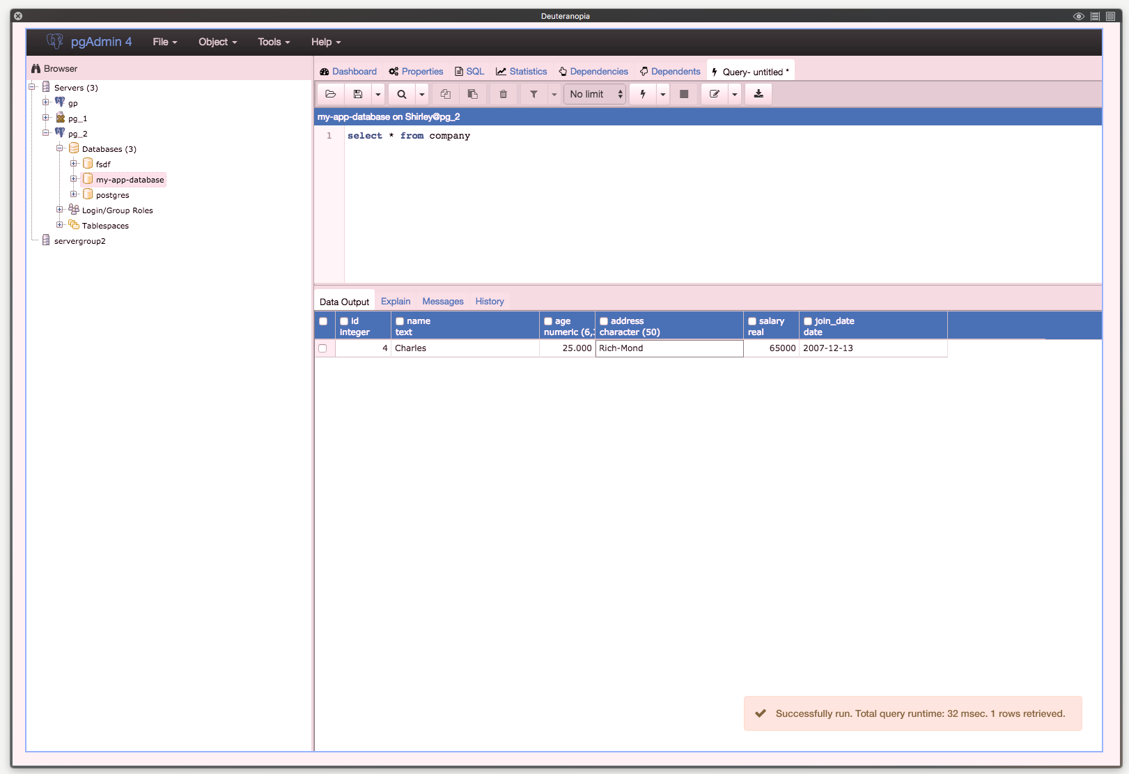
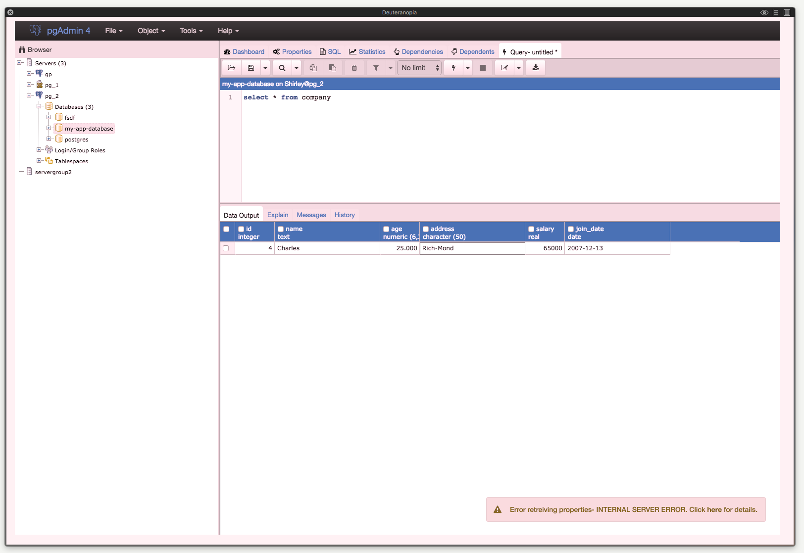
Running a query
I've added rounded corners - it doesn't seem like there are any other areas where sharp corners are used so I think these should be round.
Dialog messages
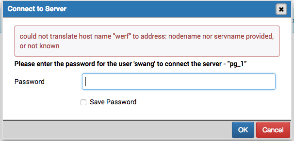
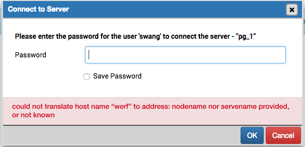
A note about 'connect to server' message. Currently the error appears above where you enter a password. I think all messages should live at the bottom of the dialog, above the buttons.
(below is current error message)
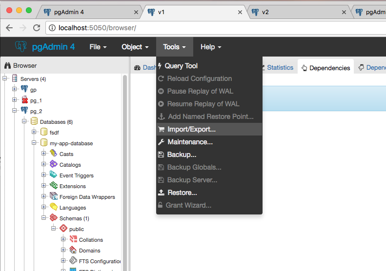
Update on tools
I played around with Lucidcharts and it seems like the only units available for drawing out shapes are inches or centimeters, neither of which is particularly useful for specifying sizes of buttons, menus etc.
I found Figma, which is a fairly feature robust web app, similar to Sketch and designed for collaboration (it's also free!). Other pros:
- saved asset library for projects (perfect for mocking up future pgAdmin screens w/o the need to recreate assets)
- version control
- link for public access
- generates some CSS from the image
Here's the link to the project. https://www.figma.com/file/UjGekp34w6iBizjlGu2D4ccp/4.21pgAdmin-styles-Page-1
Let me know what you think.
Shirley
Attachment
Hi!
--
On Tue, Apr 25, 2017 at 9:33 PM, Shirley Wang <swang@pivotal.io> wrote:

Hello!Update on alertsHere are mockups of error and update alert styles, as modeled by bootstrap.Success messages appear- after running a query- adding a database (database connected)Error messages appear- after running query- missing info in dialogsLet me know if I'm missing any areas that have different styling.Running a queryI've added rounded corners - it doesn't seem like there are any other areas where sharp corners are used so I think these should be round.


Nice!
Dialog messagesA note about 'connect to server' message. Currently the error appears above where you enter a password. I think all messages should live at the bottom of the dialog, above the buttons.

Agreed. I like the change - though I prefer the version in Figma (below):
I think it looks more attractive, and is more obviously a "transient element" (for want of a better term) - i.e. something that will go away again. I think we also need to style the error highlighting on the actual field to use the same shades of red.
Update on toolsI played around with Lucidcharts and it seems like the only units available for drawing out shapes are inches or centimeters, neither of which is particularly useful for specifying sizes of buttons, menus etc.I found Figma, which is a fairly feature robust web app, similar to Sketch and designed for collaboration (it's also free!). Other pros:- saved asset library for projects (perfect for mocking up future pgAdmin screens w/o the need to recreate assets)- version control- link for public access- generates some CSS from the imageHere's the link to the project. https://www.figma.com/file/ UjGekp34w6iBizjlGu2D4ccp/4. 21pgAdmin-styles-Page-1 Let me know what you think.
I'll have a play with it. Initial thoughts (after literally 5 minutes) are that it seems like it could be very useful. I particularly like the asset library.
Thanks!
Dave Page
Blog: http://pgsnake.blogspot.com
Twitter: @pgsnake
EnterpriseDB UK: http://www.enterprisedb.com
The Enterprise PostgreSQL Company
Blog: http://pgsnake.blogspot.com
Twitter: @pgsnake
EnterpriseDB UK: http://www.enterprisedb.com
The Enterprise PostgreSQL Company
Attachment
On Wed, Apr 26, 2017 at 4:14 AM Dave Page <dpage@pgadmin.org> wrote:
Hi!On Tue, Apr 25, 2017 at 9:33 PM, Shirley Wang <swang@pivotal.io> wrote:Hello!Update on alertsHere are mockups of error and update alert styles, as modeled by bootstrap.Success messages appear- after running a query- adding a database (database connected)Error messages appear- after running query- missing info in dialogsLet me know if I'm missing any areas that have different styling.Running a queryI've added rounded corners - it doesn't seem like there are any other areas where sharp corners are used so I think these should be round.Nice!Dialog messagesA note about 'connect to server' message. Currently the error appears above where you enter a password. I think all messages should live at the bottom of the dialog, above the buttons.Agreed. I like the change - though I prefer the version in Figma (below):I think it looks more attractive, and is more obviously a "transient element" (for want of a better term) - i.e. something that will go away again. I think we also need to style the error highlighting on the actual field to use the same shades of red.


Cool. Agree with those points. Let's do that.
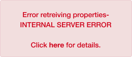
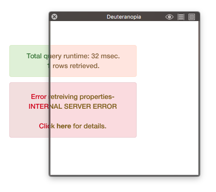
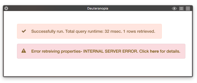
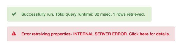
Another thing, I was checking if the success and error messages are be differentiable for people who have Deuteranopia (red-green color blindness), and it's pretty difficult.
Example:

I think the addition of icons and some copy would help:


Attachment
- database-error.png
- success-query.png
- error-query.png
- connectserver-error.png
- Screen Shot 2017-04-26 at 09.10.37.png
- Screen Shot 2017-04-26 at 10.53.50 AM.png
- Screen Shot 2017-04-26 at 11.28.41 AM.png
- Screen Shot 2017-04-26 at 11.28.51 AM.png
- runquery-success.png
- run query- fail.png
- Screen Shot 2017-04-26 at 11.39.05 AM.png
- Screen Shot 2017-04-26 at 11.42.30 AM.png
- Screen Shot 2017-04-26 at 11.42.41 AM.png
As a person with red-green color blindness, this would be a big help.
On Wed, Apr 26, 2017 at 11:45 AM, Shirley Wang <swang@pivotal.io> wrote:
On Wed, Apr 26, 2017 at 4:14 AM Dave Page <dpage@pgadmin.org> wrote:Hi!On Tue, Apr 25, 2017 at 9:33 PM, Shirley Wang <swang@pivotal.io> wrote:Hello!Update on alertsHere are mockups of error and update alert styles, as modeled by bootstrap.Success messages appear- after running a query- adding a database (database connected)Error messages appear- after running query- missing info in dialogsLet me know if I'm missing any areas that have different styling.Running a queryI've added rounded corners - it doesn't seem like there are any other areas where sharp corners are used so I think these should be round.Nice!Dialog messagesA note about 'connect to server' message. Currently the error appears above where you enter a password. I think all messages should live at the bottom of the dialog, above the buttons.Agreed. I like the change - though I prefer the version in Figma (below):I think it looks more attractive, and is more obviously a "transient element" (for want of a better term) - i.e. something that will go away again. I think we also need to style the error highlighting on the actual field to use the same shades of red.Cool. Agree with those points. Let's do that.Another thing, I was checking if the success and error messages are be differentiable for people who have Deuteranopia (red-green color blindness), and it's pretty difficult.Example:I think the addition of icons and some copy would help:


Attachment
- runquery-success.png
- run query- fail.png
- Screen Shot 2017-04-26 at 11.42.30 AM.png
- Screen Shot 2017-04-26 at 09.10.37.png
- error-query.png
- Screen Shot 2017-04-26 at 11.28.51 AM.png
- Screen Shot 2017-04-26 at 10.53.50 AM.png
- database-error.png
- Screen Shot 2017-04-26 at 11.39.05 AM.png
- Screen Shot 2017-04-26 at 11.42.41 AM.png
- Screen Shot 2017-04-26 at 11.28.41 AM.png
- connectserver-error.png
- success-query.png
On Wed, Apr 26, 2017 at 4:45 PM, Shirley Wang <swang@pivotal.io> wrote:
I think the addition of icons and some copy would help:
Agreed.
Dave Page
Blog: http://pgsnake.blogspot.com
Twitter: @pgsnake
EnterpriseDB UK: http://www.enterprisedb.com
The Enterprise PostgreSQL Company
Blog: http://pgsnake.blogspot.com
Twitter: @pgsnake
EnterpriseDB UK: http://www.enterprisedb.com
The Enterprise PostgreSQL Company
Attachment
On Wed, Apr 26, 2017 at 9:56 PM, Dave Page <dpage@pgadmin.org> wrote:
On Wed, Apr 26, 2017 at 4:45 PM, Shirley Wang <swang@pivotal.io> wrote:I think the addition of icons and some copy would help:Agreed.

+1
--Dave Page
Blog: http://pgsnake.blogspot.com
Twitter: @pgsnake
EnterpriseDB UK: http://www.enterprisedb.com
The Enterprise PostgreSQL Company
Attachment
Hello!


Update on colors
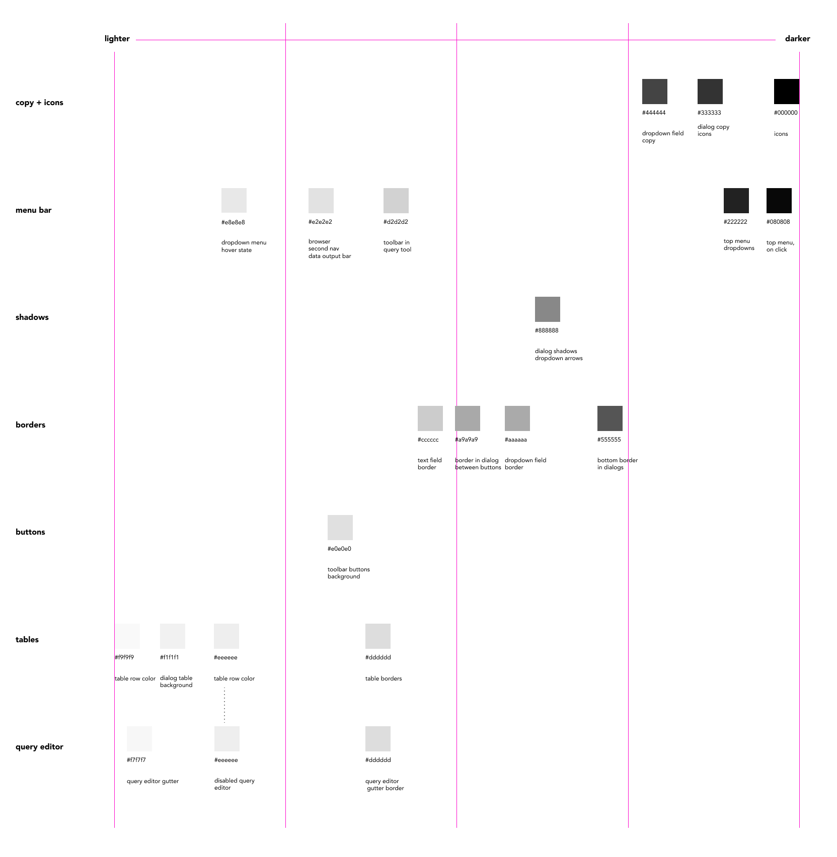
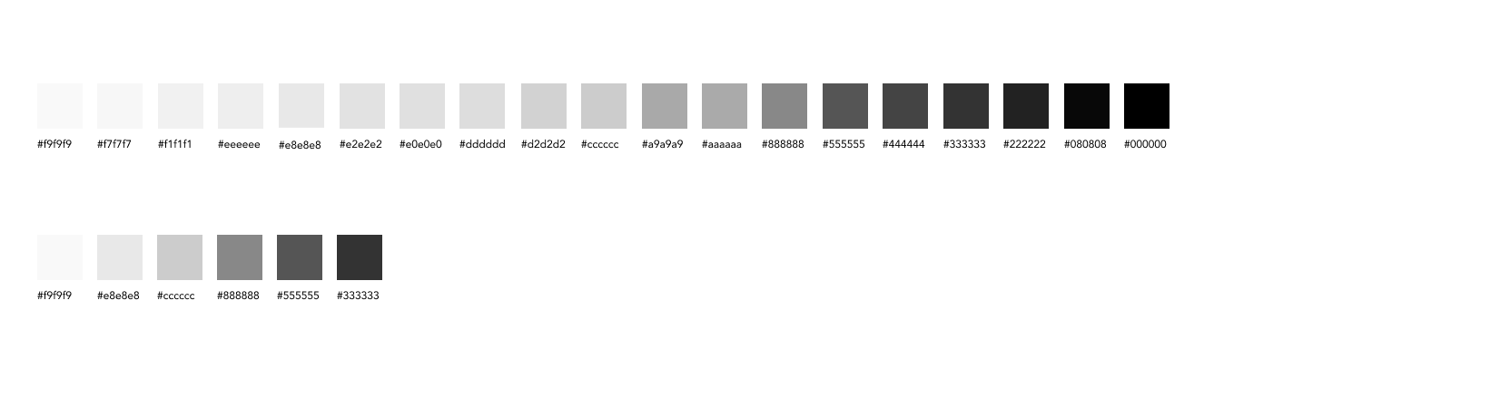
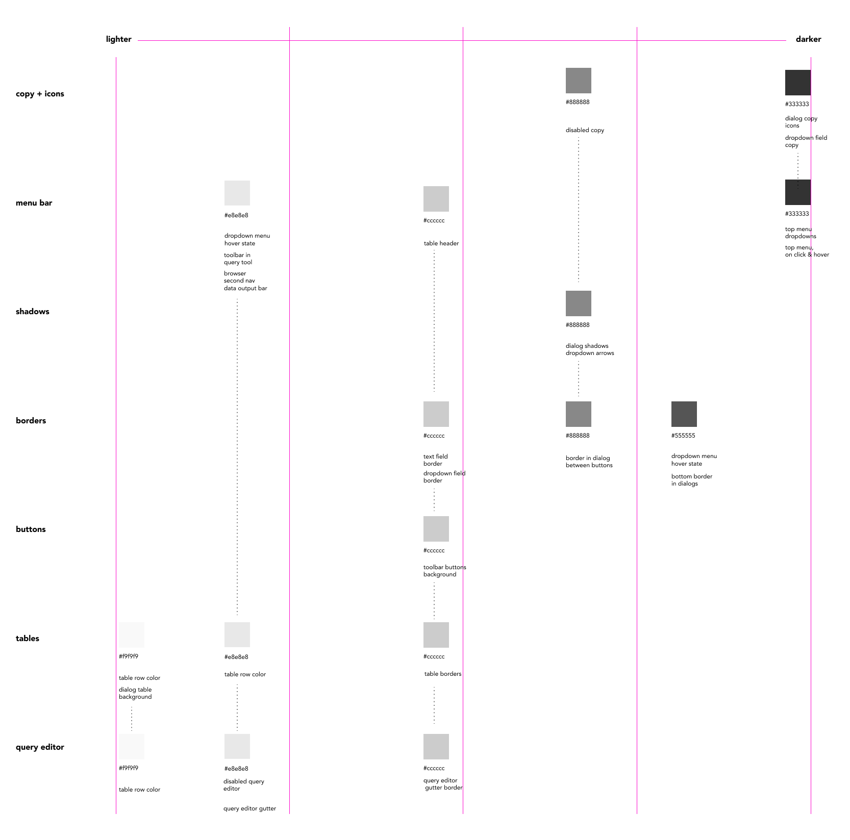
As of now, there are several greys are very similar, used across multiple areas of pgAdmin with no overlaps on color.
Here are the greys organized by scale, with the narrowed down greys underneath:
The palette of 6 greys is flexible enough to be used across all the areas within pgAdmin, and easier to map consistency.
Here's what it looks like with the 6 greys
Dropdown menus
Change from having white hover to dark grey, keeps text color the same
Query tool
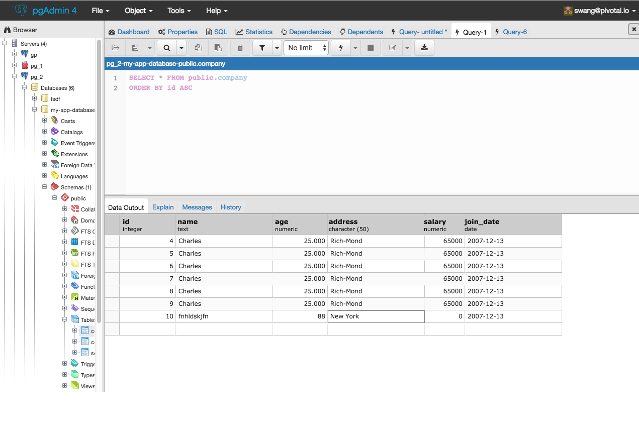
I think some interesting things with color contrast are introduced once we look at the uneditable query editor as accessed through 'View all Data'.
We can address this either by changing the greys in the results table, or changing the grey in the query editor. As of now, I think changing the query editor grey might work better to make sure that when columns are selected in the 'Data Output' panel, they stand out with the blue.
If we lighten the editor table and fade out the text in the editor, it would look like this:
Thoughts?
On Wed, Apr 26, 2017 at 11:24 PM Ashesh Vashi <ashesh.vashi@enterprisedb.com> wrote:
On Wed, Apr 26, 2017 at 9:56 PM, Dave Page <dpage@pgadmin.org> wrote:On Wed, Apr 26, 2017 at 4:45 PM, Shirley Wang <swang@pivotal.io> wrote:I think the addition of icons and some copy would help:Agreed.+1--Dave Page
Blog: http://pgsnake.blogspot.com
Twitter: @pgsnake
EnterpriseDB UK: http://www.enterprisedb.com
The Enterprise PostgreSQL Company

Attachment
Hi
--
On Tue, May 2, 2017 at 8:47 PM, Shirley Wang <swang@pivotal.io> wrote:
Hello!Update on colorsAs of now, there are several greys are very similar, used across multiple areas of pgAdmin with no overlaps on color.Here are the greys organized by scale, with the narrowed down greys underneath:The palette of 6 greys is flexible enough to be used across all the areas within pgAdmin, and easier to map consistency.


OK.
Here's what it looks like with the 6 greysDropdown menusChange from having white hover to dark grey, keeps text color the same


That looks fine to me.
Query tool
I *really* don't like the dark gray on the grid header - it's too imposing and grabs the eye away from the data. How would it look if we used the lighter gray that is seen on the row headers (the first column)? Looking at Excel, it uses the same colour for both the row and the column headers, though it's more like the bluish colour we're using for alternate rows (not that we should use that - see below).
I think some interesting things with color contrast are introduced once we look at the uneditable query editor as accessed through 'View all Data'.
I'm not overly convinced about the gray used for the codemirror gutter. It looks a little blue. Regarding the inactive edit area, I don't think that looks wrong (unlike one of the earlier drafts where the info bar was the same colour). However, I'm not against changing it.
We can address this either by changing the greys in the results table, or changing the grey in the query editor. As of now, I think changing the query editor grey might work better to make sure that when columns are selected in the 'Data Output' panel, they stand out with the blue.If we lighten the editor table and fade out the text in the editor, it would look like this:

I could live with that (assuming the loss of focus/definition is an artefact of the mockup).
So to summarise:
- I'm happy to see the number of grays reduced as proposed.
- I don't like the dark gray column headers.
- I think the column and row headers should be the same colour.
- I think we should review the bluish-gray used for the codemirror gutter (though, it looks fine for the alternate rows)
- We should use a light-gray for the disabled codemirror, with slightly faded text.
What do you think?
Thanks!
Thoughts?On Wed, Apr 26, 2017 at 9:56 PM, Dave Page <dpage@pgadmin.org> wrote:On Wed, Apr 26, 2017 at 4:45 PM, Shirley Wang <swang@pivotal.io> wrote:I think the addition of icons and some copy would help:Agreed.+1--Dave Page
Blog: http://pgsnake.blogspot.com
Twitter: @pgsnake
EnterpriseDB UK: http://www.enterprisedb.com
The Enterprise PostgreSQL Company

Dave Page
Blog: http://pgsnake.blogspot.com
Twitter: @pgsnake
EnterpriseDB UK: http://www.enterprisedb.com
The Enterprise PostgreSQL Company
Blog: http://pgsnake.blogspot.com
Twitter: @pgsnake
EnterpriseDB UK: http://www.enterprisedb.com
The Enterprise PostgreSQL Company
Attachment
On Wed, May 3, 2017 at 4:27 AM Dave Page <dpage@pgadmin.org> wrote:
HiOn Tue, May 2, 2017 at 8:47 PM, Shirley Wang <swang@pivotal.io> wrote:Hello!Update on colorsAs of now, there are several greys are very similar, used across multiple areas of pgAdmin with no overlaps on color.Here are the greys organized by scale, with the narrowed down greys underneath:The palette of 6 greys is flexible enough to be used across all the areas within pgAdmin, and easier to map consistency.OK.Here's what it looks like with the 6 greysDropdown menusChange from having white hover to dark grey, keeps text color the sameThat looks fine to me.Query toolI *really* don't like the dark gray on the grid header - it's too imposing and grabs the eye away from the data. How would it look if we used the lighter gray that is seen on the row headers (the first column)? Looking at Excel, it uses the same colour for both the row and the column headers, though it's more like the bluish colour we're using for alternate rows (not that we should use that - see below).


I think some interesting things with color contrast are introduced once we look at the uneditable query editor as accessed through 'View all Data'.I'm not overly convinced about the gray used for the codemirror gutter. It looks a little blue. Regarding the inactive edit area, I don't think that looks wrong (unlike one of the earlier drafts where the info bar was the same colour). However, I'm not against changing it.

We can address this either by changing the greys in the results table, or changing the grey in the query editor. As of now, I think changing the query editor grey might work better to make sure that when columns are selected in the 'Data Output' panel, they stand out with the blue.If we lighten the editor table and fade out the text in the editor, it would look like this:I could live with that (assuming the loss of focus/definition is an artefact of the mockup).

Yes, I've been editing colors within Chrome inspector and taking screenshots.
So to summarise:- I'm happy to see the number of grays reduced as proposed.- I don't like the dark gray column headers.- I think the column and row headers should be the same colour.- I think we should review the bluish-gray used for the codemirror gutter (though, it looks fine for the alternate rows)- We should use a light-gray for the disabled codemirror, with slightly faded text.What do you think?
Gotcha. Here's the query tool with the same grey as the row header.

I quite like this grey as a header.
And in the 'View all Data'

I made the codemirror and codemirror gutter the same color with a 50% opacity on the text. It looks like its lighter in the 'View all data' mockup, but that's because the codemirror being grey makes the gutter lose contrast.
I'm not sure why it looks bluish grey for you, it's a neutral grey both times (#f9f9f9). Perhaps try editing the color in Chrome Inspector to see if it makes a difference?
Attachment
- viewalldata-gr.png
- v1- palette.png
- Screen Shot 2017-05-02 at 11.35.54 AM.png
- Screen Shot 2017-04-26 at 11.28.41 AM.png
- greys-v2 %281%29.png
- v1.png
- greys-in-pgAdmin.png
- viewalldata-lightgrey-opacity.png
- view results- same greys.png
- view all data- greys.png
- view all data- greys-1.png
- view results- same greys-1.png
On Wed, May 3, 2017 at 11:06 PM, Shirley Wang <swang@pivotal.io> wrote:
So to summarise:- I'm happy to see the number of grays reduced as proposed.- I don't like the dark gray column headers.- I think the column and row headers should be the same colour.- I think we should review the bluish-gray used for the codemirror gutter (though, it looks fine for the alternate rows)- We should use a light-gray for the disabled codemirror, with slightly faded text.What do you think?Gotcha. Here's the query tool with the same grey as the row header.I quite like this grey as a header.

Yes, me too.
And in the 'View all Data'I made the codemirror and codemirror gutter the same color with a 50% opacity on the text. It looks like its lighter in the 'View all data' mockup, but that's because the codemirror being grey makes the gutter lose contrast.

Works for me :-)
I'm not sure why it looks bluish grey for you, it's a neutral grey both times (#f9f9f9). Perhaps try editing the color in Chrome Inspector to see if it makes a difference?
Likely just my ageing eyes.
Dave Page
Blog: http://pgsnake.blogspot.com
Twitter: @pgsnake
EnterpriseDB UK: http://www.enterprisedb.com
The Enterprise PostgreSQL Company
Blog: http://pgsnake.blogspot.com
Twitter: @pgsnake
EnterpriseDB UK: http://www.enterprisedb.com
The Enterprise PostgreSQL Company
Attachment
Hello!
Update on style guide location
We're going to move the agreed upon styles from Figma onto a webpage that will be accessible by everyone. We've decided to have a static site, with the html and css available to copy and paste. We'll add components to the style guide after we update the current UI with new styles.
Dropdown styles
I noticed that some drop downs include a 'x' next to the current option in the text field:
The 'x' and the down arrow functionally do the same thing, and it seems redundant to have both. I would suggest removing the 'x' since selecting another option from the dropdown will automatically replace the current option.
Button toggles vs checkboxes
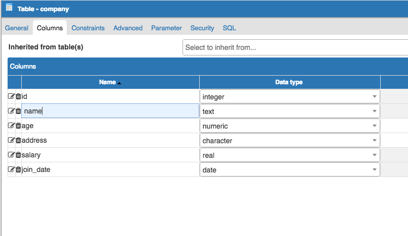
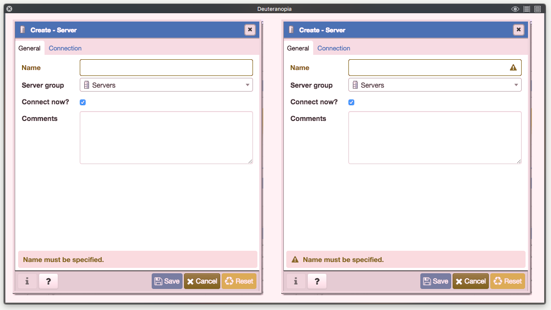
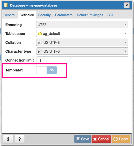
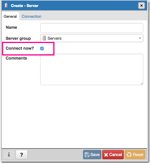
In some cases within dialogs, a toggle is used to define yes or no, while in other cases a radio button is used to define yes or no:
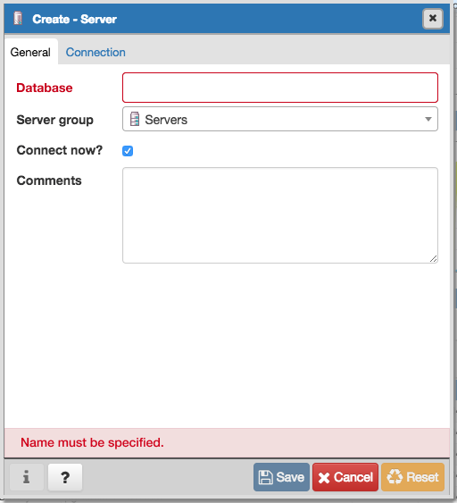
It does seem like 'Connect now?' and 'Save password' (in 'Connection' tab within 'Create - Server') are the only places where checkboxes are used, is there a reason why these are different? I think we should just choose one, unless there was a specific reason as to why both check boxes and toggles are used.
On Thu, May 4, 2017 at 4:09 AM Dave Page <dpage@pgadmin.org> wrote:
On Wed, May 3, 2017 at 11:06 PM, Shirley Wang <swang@pivotal.io> wrote:So to summarise:- I'm happy to see the number of grays reduced as proposed.- I don't like the dark gray column headers.- I think the column and row headers should be the same colour.- I think we should review the bluish-gray used for the codemirror gutter (though, it looks fine for the alternate rows)- We should use a light-gray for the disabled codemirror, with slightly faded text.What do you think?Gotcha. Here's the query tool with the same grey as the row header.I quite like this grey as a header.Yes, me too.And in the 'View all Data'I made the codemirror and codemirror gutter the same color with a 50% opacity on the text. It looks like its lighter in the 'View all data' mockup, but that's because the codemirror being grey makes the gutter lose contrast.Works for me :-)I'm not sure why it looks bluish grey for you, it's a neutral grey both times (#f9f9f9). Perhaps try editing the color in Chrome Inspector to see if it makes a difference?Likely just my ageing eyes.--Dave Page
Blog: http://pgsnake.blogspot.com
Twitter: @pgsnake
EnterpriseDB UK: http://www.enterprisedb.com
The Enterprise PostgreSQL Company

Attachment
Hi
--
On Thu, May 18, 2017 at 6:57 PM, Shirley Wang <swang@pivotal.io> wrote:
Hello!Update on style guide locationWe're going to move the agreed upon styles from Figma onto a webpage that will be accessible by everyone. We've decided to have a static site, with the html and css available to copy and paste. We'll add components to the style guide after we update the current UI with new styles.Dropdown stylesI noticed that some drop downs include a 'x' next to the current option in the text field:The 'x' and the down arrow functionally do the same thing, and it seems redundant to have both. I would suggest removing the 'x' since selecting another option from the dropdown will automatically replace the current option.
No they don't. The x clears the current selection, and opens the combo. The arrow will just open the combo. Both operations are valid (and in some cases, required), but for clarity we probably should change it such that the x doesn't open the combo.
Button toggles vs checkboxesIn some cases within dialogs, a toggle is used to define yes or no, while in other cases a radio button is used to define yes or no:It does seem like 'Connect now?' and 'Save password' (in 'Connection' tab within 'Create - Server') are the only places where checkboxes are used, is there a reason why these are different? I think we should just choose one, unless there was a specific reason as to why both check boxes and toggles are used.
I think it was just because that was one of the very first dialogues written, when we were in POC mode. It should be fixed.
Thanks!
Dave Page
Blog: http://pgsnake.blogspot.com
Twitter: @pgsnake
EnterpriseDB UK: http://www.enterprisedb.com
The Enterprise PostgreSQL Company
Blog: http://pgsnake.blogspot.com
Twitter: @pgsnake
EnterpriseDB UK: http://www.enterprisedb.com
The Enterprise PostgreSQL Company
On Fri, May 19, 2017 at 7:40 AM Dave Page <dpage@pgadmin.org> wrote:
HiOn Thu, May 18, 2017 at 6:57 PM, Shirley Wang <swang@pivotal.io> wrote:Hello!Update on style guide locationWe're going to move the agreed upon styles from Figma onto a webpage that will be accessible by everyone. We've decided to have a static site, with the html and css available to copy and paste. We'll add components to the style guide after we update the current UI with new styles.Dropdown stylesI noticed that some drop downs include a 'x' next to the current option in the text field:The 'x' and the down arrow functionally do the same thing, and it seems redundant to have both. I would suggest removing the 'x' since selecting another option from the dropdown will automatically replace the current option.No they don't. The x clears the current selection, and opens the combo. The arrow will just open the combo. Both operations are valid (and in some cases, required), but for clarity we probably should change it such that the x doesn't open the combo.
If the 'x' doesn't open the combo, Is there a way to just type in that text field without opening the drop down menu? It seems like in many of the fields where there is an 'x' a user would still need to open the dropdown first to type.

In most cases where I've seen a text field with options, usually a drop down appears automagically without a need for a dropdown icon or x

Button toggles vs checkboxesIn some cases within dialogs, a toggle is used to define yes or no, while in other cases a radio button is used to define yes or no:It does seem like 'Connect now?' and 'Save password' (in 'Connection' tab within 'Create - Server') are the only places where checkboxes are used, is there a reason why these are different? I think we should just choose one, unless there was a specific reason as to why both check boxes and toggles are used.I think it was just because that was one of the very first dialogues written, when we were in POC mode. It should be fixed.
ok!
Attachment
On Friday, May 19, 2017, Shirley Wang <swang@pivotal.io> wrote:
On Fri, May 19, 2017 at 7:40 AM Dave Page <dpage@pgadmin.org> wrote:HiOn Thu, May 18, 2017 at 6:57 PM, Shirley Wang <swang@pivotal.io> wrote:Hello!Update on style guide locationWe're going to move the agreed upon styles from Figma onto a webpage that will be accessible by everyone. We've decided to have a static site, with the html and css available to copy and paste. We'll add components to the style guide after we update the current UI with new styles.Dropdown stylesI noticed that some drop downs include a 'x' next to the current option in the text field:The 'x' and the down arrow functionally do the same thing, and it seems redundant to have both. I would suggest removing the 'x' since selecting another option from the dropdown will automatically replace the current option.No they don't. The x clears the current selection, and opens the combo. The arrow will just open the combo. Both operations are valid (and in some cases, required), but for clarity we probably should change it such that the x doesn't open the combo.If the 'x' doesn't open the combo, Is there a way to just type in that text field without opening the drop down menu? It seems like in many of the fields where there is an 'x' a user would still need to open the dropdown first to type.In most cases where I've seen a text field with options, usually a drop down appears automagically without a need for a dropdown icon or x


Yes, I think that would be an improvement, if it can be done appropriately. I think the reason it's not done that way now is that unlike the examples you gave, in pgAdmin we're searching for one of the existing values in the list, rather than entering a free-type value that might be auto-completed.
Button toggles vs checkboxesIn some cases within dialogs, a toggle is used to define yes or no, while in other cases a radio button is used to define yes or no:It does seem like 'Connect now?' and 'Save password' (in 'Connection' tab within 'Create - Server') are the only places where checkboxes are used, is there a reason why these are different? I think we should just choose one, unless there was a specific reason as to why both check boxes and toggles are used.I think it was just because that was one of the very first dialogues written, when we were in POC mode. It should be fixed.ok!
--
Dave Page
Blog: http://pgsnake.blogspot.com
Twitter: @pgsnake
EnterpriseDB UK: http://www.enterprisedb.com
The Enterprise PostgreSQL Company
Attachment
In most cases where I've seen a text field with options, usually a drop down appears automagically without a need for a dropdown icon or xYes, I think that would be an improvement, if it can be done appropriately. I think the reason it's not done that way now is that unlike the examples you gave, in pgAdmin we're searching for one of the existing values in the list, rather than entering a free-type value that might be auto-completed.
That's what the Yelp example shows: they have a list of options (Restaurants, Bars, Food, Delivery, Pickup, and Reservations) that show as default when there are no options typed. There's just additional features included in the GIF, sorry for the confusion. We can ignore the auto-completed examples for free type values, and have auto-complete for values that exist in the list.
Mainly, if we're enabling users to type, I don't think we need icons within each field as the drop down appearing is enough context. However, if we are not enabling a user to type, then a drop down icon should appear to show that only clicking is allowed to select an option. Thoughts?
Attachment
On Mon, May 22, 2017 at 5:49 PM, Shirley Wang <swang@pivotal.io> wrote:
In most cases where I've seen a text field with options, usually a drop down appears automagically without a need for a dropdown icon or xYes, I think that would be an improvement, if it can be done appropriately. I think the reason it's not done that way now is that unlike the examples you gave, in pgAdmin we're searching for one of the existing values in the list, rather than entering a free-type value that might be auto-completed.That's what the Yelp example shows: they have a list of options (Restaurants, Bars, Food, Delivery, Pickup, and Reservations) that show as default when there are no options typed. There's just additional features included in the GIF, sorry for the confusion. We can ignore the auto-completed examples for free type values, and have auto-complete for values that exist in the list.Mainly, if we're enabling users to type, I don't think we need icons within each field as the drop down appearing is enough context. However, if we are not enabling a user to type, then a drop down icon should appear to show that only clicking is allowed to select an option. Thoughts?
When you say "icon" here, are you talking about the combo box arrow, or icons on the items themselves? The latter are often useful if you have items of different types in the same list.
I think we should have the combo box arrow, to show the user they don't have to type if they don't want to.
--
Dave Page
Blog: http://pgsnake.blogspot.com
Twitter: @pgsnake
EnterpriseDB UK: http://www.enterprisedb.com
The Enterprise PostgreSQL Company
Blog: http://pgsnake.blogspot.com
Twitter: @pgsnake
EnterpriseDB UK: http://www.enterprisedb.com
The Enterprise PostgreSQL Company
Attachment
When you say "icon" here, are you talking about the combo box arrow, or icons on the items themselves? The latter are often useful if you have items of different types in the same list.I think we should have the combo box arrow, to show the user they don't have to type if they don't want to.
I'm talking about the combo box arrow. I think that's fine, but in that case users shouldn't be able type, they should only be able to select from a group of options, like this:
From what I understand, the text field where a user can type in is for searching through options available to them. If we know that people tend to search by typing more than scrolling, we should use the precedent for type ahead dropdowns.
If people don't typically type to search or there are usually only a few options, it can just be a dropdown.
Attachment
On Wed, May 31, 2017 at 2:27 PM, Shirley Wang <swang@pivotal.io> wrote:
When you say "icon" here, are you talking about the combo box arrow, or icons on the items themselves? The latter are often useful if you have items of different types in the same list.I think we should have the combo box arrow, to show the user they don't have to type if they don't want to.I'm talking about the combo box arrow. I think that's fine, but in that case users shouldn't be able type, they should only be able to select from a group of options, like this:From what I understand, the text field where a user can type in is for searching through options available to them. If we know that people tend to search by typing more than scrolling, we should use the precedent for type ahead dropdowns.

We are using a much older precedent - one used in Windows for 20+ years (possibly other OSs too).
Remember that some of these combo boxes contain values that are specific to the database object - the user may not know what to start typing, so the arrow gives them a hint that they can get a list by clicking - or they can type.
The real difference here is that we also include the x to allow the box to be cleared, where Windows would add a blank option as the first thing in the list typically.
If people don't typically type to search or there are usually only a few options, it can just be a dropdown.
Dave Page
Blog: http://pgsnake.blogspot.com
Twitter: @pgsnake
EnterpriseDB UK: http://www.enterprisedb.com
The Enterprise PostgreSQL Company
Blog: http://pgsnake.blogspot.com
Twitter: @pgsnake
EnterpriseDB UK: http://www.enterprisedb.com
The Enterprise PostgreSQL Company
Attachment
On Wed, May 31, 2017 at 11:55 AM Dave Page <dpage@pgadmin.org> wrote:
On Wed, May 31, 2017 at 2:27 PM, Shirley Wang <swang@pivotal.io> wrote:When you say "icon" here, are you talking about the combo box arrow, or icons on the items themselves? The latter are often useful if you have items of different types in the same list.I think we should have the combo box arrow, to show the user they don't have to type if they don't want to.I'm talking about the combo box arrow. I think that's fine, but in that case users shouldn't be able type, they should only be able to select from a group of options, like this:From what I understand, the text field where a user can type in is for searching through options available to them. If we know that people tend to search by typing more than scrolling, we should use the precedent for type ahead dropdowns.We are using a much older precedent - one used in Windows for 20+ years (possibly other OSs too).Remember that some of these combo boxes contain values that are specific to the database object - the user may not know what to start typing, so the arrow gives them a hint that they can get a list by clicking - or they can type.The real difference here is that we also include the x to allow the box to be cleared, where Windows would add a blank option as the first thing in the list typically.

I see. It feels like we're at a standstill as to which precedent to use and neither of us is wrong. This might be a good candidate for user testing. We can see how people are using the x as well as learn more about typing / selecting an option behavior.
I believe there are some dropdowns in the partition design we can use to test. If it doesn't make sense there, I'm fine putting this in the back burner until there is a good workflow to test it.
Attachment
Hi all,
We've updated the borders around alerts so that they are more prominent.
Everything else stays the same. Let me know your thoughts if any.
Shirley & Shruti
On Wed, May 31, 2017 at 3:02 PM Shirley Wang <swang@pivotal.io> wrote:
On Wed, May 31, 2017 at 11:55 AM Dave Page <dpage@pgadmin.org> wrote:On Wed, May 31, 2017 at 2:27 PM, Shirley Wang <swang@pivotal.io> wrote:When you say "icon" here, are you talking about the combo box arrow, or icons on the items themselves? The latter are often useful if you have items of different types in the same list.I think we should have the combo box arrow, to show the user they don't have to type if they don't want to.I'm talking about the combo box arrow. I think that's fine, but in that case users shouldn't be able type, they should only be able to select from a group of options, like this:From what I understand, the text field where a user can type in is for searching through options available to them. If we know that people tend to search by typing more than scrolling, we should use the precedent for type ahead dropdowns.We are using a much older precedent - one used in Windows for 20+ years (possibly other OSs too).Remember that some of these combo boxes contain values that are specific to the database object - the user may not know what to start typing, so the arrow gives them a hint that they can get a list by clicking - or they can type.The real difference here is that we also include the x to allow the box to be cleared, where Windows would add a blank option as the first thing in the list typically.I see. It feels like we're at a standstill as to which precedent to use and neither of us is wrong. This might be a good candidate for user testing. We can see how people are using the x as well as learn more about typing / selecting an option behavior.I believe there are some dropdowns in the partition design we can use to test. If it doesn't make sense there, I'm fine putting this in the back burner until there is a good workflow to test it.
Looks nice.
On Wed, Jun 21, 2017 at 10:34 PM, Shirley Wang <swang@pivotal.io> wrote:
Hi all,We've updated the borders around alerts so that they are more prominent.Everything else stays the same. Let me know your thoughts if any.Shirley & ShrutiOn Wed, May 31, 2017 at 3:02 PM Shirley Wang <swang@pivotal.io> wrote:On Wed, May 31, 2017 at 11:55 AM Dave Page <dpage@pgadmin.org> wrote:On Wed, May 31, 2017 at 2:27 PM, Shirley Wang <swang@pivotal.io> wrote:When you say "icon" here, are you talking about the combo box arrow, or icons on the items themselves? The latter are often useful if you have items of different types in the same list.I think we should have the combo box arrow, to show the user they don't have to type if they don't want to.I'm talking about the combo box arrow. I think that's fine, but in that case users shouldn't be able type, they should only be able to select from a group of options, like this:From what I understand, the text field where a user can type in is for searching through options available to them. If we know that people tend to search by typing more than scrolling, we should use the precedent for type ahead dropdowns.We are using a much older precedent - one used in Windows for 20+ years (possibly other OSs too).Remember that some of these combo boxes contain values that are specific to the database object - the user may not know what to start typing, so the arrow gives them a hint that they can get a list by clicking - or they can type.The real difference here is that we also include the x to allow the box to be cleared, where Windows would add a blank option as the first thing in the list typically.I see. It feels like we're at a standstill as to which precedent to use and neither of us is wrong. This might be a good candidate for user testing. We can see how people are using the x as well as learn more about typing / selecting an option behavior.I believe there are some dropdowns in the partition design we can use to test. If it doesn't make sense there, I'm fine putting this in the back burner until there is a good workflow to test it.
Dave Page
Blog: http://pgsnake.blogspot.com
Twitter: @pgsnake
EnterpriseDB UK: http://www.enterprisedb.com
The Enterprise PostgreSQL Company
Blog: http://pgsnake.blogspot.com
Twitter: @pgsnake
EnterpriseDB UK: http://www.enterprisedb.com
The Enterprise PostgreSQL Company
Hello!
Currently the app uses 'monospace' to define the font family for SQL queries and messages, which looks a little squished when in uppercase. PT mono is another monospaced font (available on Google fonts) that looks similar to 'monospace' but is more legible for uppercase.
PT Mono:

Monospace
Thoughts?
On Fri, Jun 30, 2017 at 12:19 PM, Shirley Wang <swang@pivotal.io> wrote:
Hello!Currently the app uses 'monospace' to define the font family for SQL queries and messages, which looks a little squished when in uppercase. PT mono is another monospaced font (available on Google fonts) that looks similar to 'monospace' but is more legible for uppercase.PT Mono:MonospaceThoughts?
I'm not sure I like it. It looks a little like the old-school "digital" font; the sort of thing they used in the movie War Games.
Dave Page
Blog: http://pgsnake.blogspot.com
Twitter: @pgsnake
EnterpriseDB UK: http://www.enterprisedb.com
The Enterprise PostgreSQL Company
Blog: http://pgsnake.blogspot.com
Twitter: @pgsnake
EnterpriseDB UK: http://www.enterprisedb.com
The Enterprise PostgreSQL Company
On Mon, Jul 3, 2017 at 5:36 AM, Dave Page <dpage@pgadmin.org> wrote:
I'm not sure I like it. It looks a little like the old-school "digital" font; the sort of thing they used in the movie War Games.On Fri, Jun 30, 2017 at 12:19 PM, Shirley Wang <swang@pivotal.io> wrote:Hello!Currently the app uses 'monospace' to define the font family for SQL queries and messages, which looks a little squished when in uppercase. PT mono is another monospaced font (available on Google fonts) that looks similar to 'monospace' but is more legible for uppercase.PT Mono:MonospaceThoughts?
As an aside, font used in the movie War Games actually kinda seels it to me in my book.
Looking at the two the other day, it seemed like the lower case fonts are pretty much the same but the Capital letters of PT Mono are spaced out a bit more making it easier to read.
-- Rob
--Dave Page
Blog: http://pgsnake.blogspot.com
Twitter: @pgsnake
EnterpriseDB UK: http://www.enterprisedb.com
The Enterprise PostgreSQL Company
I noticed that the default font, Menlo, was disabled in favor of Monospace. Was there a specific reason why Monospace was used in favor of Menlo?
I find that Menlo is an easier font to read, especially for uppercase letters. For web apps, sans-serif fonts are used (fonts without the little notch, or serifs, at the end of each stroke of a letter) so it's easier to read on a display. Serif fonts are better for print.
Menlo:

On Mon, Jul 10, 2017 at 9:48 PM, Shirley Wang <swang@pivotal.io> wrote:
I noticed that the default font, Menlo, was disabled in favor of Monospace. Was there a specific reason why Monospace was used in favor of Menlo?I find that Menlo is an easier font to read, especially for uppercase letters. For web apps, sans-serif fonts are used (fonts without the little notch, or serifs, at the end of each stroke of a letter) so it's easier to read on a display. Serif fonts are better for print.
I'm not aware of a change to that font. The only commits I can find that reference either Menlo or monospace are these:
commit e2cbaaef7124b41be91bf34d704f0d3f61cf7b0c
Author: Matthew Kleiman <mkleiman@pivotal.io>
Date: Thu Jul 6 13:08:29 2017 +0100
UI tweaks for the query history.
commit 7f5541205936e32b08a2183f00173a0c64019c8e
Author: Joao Pedro De Almeida Pereira <jdealmeidapereira@pivotal.io>
Date: Tue Jun 27 10:55:57 2017 -0400
Overhaul the query history tab to allow browsing of the history and full query text. Fixes #2282
Patch by Joao and the team at Pivotal.
commit 1208206bc0eca2d135469258e8a209b983e668be
Author: Shruti B Iyer <siyer@pivotal.io>
Date: Tue Jun 13 09:50:41 2017 +0100
Initial re-vamp of the History tab.
Menlo:
Dave Page
Blog: http://pgsnake.blogspot.com
Twitter: @pgsnake
EnterpriseDB UK: http://www.enterprisedb.com
The Enterprise PostgreSQL Company
Blog: http://pgsnake.blogspot.com
Twitter: @pgsnake
EnterpriseDB UK: http://www.enterprisedb.com
The Enterprise PostgreSQL Company
I'm not aware of a change to that font. The only commits I can find that reference either Menlo or monospace are these:
Date: Thu Jul 6 13:08:29 2017 +0100UI tweaks for the query history.commit 7f5541205936e32b08a2183f00173a0c64019c8eAuthor: Joao Pedro De Almeida Pereira <jdealmeidapereira@pivotal.io>Date: Tue Jun 27 10:55:57 2017 -0400Overhaul the query history tab to allow browsing of the history and full query text. Fixes #2282Patch by Joao and the team at Pivotal.commit 1208206bc0eca2d135469258e8a209b983e668beAuthor: Shruti B Iyer <siyer@pivotal.io>Date: Tue Jun 13 09:50:41 2017 +0100Initial re-vamp of the History tab.
Oh ok, it doesn't seem like the overwrites were intentional. I find Menlo an easier typeface to read and scan than monospace, but I'm hesitant to change it especially if there's no pain associated with Monospace. I'll send out a message on the mailing list and see what the feedback is on current typeface used.
On another note, headers for tables (for example under statistics tab) are currently bolded and 12px. Headers for dialogs are 13px and bold. To keep it consistent with other typography in the app, both should be 13px and not bolded. By updating them, they will be consistent with the editor title in the query tool which is already 13px and not bolded.
Current:
Update (these are all 13px not bolded)
Editor title in query tool (currently 13px and not bolded)
On Wed, Jul 12, 2017 at 4:26 PM, Shirley Wang <swang@pivotal.io> wrote:
I'm not aware of a change to that font. The only commits I can find that reference either Menlo or monospace are these:Date: Thu Jul 6 13:08:29 2017 +0100UI tweaks for the query history.commit 7f5541205936e32b08a2183f00173a0c64019c8e Author: Joao Pedro De Almeida Pereira <jdealmeidapereira@pivotal.io>Date: Tue Jun 27 10:55:57 2017 -0400Overhaul the query history tab to allow browsing of the history and full query text. Fixes #2282Patch by Joao and the team at Pivotal.commit 1208206bc0eca2d135469258e8a209b983e668be Author: Shruti B Iyer <siyer@pivotal.io>Date: Tue Jun 13 09:50:41 2017 +0100Initial re-vamp of the History tab.Oh ok, it doesn't seem like the overwrites were intentional. I find Menlo an easier typeface to read and scan than monospace, but I'm hesitant to change it especially if there's no pain associated with Monospace. I'll send out a message on the mailing list and see what the feedback is on current typeface used.
OK.
On another note, headers for tables (for example under statistics tab) are currently bolded and 12px. Headers for dialogs are 13px and bold. To keep it consistent with other typography in the app, both should be 13px and not bolded. By updating them, they will be consistent with the editor title in the query tool which is already 13px and not bolded.
Iirc, we did some back and forth over that about 18 months ago, as dialogues didn't look quite right without the bold - and I do think that it looks a little light on your mockup. I don't think there's a hard requirement they match table headers; they are distinct types of header.
Happy to try out change though if you can workup one or more suggested patches.
Current:Update (these are all 13px not bolded)Editor title in query tool (currently 13px and not bolded)
Dave Page
Blog: http://pgsnake.blogspot.com
Twitter: @pgsnake
EnterpriseDB UK: http://www.enterprisedb.com
The Enterprise PostgreSQL Company
Blog: http://pgsnake.blogspot.com
Twitter: @pgsnake
EnterpriseDB UK: http://www.enterprisedb.com
The Enterprise PostgreSQL Company
Iirc, we did some back and forth over that about 18 months ago, as dialogues didn't look quite right without the bold - and I do think that it looks a little light on your mockup. I don't think there's a hard requirement they match table headers; they are distinct types of header.Happy to try out change though if you can workup one or more suggested patches.
Two more things we're going to add to the style guide are the dialog labels and buttons within the dialog.
Dialog text fields:
These will have 14px bold labels, and the text field box will be 36px in height
Larger text fields should be set to 360px in height and have a draggable corner to adjust height if needed
Buttons in dialog:
The should be one solid color to help them stay consistent with the aesthetic of the rest of the application (ex. alerts styling).
enabled and disabled versions of buttons:
In terms of usability, having the most common action in the corner makes it easier to find and click. Rearranging the buttons so that 'save' is at the end would accomplish this.
Iirc, we did some back and forth over that about 18 months ago, as dialogues didn't look quite right without the bold - and I do think that it looks a little light on your mockup. I don't think there's a hard requirement they match table headers; they are distinct types of header.Happy to try out change though if you can workup one or more suggested patches.Two more things we're going to add to the style guide are the dialog labels and buttons within the dialog.Dialog text fields:These will have 14px bold labels, and the text field box will be 36px in height<label.png>Larger text fields should be set to 360px in height and have a draggable corner to adjust height if neededButtons in dialog:The should be one solid color to help them stay consistent with the aesthetic of the rest of the application (ex. alerts styling).enabled and disabled versions of buttons:In terms of usability, having the most common action in the corner makes it easier to find and click. Rearranging the buttons so that 'save' is at the end would accomplish this.
There are OS conventions for the positioning of those buttons, which I believe we should follow. Unfortunately Mac and Windows are exactly opposite which complicates things. Iirc, we follow Windows as its more widely used.
I'm hesitant to change that to something we invent, as I've seen people get confused by the difference a number of times when moving from Windows to Mac. If anything, we should make our behaviour dynamically follow the OS standard of whatever the client is running on.