Re: [pgadmin-hackers] [Design update] Style guide for pgAdmin4 - Mailing list pgadmin-hackers

From Shirley Wang
Subject Re: [pgadmin-hackers] [Design update] Style guide for pgAdmin4
Date
Msg-id CAPG3WN4kqySBvY+LXgXOC6Sut-eo6bJ04o1mmYjdTy5MJTkLFQ@mail.gmail.com
Whole thread Raw
In response to Re: [pgadmin-hackers] [Design update] Style guide for pgAdmin4  (Dave Page <dpage@pgadmin.org>)
Responses Re: [pgadmin-hackers] [Design update] Style guide for pgAdmin4
List pgadmin-hackers


On Mon, Apr 24, 2017 at 4:58 AM Dave Page <dpage@pgadmin.org> wrote:
Hi

On Fri, Apr 21, 2017 at 7:27 PM, Shirley Wang <swang@pivotal.io> wrote:
Hello


Please feel free to edit the Sketch file- my only ask is new versions hare named accordingly. 

Is this the app you used? https://www.sketchapp.com/

Yes. Also, I recognize it's probably not the best tool, given that there's a 30 day free trial and then you need to purchase a license. I'm looking into other programs that are free.

FYI, we use LucidCharts internally. It's a pretty good Google Apps integrated version of Microsoft Visio.

Ah ok. Do you have any files related to pgAdmin you can share (or put into Google drive folder)?

Nothing of any relevance now.


Some initial thoughts on the inventory:

- Wow, that's a lot of colours. I didn't realise we had so many. I think we need to work that down to a set of a dozen or less primary colours.

Me neither! I'm not so concerned with the number of different colors, but with the number of similar shades of each color. 

I can distill those down and send another email shortly.
 
 
- I wouldn't worry about the button colour borders and gradients too much. Those are standard bootstrap colours, so we should document them in terms of bootstrap styles, not colour components.

Ok. But are they appropriate for this app?

Personally I think they're fine.

They seem ok for buttons (cancel, save, reset, toolbar). I found the gradient is also on alerts when you click Dependencies, Dependents while selecting Server in the browser. 

I think those alerts should not have a gradient to match with the other types of alerts (notifiers and error messages). Since these specific alerts are not success / fail messages, the blue works because it's a neutral color.

They're also bootstrap standards. No problem changing them as far as I'm concerned (though - the entire set should be overridden, in case people use them in the future): http://getbootstrap.com/components/#alerts.

Will do.


highlight_selection color.png
Here is what the updated colors would look like in the app. 

Focus on text field in nodes
Screen Shot 2017-04-21 at 12.13.53 PM.png

Browser
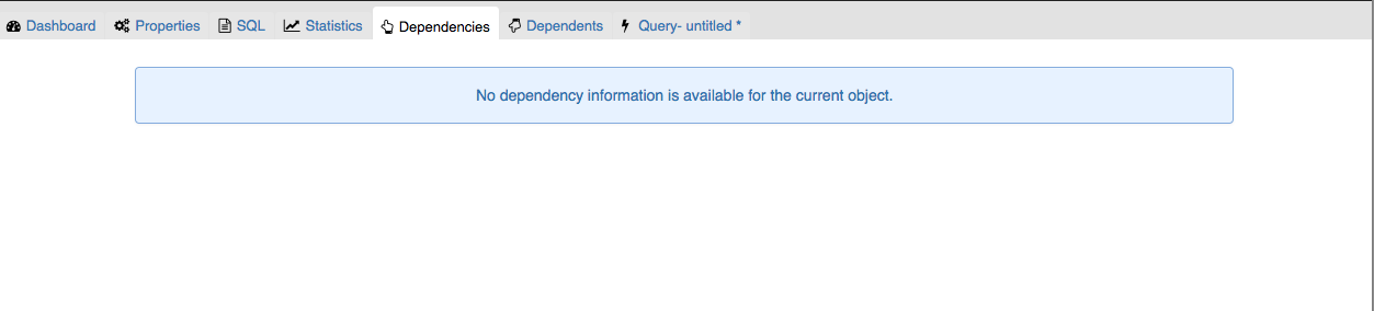
Screen Shot 2017-04-21 at 12.14.55 PM.png

Highlight in dropdown menu
Screen Shot 2017-04-21 at 12.19.51 PM.png

Alerts Screen Shot 2017-04-21 at 11.29.11 AM.png
If this is ok, we will add these changes to our backlog as style changes.

Sure.
On Fri, Apr 21, 2017 at 7:36 PM, Shirley Wang <swang@pivotal.io> wrote:
One more thing: there are two very close greens between notifiers and toggle buttons in preferences menus
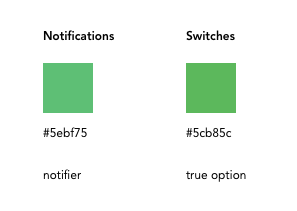
notifications_switches.png


I recommend documenting the green for switches (#5cb85c), which would change notifiers from this:

Notifiers.png

to this:
Screen Shot 2017-04-20 at 5.28.55 PM.png


Wouldn't it be better if it matched the (possibly-recoloured-by-us) Bootstrap alert-success class? I agree that it's silly having two closely matched colours, but I think it makes more sense to have the alerts and notifiers match, than to match the switches. 


Do you mean this?
Screen Shot 2017-04-25 at 9.46.03 AM.png

If so, ok! If there's no good reason to keep the same colors, we should switch. 
Attachment

pgadmin-hackers by date:

Previous
From: Akshay Joshi
Date:
Subject: Re: [pgadmin-hackers] [pgAdmin4][PATCH] To fix the issue of defaultparameters ordering in Functions
Next
From: Dave Page
Date:
Subject: Re: [pgadmin-hackers] [Design update] Style guide for pgAdmin4