Yes. Also, I recognize it's probably not the best tool, given that there's a 30 day free trial and then you need to purchase a license. I'm looking into other programs that are free.
FYI, we use LucidCharts internally. It's a pretty good Google Apps integrated version of Microsoft Visio.
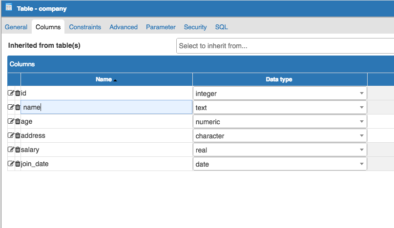
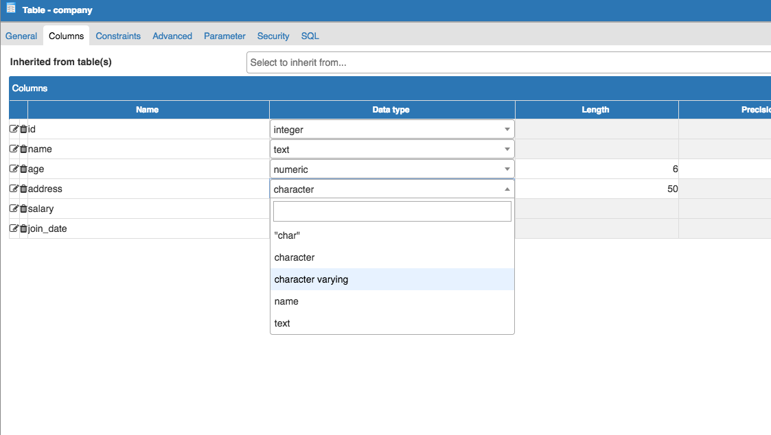
Ah ok. Do you have any files related to pgAdmin you can share (or put into Google drive folder)?
Nothing of any relevance now.
Some initial thoughts on the inventory:
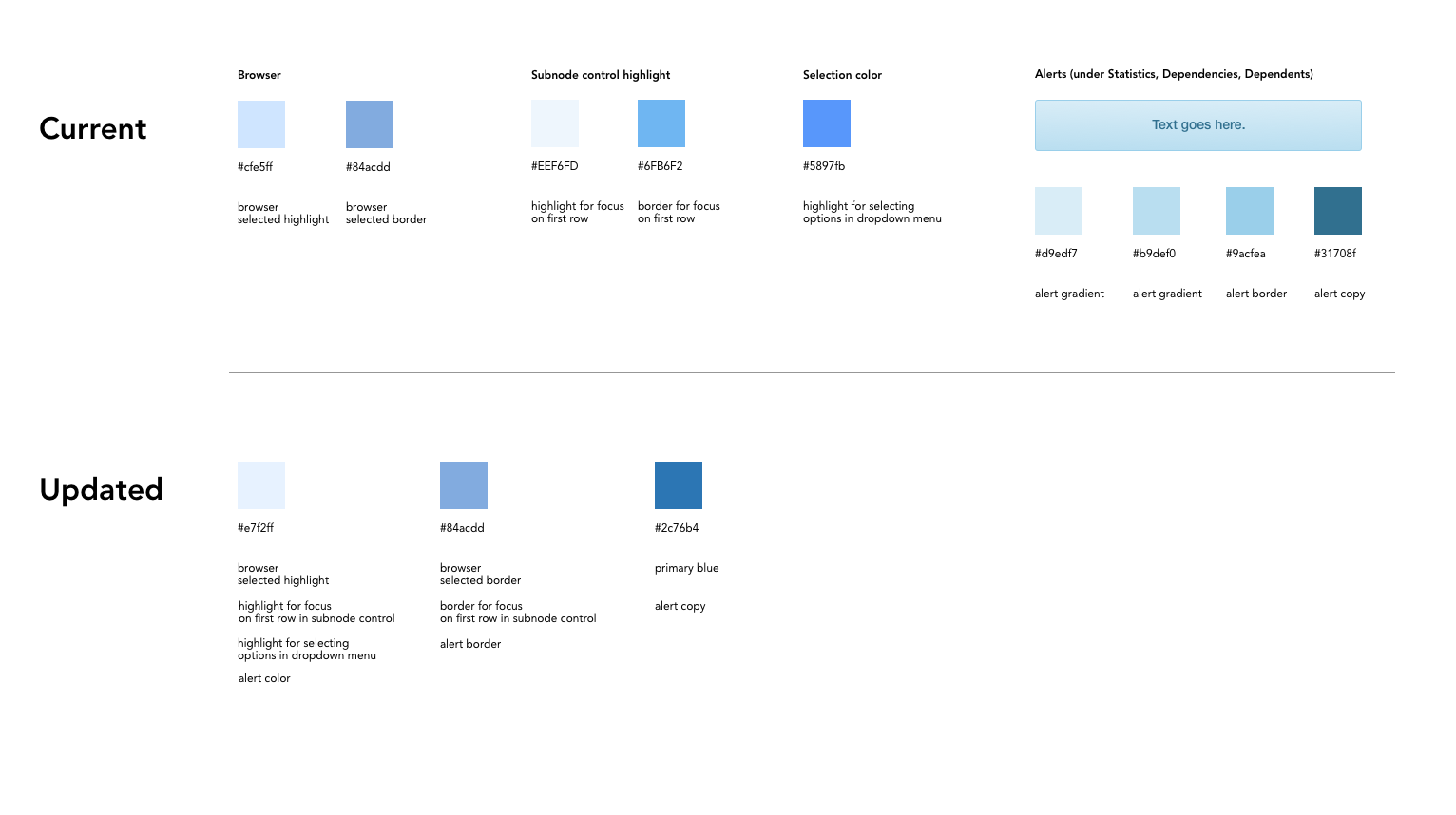
- Wow, that's a lot of colours. I didn't realise we had so many. I think we need to work that down to a set of a dozen or less primary colours.
Me neither! I'm not so concerned with the number of different colors, but with the number of similar shades of each color.
I can distill those down and send another email shortly.
- I wouldn't worry about the button colour borders and gradients too much. Those are standard bootstrap colours, so we should document them in terms of bootstrap styles, not colour components.
Ok. But are they appropriate for this app?
Personally I think they're fine.
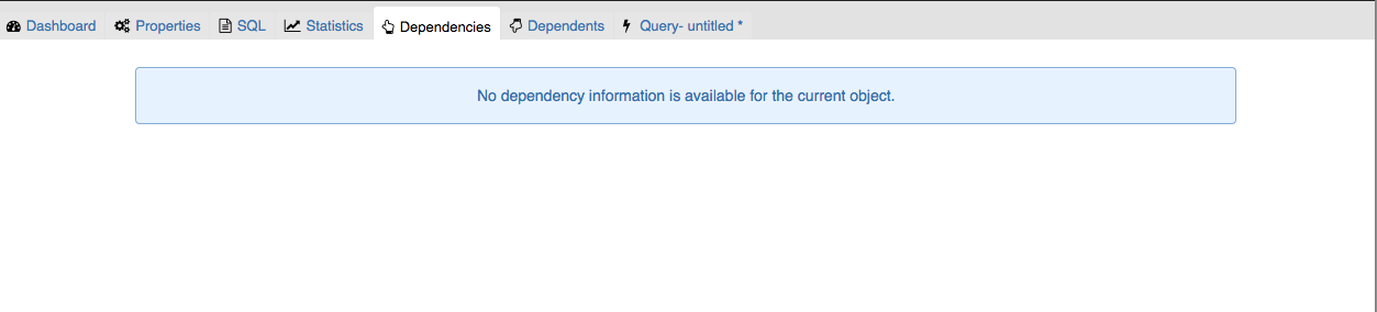
They seem ok for buttons (cancel, save, reset, toolbar). I found the gradient is also on alerts when you click Dependencies, Dependents while selecting Server in the browser.
I think those alerts should not have a gradient to match with the other types of alerts (notifiers and error messages). Since these specific alerts are not success / fail messages, the blue works because it's a neutral color.
They're also bootstrap standards. No problem changing them as far as I'm concerned (though - the entire set should be overridden, in case people use them in the future): http://getbootstrap.com/components/#alerts.
Here is what the updated colors would look like in the app.
Focus on text field in nodes
Browser
Highlight in dropdown menu
Alerts
If this is ok, we will add these changes to our backlog as style changes.