On Tue, May 2, 2017 at 8:47 PM, Shirley Wang <swang@pivotal.io> wrote:
Hello!
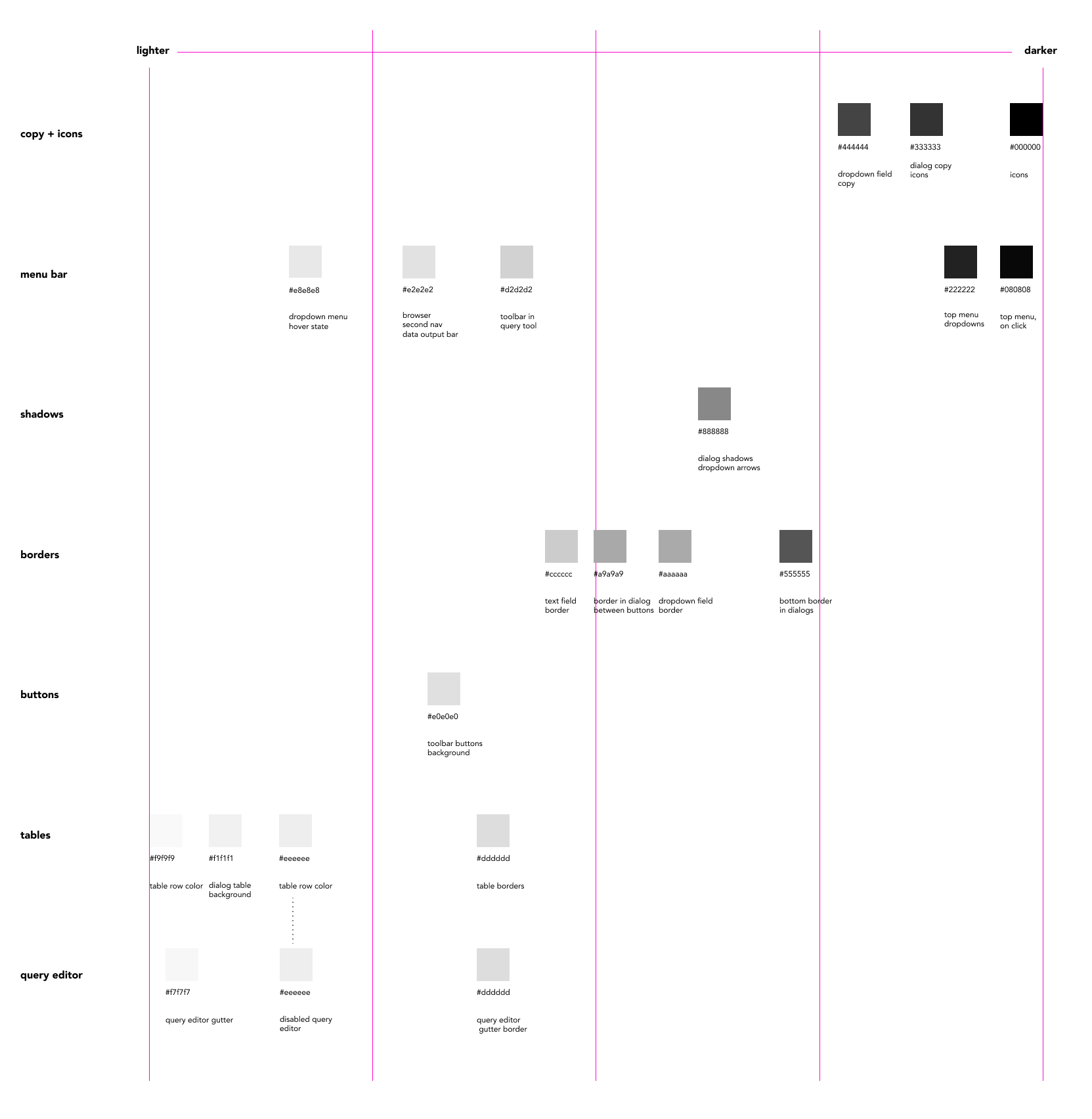
Update on colors
As of now, there are several greys are very similar, used across multiple areas of pgAdmin with no overlaps on color.
Here are the greys organized by scale, with the narrowed down greys underneath:
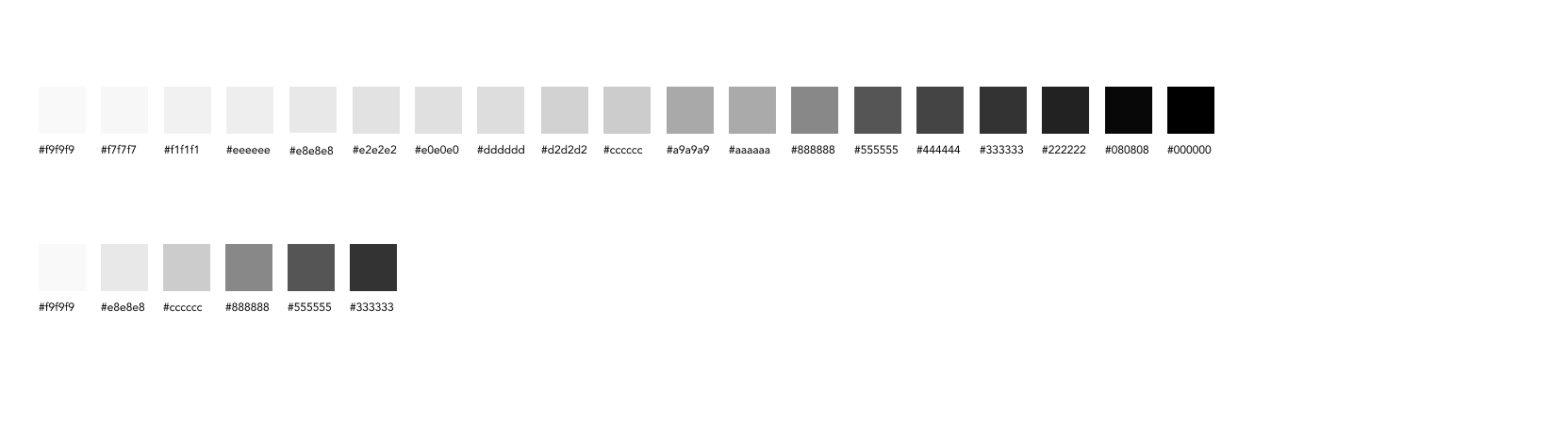
The palette of 6 greys is flexible enough to be used across all the areas within pgAdmin, and easier to map consistency.
OK.
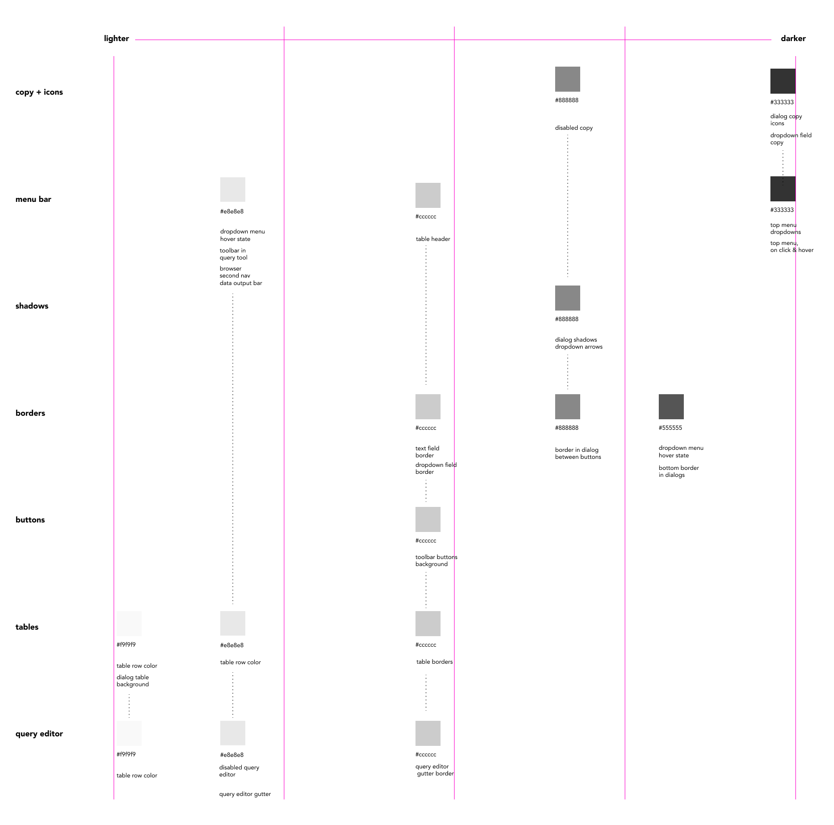
Here's what it looks like with the 6 greys
Dropdown menus
Change from having white hover to dark grey, keeps text color the same
That looks fine to me.
Query tool
I *really* don't like the dark gray on the grid header - it's too imposing and grabs the eye away from the data. How would it look if we used the lighter gray that is seen on the row headers (the first column)? Looking at Excel, it uses the same colour for both the row and the column headers, though it's more like the bluish colour we're using for alternate rows (not that we should use that - see below).
I think some interesting things with color contrast are introduced once we look at the uneditable query editor as accessed through 'View all Data'.
I'm not overly convinced about the gray used for the codemirror gutter. It looks a little blue. Regarding the inactive edit area, I don't think that looks wrong (unlike one of the earlier drafts where the info bar was the same colour). However, I'm not against changing it.
We can address this either by changing the greys in the results table, or changing the grey in the query editor. As of now, I think changing the query editor grey might work better to make sure that when columns are selected in the 'Data Output' panel, they stand out with the blue.
If we lighten the editor table and fade out the text in the editor, it would look like this:
I could live with that (assuming the loss of focus/definition is an artefact of the mockup).
So to summarise:
- I'm happy to see the number of grays reduced as proposed.
- I don't like the dark gray column headers.
- I think the column and row headers should be the same colour.
- I think we should review the bluish-gray used for the codemirror gutter (though, it looks fine for the alternate rows)
- We should use a light-gray for the disabled codemirror, with slightly faded text.