Thread: Looking for table design interface advice for pgAdmin Database Designer
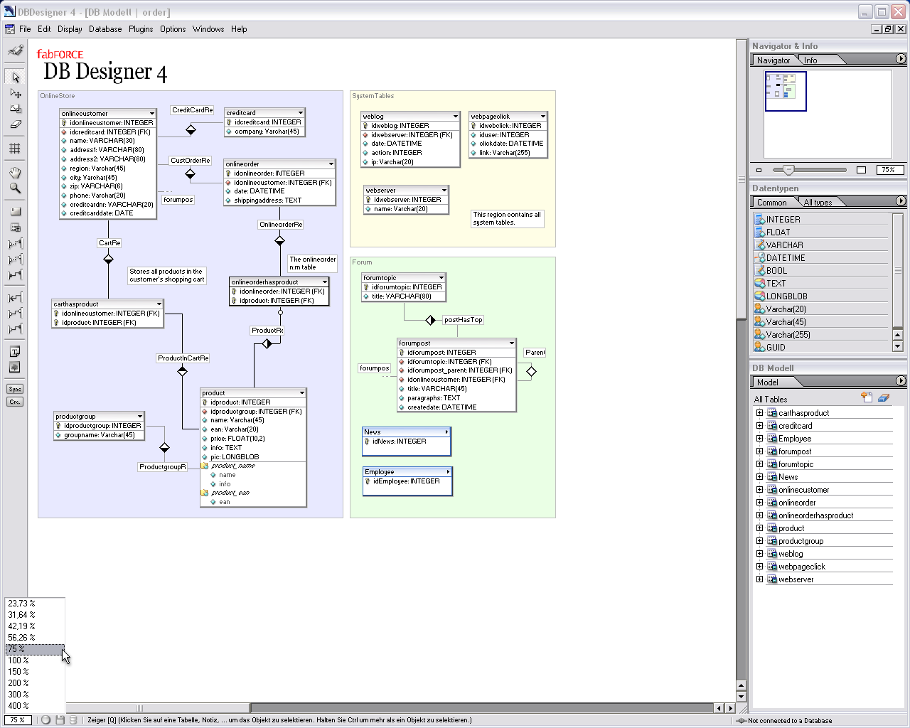
Hi, I'm just working right now at Database Designer for pgAdmin with the GSoC, and I want to create a table user interface that will be simple, easy to use, and more keyboardless possible, right now my proposal is with two designs that you can see at this image:
http://a.imageshack.us/img707/8048/tableinterface.png
Symbols explanation:
+ Add a Column or index
- Remove a Column or index, you click this simbol and then click the column (Table should show in a very clear way that it's in delete mode, for example by change in some way their border and writing below table in clear red letters : TABLE IN DELETE COLUMN MODE or something like that), then user confirm if delete or not column.
I-
-| Create Join Symbol, allow you to create a join relatioship between two tables by dragging from this table (Fk source) to destination table, or just click (just dragging is implemented right now) this symbol and then click destination table and the join is created.
X Remove table
_ Hide all except table title
^ and v Hide and show below part of table.
* Not Null Column
o Null Column
F Foreign Key
U Unique Key
Key Image (primary Key)
Notes (Some are ideas, some are implemented yet):
- You can change column name just by double click at column, there you can put your custom datatype by typing name : datatype or after you type just name without ":" you can do right click and select datatype from popup menu
- You can add and remove columns, and create joins using a popup right click menu too on a table.
Current state of designer can be follow by twitter:
Here is a little youtube video: http://is.gd/dnqA4
All ideas are welcome, and main idea of this post is to ask before code and lost less time and effort possible
Thanks in advance.
Regards, Luis.
On 14 July 2010 16:38, Luis Ochoa <ziul1979@gmail.com> wrote:
> Hi, I'm just working right now at Database Designer for pgAdmin with the
> GSoC, and I want to create a table user interface that will be simple, easy
> to use, and more keyboardless possible, right now my proposal is with two
> designs that you can see at this image:
>
> http://a.imageshack.us/img707/8048/tableinterface.png
>
>
> Symbols explanation:
>
> +   Add a Column or index
>
> -    Remove a Column or index, you click this simbol and then click the
> column (Table should show in a very clear way that it's in delete mode, for
> example by change in some way their border and writing below table in clear
> red letters : TABLE IN DELETE COLUMN MODE or something like that), then user
> confirm if delete or not column.
>
> I-
>   -|   Create Join Symbol, allow   you to create a join relatioship between
> two tables by dragging from this table (Fk source) to destination table, or
> just click (just dragging is implemented right now) this symbol and then
> click destination table and the join is created.
>
> X  Remove table
>
> _  Hide all except table title
>
> ^ and v    Hide and show below part of table.
>
> *   Not Null Column
> o  Null Column
>
> F  Foreign Key
>
> U Unique Key
>
> Key Image  (primary Key)
>
>
> Notes (Some are ideas, some are implemented yet):
>
> - You can change column name just by double click at column, there you can
> put your custom datatype by typing name : datatype or after you type just
> name without ":" you can do right click and select datatype from popup menu
>
> - You can add and remove columns, and create joins using a popup right click
> menu too on a table.
>
> Current state of designer can be follow by twitter:
> Here is a little youtube video: http://is.gd/dnqA4
>
> All ideas are welcome, and main idea of this post is to ask before code and
> lost less time and effort possible
>
> Thanks in advance.
>
> Regards, Luis.
>

Thanks for working on this.

I'm wondering if it might be better if there wasn't a type selected
automatically for a column so that the user doesn't accidently leave
it and forget to change it.

Also, could the data types line up so it's easier to read?  I know
it's still under development, but clickable elements should probably
be bigger and clearer to reduce the chance of clicking on the wrong
thing.  And anything the user has to squint at to see (like the F for
foreign key and U for unique constraint) would be a problem.

And tooltips for everything?  Many of those icons could be seen as cryptic.

Regarding the joins, will there be a clear indicator as to which
column is linking to which?

Would tables be renamable?

And what's your Twitter handle?  I don't see it above. :)

Keep up the good work.

Thom
Re: Looking for table design interface advice for pgAdmin Database Designer
From
Guillaume Lelarge
Date:
Le 14/07/2010 17:38, Luis Ochoa a écrit :
> Hi, I'm just working right now at Database Designer for pgAdmin with the
> GSoC, and I want to create a table user interface that will be simple,
> easy to use, and more keyboardless possible, right now my proposal is
> with two designs that you can see at this image:
>
> http://a.imageshack.us/img707/8048/tableinterface.png
>

I prefer the one on the right. It seems clearer to me.

I see that you took the primary key icon from the one we use. You should
do the same for the unique and foreign key constraints.

And you already got my comment for the video :)


--
Guillaume
 http://www.postgresql.fr
 http://dalibo.com
Re: Looking for table design interface advice for pgAdmin Database Designer
From
Guillaume Lelarge
Date:
Le 14/07/2010 17:56, Thom Brown a écrit :
> On 14 July 2010 16:38, Luis Ochoa <ziul1979@gmail.com> wrote:
>> Hi, I'm just working right now at Database Designer for pgAdmin with the
>> GSoC, and I want to create a table user interface that will be simple, easy
>> to use, and more keyboardless possible, right now my proposal is with two
>> designs that you can see at this image:
>>
>> http://a.imageshack.us/img707/8048/tableinterface.png
>>
>>
>> Symbols explanation:
>>
>> +   Add a Column or index
>>
>> -    Remove a Column or index, you click this simbol and then click the
>> column (Table should show in a very clear way that it's in delete mode, for
>> example by change in some way their border and writing below table in clear
>> red letters : TABLE IN DELETE COLUMN MODE or something like that), then user
>> confirm if delete or not column.
>>
>> I-
>>   -|   Create Join Symbol, allow   you to create a join relatioship between
>> two tables by dragging from this table (Fk source) to destination table, or
>> just click (just dragging is implemented right now) this symbol and then
>> click destination table and the join is created.
>>
>> X  Remove table
>>
>> _  Hide all except table title
>>
>> ^ and v    Hide and show below part of table.
>>
>> *   Not Null Column
>> o  Null Column
>>
>> F  Foreign Key
>>
>> U Unique Key
>>
>> Key Image  (primary Key)
>>
>>
>> Notes (Some are ideas, some are implemented yet):
>>
>> - You can change column name just by double click at column, there you can
>> put your custom datatype by typing name : datatype or after you type just
>> name without ":" you can do right click and select datatype from popup menu
>>
>> - You can add and remove columns, and create joins using a popup right click
>> menu too on a table.
>>
>> Current state of designer can be follow by twitter:
>> Here is a little youtube video: http://is.gd/dnqA4
>>
>> All ideas are welcome, and main idea of this post is to ask before code and
>> lost less time and effort possible
>>
>> Thanks in advance.
>>
>> Regards, Luis.
>>
>
> Thanks for working on this.
>
> I'm wondering if it might be better if there wasn't a type selected
> automatically for a column so that the user doesn't accidently leave
> it and forget to change it.
>

Yeah, I also think so. And there's a good chance people won't be happy
with our default choice for the datatype. So, it's better not to have one.

> Also, could the data types line up so it's easier to read?  I know
> it's still under development, but clickable elements should probably
> be bigger and clearer to reduce the chance of clicking on the wrong
> thing.  And anything the user has to squint at to see (like the F for
> foreign key and U for unique constraint) would be a problem.
>
> And tooltips for everything?  Many of those icons could be seen as cryptic.
>
> Regarding the joins, will there be a clear indicator as to which
> column is linking to which?
>
> Would tables be renamable?
>

+1 for the four comments.

> And what's your Twitter handle?  I don't see it above. :)
>

http://twitter.com/xiul/

> Keep up the good work.
>

+1 :)


--
Guillaume
 http://www.postgresql.fr
 http://dalibo.com
On Wed, Jul 14, 2010 at 5:46 PM, Guillaume Lelarge <guillaume@lelarge.info> wrote:
That's a good point, and will be fixed soon.
I'm not sure about line up data types you can see other modeller like this:
http://www.fabforce.net/dbdesigner4/images/ss/dbd4_ss_simplemodel.png
and in fact they align at left table's columns. Probably line up datatypes won't get a better reading, because columns sizes differences, for example:
id : integer
cmpy_emp_first_name_id : integer
id2 : integer
id 3 : integer
cmpy_emp_last_name_of_external_boss_id : integer
id 5 : integer
I'm not sure if clickable elements should be bigger that their current size (8x8), at first time I defined then like 16x16 but the look weird, but well this can be tested & changed if needed later :) but as a comment: when you past over handles elements like the +, - and join, the mouse over action, can change the mouse pointer, right now I don't do that but later I'm going to do that.
Right F and U where only temporary solutions, but I think that Guillaume comment about using standard icons of pgAdmin is the best way of create consistency at user interface between database designer and others parts of pgAdmin.
Yes I think about tooltips, and I'm going to add them in a future
my idea for joins is this: When you select a join, columns from source table (always primary of that table) will change their color to the same color of the join when is selected, and then destination table column (foreign keys to that primary keys) will change too theri color.
Yes *1. ;)
*1 Some restrictions apply, if table is just in modeler (not implemented yet) it can be done, or if table accomplish with all requirements to be rename, it can be done too. Just remember if a table name is changed, is changed at modeler level, when you commit changes, modeler try to rename it, if not possible some kind of warning is raised and table name remains as started. +1 for the four comments.
Le 14/07/2010 17:56, Thom Brown a écrit :> On 14 July 2010 16:38, Luis Ochoa <ziul1979@gmail.com> wrote:
...
>> Regards, Luis.
>>
>
> Thanks for working on this.
>
> I'm wondering if it might be better if there wasn't a type selected
> automatically for a column so that the user doesn't accidently leave
> it and forget to change it.
Yeah, I also think so. And there's a good chance people won't be happy
with our default choice for the datatype. So, it's better not to have one.
That's a good point, and will be fixed soon.
> Also, could the data types line up so it's easier to read?
I know
I'm not sure about line up data types you can see other modeller like this:
http://www.fabforce.net/dbdesigner4/images/ss/dbd4_ss_simplemodel.png
and in fact they align at left table's columns. Probably line up datatypes won't get a better reading, because columns sizes differences, for example:
id : integer
cmpy_emp_first_name_id : integer
id2 : integer
id 3 : integer
cmpy_emp_last_name_of_external_boss_id : integer
id 5 : integer
> it's still under development, but clickable elements should probably
> be bigger and clearer to reduce the chance of clicking on the wrong
> thing.
I'm not sure if clickable elements should be bigger that their current size (8x8), at first time I defined then like 16x16 but the look weird, but well this can be tested & changed if needed later :) but as a comment: when you past over handles elements like the +, - and join, the mouse over action, can change the mouse pointer, right now I don't do that but later I'm going to do that.
And anything the user has to squint at to see (like the F for
> foreign key and U for unique constraint) would be a problem.
>
Right F and U where only temporary solutions, but I think that Guillaume comment about using standard icons of pgAdmin is the best way of create consistency at user interface between database designer and others parts of pgAdmin.
> And tooltips for everything? Many of those icons could be seen as cryptic.
>
Yes I think about tooltips, and I'm going to add them in a future
> Regarding the joins, will there be a clear indicator as to which
> column is linking to which?
my idea for joins is this: When you select a join, columns from source table (always primary of that table) will change their color to the same color of the join when is selected, and then destination table column (foreign keys to that primary keys) will change too theri color.
> Would tables be renamable?
>
Yes *1. ;)
*1 Some restrictions apply, if table is just in modeler (not implemented yet) it can be done, or if table accomplish with all requirements to be rename, it can be done too. Just remember if a table name is changed, is changed at modeler level, when you commit changes, modeler try to rename it, if not possible some kind of warning is raised and table name remains as started. +1 for the four comments.
> And what's your Twitter handle? I don't see it above. :)
>
Thanks for your comments.
Regards, Luis.
On 15 July 2010 16:10, Luis Ochoa <ziul1979@gmail.com> wrote:
> On Wed, Jul 14, 2010 at 5:46 PM, Guillaume Lelarge <guillaume@lelarge.info>
> wrote:
>>
>> Le 14/07/2010 17:56, Thom Brown a écrit :
>> > On 14 July 2010 16:38, Luis Ochoa <ziul1979@gmail.com> wrote:
>> ...
>> >> Regards, Luis.
>> >>
>> >
>> > Thanks for working on this.
>> >
>> > I'm wondering if it might be better if there wasn't a type selected
>> > automatically for a column so that the user doesn't accidently leave
>> > it and forget to change it.
>>
>> Yeah, I also think so. And there's a good chance people won't be happy
>> with our default choice for the datatype. So, it's better not to have one.
>
> That's a good point, and will be fixed soon.
>
>>
>>
>>
>> > Also, could the data types line up so it's easier to read?
>>
>>  I know
>
> I'm not sure about line up data types you can see other modeller like this:
>
> http://www.fabforce.net/dbdesigner4/images/ss/dbd4_ss_simplemodel.png
>
> and in fact they align at left table's columns. Probably line up datatypes
> won't get a better reading, because columns sizes differences, for example:
>
> id                                                                 :
> integer
> cmpy_emp_first_name_id                              :  integer
> id2                                                               :  integer
> id 3                                                              :  integer
> cmpy_emp_last_name_of_external_boss_id    :  integer
> id 5                                                              :  integer
>

In that case, could they be bold and a different colour too, just to
improve scanability?

>> > it's still under development, but clickable elements should probably
>> > be bigger and clearer to reduce the chance of clicking on the wrong
>> > thing.
>
> I'm not sure if clickable elements should be bigger that their current size
> (8x8), at first time I defined then like 16x16 but the look weird, but well
> this can be tested & changed if needed later :)   but as a comment: when you
> past over handles elements like the +, - and join, the mouse over action,
> can change the mouse pointer, right now I don't do that but later I'm going
> to do that.
>
>>
>> And anything the user has to squint at to see (like the F for
>> > foreign key and U for unique constraint) would be a problem.
>> >
>
> Right F and U where only temporary solutions, but I think that Guillaume
> comment about using standard icons of pgAdmin is the best way of create
> consistency at user interface between database designer and others parts of
> pgAdmin.
>
>>
>> > And tooltips for everything?  Many of those icons could be seen as
>> > cryptic.
>> >
>
> Yes I think about tooltips, and I'm going to add them in a future
>
>>
>> > Regarding the joins, will there be a clear indicator as to which
>> > column is linking to which?
>
> my idea for joins is this: When you select a join, columns from source table
> (always primary of that table) will change their color to the same color of
> the join  when is selected, and then destination table column (foreign keys
> to that primary keys) will change too theri color.

I like that idea, although it would also be worth thinking about
people who are colour-blind when designing this if you can too.

>
>>
>> > Would tables be renamable?
>> >
>
> Yes *1.  ;)
>
> *1 Some restrictions apply, if table is just in modeler (not implemented
> yet) it can be done, or if table accomplish with all requirements to be
> rename, it can be done too. Just remember if a table name is changed, is
> changed at modeler level, when you commit changes, modeler try to rename it,
> if not possible some kind of warning is raised and table name remains as
> started. +1 for the four comments.
>
>>
>> > And what's your Twitter handle?  I don't see it above. :)
>> >
>
> Sorry for that :$  but it was fixed yet by Guillaume (thanks)
>  http://twitter.com/xiul/
>>
>
> Thanks for your comments.
> Regards, Luis.
>

Thanks

Thom
In that case, could they be bold and a different colour too, just to> I'm not sure about line up data types you can see other modeller like this:
>
> http://www.fabforce.net/dbdesigner4/images/ss/dbd4_ss_simplemodel.png
>
> and in fact they align at left table's columns. Probably line up datatypes
> won't get a better reading, because columns sizes differences, for example:
>
> id :
> integer
> cmpy_emp_first_name_id : integer
> id2 : integer
> id 3 : integer
> cmpy_emp_last_name_of_external_boss_id : integer
> id 5 : integer
>
improve scanability?
it can be a good idea, I'm going to test it after finish other things.
>I like that idea, although it would also be worth thinking about
> my idea for joins is this: When you select a join, columns from source table
> (always primary of that table) will change their color to the same color of
> the join when is selected, and then destination table column (foreign keys
> to that primary keys) will change too theri color.
people who are colour-blind when designing this if you can too.
Oh a good point, then I'm going change color & use bold fonts for fk columns and add some width to join line when selected.
Any ideas or suggestions are welcome.
Regards, Luis.
Attachment
Re: Looking for table design interface advice for pgAdmin Database Designer
From
Guillaume Lelarge
Date:
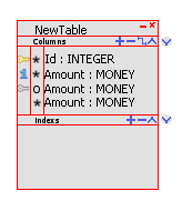
Le 23/07/2010 17:24, Luis Ochoa a écrit :
>> [...]
>> In that case, could they be bold and a different colour too, just to
>> improve scanability?
>>
>
> it can be a good idea, I'm going to test it after finish other things.
>

+1

>>  >
>>> my idea for joins is this: When you select a join, columns from source
>> table
>>> (always primary of that table) will change their color to the same color
>> of
>>> the join  when is selected, and then destination table column (foreign
>> keys
>>> to that primary keys) will change too theri color.
>>
>> I like that idea, although it would also be worth thinking about
>> people who are colour-blind when designing this if you can too.
>>
>>
> Oh a good point, then I'm going change color & use bold fonts for fk columns
> and add some width to join line when selected.
>
> Thanks for your ideas, right now I'm sending a new image of my proposal
> table figure interface for evaluation.  This is a concept donde using Gimp
> (but almost finished at source code too),  time I use same pgAdmin figures
> but I didn't find a figure for pk,fk columns (with hierarchy), any
> suggestions for this icon?  I used *  & O as not null and null symbols as in
> GQB.
>

The image seems fine to me. But that's still a lot of work to do. On
your repo, we can't add table, which really is a missing. The UI to
change a column's name and the one to change its type is not that good.
Can't you show a dialog? they could be really simple one. One with a
textbox and two buttons to rename an object (table, column, and FK), and
one with a combobox and two buttons to select the column's type. That
would be way better than what we already have.

BTW, you probably forgot to "git add" ddforeignkey.xpm,
ddprimarykey.xpm, and ddunique.xpm on your repo. Other than that, I'm
able to compile it on windows and to work a bit on it.


--
Guillaume
 http://www.postgresql.fr
 http://dalibo.com