Thread: Tree view icon samples
Attachment
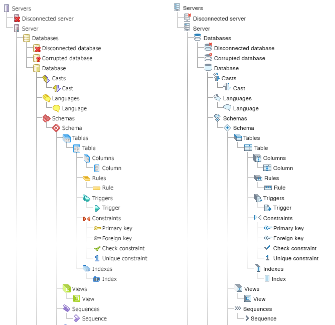
Hi

> On 28 Jun 2017, at 12:41, Chethana Kumar <chethana.kumar@enterprisedb.com> wrote:
>
> Hi Team,
>
> I am coming up with some sample icons for Tree View Control.
>
> Thought process behind the concept -
>
> 1. Included EDB color brand feel (gray and blue colors)

You mean pgAdmin colour brand :-). EDB is orange & black.

> 2. Eliminated the distraction of too many colors and provided consistency through the icons
> 3. User will recognize the icon shapes rather than recalling it by their colors (like in existing icons) so focused
moreon shapes
> 4. It also adds value to the brand since it has EDB color tones in it
>
>
> So please feel free to share your views on the same

I like them - they look much more modern and stylish, but still fit with what they represent.

Other opinions please?

Good work!
Hi
> On 28 Jun 2017, at 12:41, Chethana Kumar <chethana.kumar@enterprisedb.com> wrote:
>
> Hi Team,
>
> I am coming up with some sample icons for Tree View Control.
>
> Thought process behind the concept -
>
> 1. Included EDB color brand feel (gray and blue colors)
You mean pgAdmin colour brand :-). EDB is orange & black.
> 2. Eliminated the distraction of too many colors and provided consistency through the icons
> 3. User will recognize the icon shapes rather than recalling it by their colors (like in existing icons) so focused more on shapes
> 4. It also adds value to the brand since it has EDB color tones in it
>
>
> So please feel free to share your views on the same
I like them - they look much more modern and stylish, but still fit with what they represent.
Other opinions please?
Good work!
I like them as well. The only comment I have is that the red icon on disconnected DB and corrupted DB are difficult to make out. They are clearly differentiable but the icon itself is unclear.
-- RobOn Wed, Jun 28, 2017 at 12:49 PM, Dave Page <dpage@pgadmin.org> wrote:Hi
> On 28 Jun 2017, at 12:41, Chethana Kumar <chethana.kumar@enterprisedb.com> wrote:
>
> Hi Team,
>
> I am coming up with some sample icons for Tree View Control.
>
> Thought process behind the concept -
>
> 1. Included EDB color brand feel (gray and blue colors)
You mean pgAdmin colour brand :-). EDB is orange & black.
> 2. Eliminated the distraction of too many colors and provided consistency through the icons
> 3. User will recognize the icon shapes rather than recalling it by their colors (like in existing icons) so focused more on shapes
> 4. It also adds value to the brand since it has EDB color tones in it
>
>
> So please feel free to share your views on the same
I like them - they look much more modern and stylish, but still fit with what they represent.
Other opinions please?
Good work!
I recommend using Sim Daltonism to test colors!
Excellent idea - Chethana, please grab a copy and verify that all icons are distinct when tested for different types of colour blindness.
Blog: http://pgsnake.blogspot.com
Twitter: @pgsnake
EnterpriseDB UK: http://www.enterprisedb.com
The Enterprise PostgreSQL Company
I like them as well. The only comment I have is that the red icon on disconnected DB and corrupted DB are difficult to make out. They are clearly differentiable but the icon itself is unclear.-- RobOn Wed, Jun 28, 2017 at 12:49 PM, Dave Page <dpage@pgadmin.org> wrote:Hi
> On 28 Jun 2017, at 12:41, Chethana Kumar <chethana.kumar@enterprisedb.com> wrote:
>
> Hi Team,
>
> I am coming up with some sample icons for Tree View Control.
>
> Thought process behind the concept -
>
> 1. Included EDB color brand feel (gray and blue colors)
You mean pgAdmin colour brand :-). EDB is orange & black.
> 2. Eliminated the distraction of too many colors and provided consistency through the icons
> 3. User will recognize the icon shapes rather than recalling it by their colors (like in existing icons) so focused more on shapes
> 4. It also adds value to the brand since it has EDB color tones in it
>
>
> So please feel free to share your views on the same
I like them - they look much more modern and stylish, but still fit with what they represent.
Other opinions please?
Good work!
Attachment
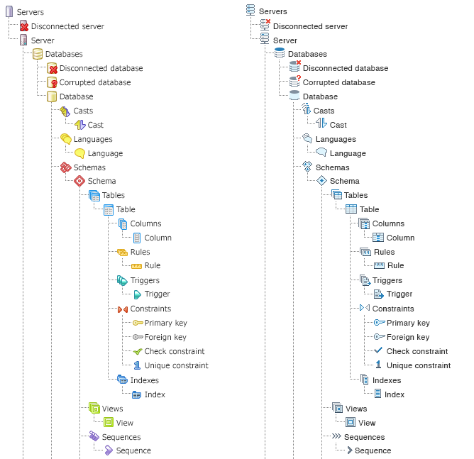
Hi Robert,Please check the icons of Database Disconnected and Database Corrupted, just let me know if still can't be able to differentiate between themselves.Regards,Chethana kumar--On Wed, Jun 28, 2017 at 10:32 PM, Robert Eckhardt <reckhardt@pivotal.io> wrote:I like them as well. The only comment I have is that the red icon on disconnected DB and corrupted DB are difficult to make out. They are clearly differentiable but the icon itself is unclear.-- RobOn Wed, Jun 28, 2017 at 12:49 PM, Dave Page <dpage@pgadmin.org> wrote:Hi
> On 28 Jun 2017, at 12:41, Chethana Kumar <chethana.kumar@enterprisedb.com> wrote:
>
> Hi Team,
>
> I am coming up with some sample icons for Tree View Control.
>
> Thought process behind the concept -
>
> 1. Included EDB color brand feel (gray and blue colors)
You mean pgAdmin colour brand :-). EDB is orange & black.
> 2. Eliminated the distraction of too many colors and provided consistency through the icons
> 3. User will recognize the icon shapes rather than recalling it by their colors (like in existing icons) so focused more on shapes
> 4. It also adds value to the brand since it has EDB color tones in it
>
>
> So please feel free to share your views on the same
I like them - they look much more modern and stylish, but still fit with what they represent.
Other opinions please?
Good work!Chethana KumarPrincipal UI/UX DesignerEnterpriseDB CorporationThe Postgres Database Company
On Wed, Jun 28, 2017 at 3:48 PM, Shirley Wang <swang@pivotal.io> wrote:I recommend using Sim Daltonism to test colors!
Excellent idea - Chethana, please grab a copy and verify that all icons are distinct when tested for different types of colour blindness.Thanks!--Dave Page
Blog: http://pgsnake.blogspot.com
Twitter: @pgsnake
EnterpriseDB UK: http://www.enterprisedb.com
The Enterprise PostgreSQL Company
On Jun 28, 2017 22:32, "Robert Eckhardt" <reckhardt@pivotal.io> wrote:I like them as well. The only comment I have is that the red icon on disconnected DB and corrupted DB are difficult to make out. They are clearly differentiable but the icon itself is unclear.A colour blind person may not be able to differentiate the primary & foreign key icons.-- Ashesh-- RobOn Wed, Jun 28, 2017 at 12:49 PM, Dave Page <dpage@pgadmin.org> wrote:Hi
> On 28 Jun 2017, at 12:41, Chethana Kumar <chethana.kumar@enterprisedb.com> wrote:
>
> Hi Team,
>
> I am coming up with some sample icons for Tree View Control.
>
> Thought process behind the concept -
>
> 1. Included EDB color brand feel (gray and blue colors)
You mean pgAdmin colour brand :-). EDB is orange & black.
> 2. Eliminated the distraction of too many colors and provided consistency through the icons
> 3. User will recognize the icon shapes rather than recalling it by their colors (like in existing icons) so focused more on shapes
> 4. It also adds value to the brand since it has EDB color tones in it
>
>
> So please feel free to share your views on the same
I like them - they look much more modern and stylish, but still fit with what they represent.
Other opinions please?
Good work!
Attachment
Hi Ashesh,I tried to eliminate the colour blind issue which might occur with the primary & foregin key icons.But still I will use the app to test the colors, just let me know your opinion now.
Regards,Chethana kumar--On Wed, Jun 28, 2017 at 11:13 PM, Ashesh Vashi <ashesh.vashi@enterprisedb.com> wrote: On Jun 28, 2017 22:32, "Robert Eckhardt" <reckhardt@pivotal.io> wrote:I like them as well. The only comment I have is that the red icon on disconnected DB and corrupted DB are difficult to make out. They are clearly differentiable but the icon itself is unclear.A colour blind person may not be able to differentiate the primary & foreign key icons.-- Ashesh-- RobOn Wed, Jun 28, 2017 at 12:49 PM, Dave Page <dpage@pgadmin.org> wrote:Hi
> On 28 Jun 2017, at 12:41, Chethana Kumar <chethana.kumar@enterprisedb.com> wrote:
>
> Hi Team,
>
> I am coming up with some sample icons for Tree View Control.
>
> Thought process behind the concept -
>
> 1. Included EDB color brand feel (gray and blue colors)
You mean pgAdmin colour brand :-). EDB is orange & black.
> 2. Eliminated the distraction of too many colors and provided consistency through the icons
> 3. User will recognize the icon shapes rather than recalling it by their colors (like in existing icons) so focused more on shapes
> 4. It also adds value to the brand since it has EDB color tones in it
>
>
> So please feel free to share your views on the same
I like them - they look much more modern and stylish, but still fit with what they represent.
Other opinions please?
Good work!Chethana KumarPrincipal UI/UX DesignerEnterpriseDB CorporationThe Postgres Database CompanyP: +91 86981 57146
On Wednesday, June 28, 2017, Chethana Kumar <chethana.kumar@enterprisedb.com> wrote:
Hi Shirley,I tried installing the app from itunes but it seems like my account is expired and needs payment to be done for re-activation of it. So can anybody please share your account credentials just to install this application for color blind testing.
Or do I have any other way to install the app, please suggest.Thanks and Regards,Chethana kumarOn Thu, Jun 29, 2017 at 6:05 AM, Dave Page <dpage@pgadmin.org> wrote:On Wed, Jun 28, 2017 at 3:48 PM, Shirley Wang <swang@pivotal.io> wrote:I recommend using Sim Daltonism to test colors!
Excellent idea - Chethana, please grab a copy and verify that all icons are distinct when tested for different types of colour blindness.Thanks!--Dave Page
Blog: http://pgsnake.blogspot.com
Twitter: @pgsnake
EnterpriseDB UK: http://www.enterprisedb.com
The Enterprise PostgreSQL Company--Chethana KumarPrincipal UI/UX DesignerEnterpriseDB CorporationThe Postgres Database CompanyP: +91 86981 57146
--
Dave Page
Blog: http://pgsnake.blogspot.com
Twitter: @pgsnake
EnterpriseDB UK: http://www.enterprisedb.com
The Enterprise PostgreSQL Company
On Thu, Jun 29, 2017 at 9:09 AM, Chethana Kumar <chethana.kumar@enterprisedb.com> wrote: Hi Ashesh,I tried to eliminate the colour blind issue which might occur with the primary & foregin key icons.But still I will use the app to test the colors, just let me know your opinion now.Please do.One more point: :-)Icons for some nodes are missing here.i.e. Partition table (introduced in 'Declarative Partition' patch), Materialized View, etc.-- Thanks, AsheshRegards,Chethana kumar--On Wed, Jun 28, 2017 at 11:13 PM, Ashesh Vashi <ashesh.vashi@enterprisedb.com> wrote: On Jun 28, 2017 22:32, "Robert Eckhardt" <reckhardt@pivotal.io> wrote:I like them as well. The only comment I have is that the red icon on disconnected DB and corrupted DB are difficult to make out. They are clearly differentiable but the icon itself is unclear.A colour blind person may not be able to differentiate the primary & foreign key icons.-- Ashesh-- RobOn Wed, Jun 28, 2017 at 12:49 PM, Dave Page <dpage@pgadmin.org> wrote:Hi
> On 28 Jun 2017, at 12:41, Chethana Kumar <chethana.kumar@enterprisedb.com> wrote:
>
> Hi Team,
>
> I am coming up with some sample icons for Tree View Control.
>
> Thought process behind the concept -
>
> 1. Included EDB color brand feel (gray and blue colors)
You mean pgAdmin colour brand :-). EDB is orange & black.
> 2. Eliminated the distraction of too many colors and provided consistency through the icons
> 3. User will recognize the icon shapes rather than recalling it by their colors (like in existing icons) so focused more on shapes
> 4. It also adds value to the brand since it has EDB color tones in it
>
>
> So please feel free to share your views on the same
I like them - they look much more modern and stylish, but still fit with what they represent.
Other opinions please?
Good work!Chethana KumarPrincipal UI/UX DesignerEnterpriseDB CorporationThe Postgres Database CompanyP: +91 86981 57146
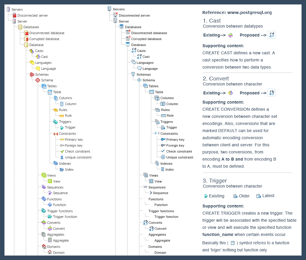
Hello Team,Below are the updates for TreeView Icons -1. Fine tuned the icons - Database, Language, Primary and Foreign key, Unique Constraint2. Designed new concept for - Casts and Converts, Trigger3. Attached the color blind test result for "Primary and Foreign key", now I feel it is pretty evident to differentiate for blind user4. Attached "thought_process.png" where I have explained the thought process for newly proposed icons (referred:www.postgresql.org)5. Added little depth to all icons to provide the Afforance of ClickOn Thu, Jun 29, 2017 at 10:21 AM, Ashesh Vashi <ashesh.vashi@enterprisedb.com> wrote: On Thu, Jun 29, 2017 at 9:09 AM, Chethana Kumar <chethana.kumar@enterprisedb.com> wrote: Hi Ashesh,I tried to eliminate the colour blind issue which might occur with the primary & foregin key icons.But still I will use the app to test the colors, just let me know your opinion now.Please do.One more point: :-)Icons for some nodes are missing here.i.e. Partition table (introduced in 'Declarative Partition' patch), Materialized View, etc.-- Thanks, AsheshRegards,Chethana kumar--On Wed, Jun 28, 2017 at 11:13 PM, Ashesh Vashi <ashesh.vashi@enterprisedb.com> wrote: On Jun 28, 2017 22:32, "Robert Eckhardt" <reckhardt@pivotal.io> wrote:I like them as well. The only comment I have is that the red icon on disconnected DB and corrupted DB are difficult to make out. They are clearly differentiable but the icon itself is unclear.A colour blind person may not be able to differentiate the primary & foreign key icons.-- Ashesh-- RobOn Wed, Jun 28, 2017 at 12:49 PM, Dave Page <dpage@pgadmin.org> wrote:Hi
> On 28 Jun 2017, at 12:41, Chethana Kumar <chethana.kumar@enterprisedb.com> wrote:
>
> Hi Team,
>
> I am coming up with some sample icons for Tree View Control.
>
> Thought process behind the concept -
>
> 1. Included EDB color brand feel (gray and blue colors)
You mean pgAdmin colour brand :-). EDB is orange & black.
> 2. Eliminated the distraction of too many colors and provided consistency through the icons
> 3. User will recognize the icon shapes rather than recalling it by their colors (like in existing icons) so focused more on shapes
> 4. It also adds value to the brand since it has EDB color tones in it
>
>
> So please feel free to share your views on the same
I like them - they look much more modern and stylish, but still fit with what they represent.
Other opinions please?
Good work!Chethana KumarPrincipal UI/UX DesignerEnterpriseDB CorporationThe Postgres Database CompanyP: +91 86981 57146--Chethana KumarPrincipal UI/UX DesignerEnterpriseDB CorporationThe Postgres Database CompanyP: +91 86981 57146
Attachment
Hi Team, Attachment was missing.On Fri, Jun 30, 2017 at 5:24 PM, Chethana Kumar <chethana.kumar@enterprisedb.com> wrote: Hello Team,Below are the updates for TreeView Icons -1. Fine tuned the icons - Database, Language, Primary and Foreign key, Unique Constraint2. Designed new concept for - Casts and Converts, Trigger3. Attached the color blind test result for "Primary and Foreign key", now I feel it is pretty evident to differentiate for blind user4. Attached "thought_process.png" where I have explained the thought process for newly proposed icons (referred:www.postgresql.org)5. Added little depth to all icons to provide the Afforance of ClickOn Thu, Jun 29, 2017 at 10:21 AM, Ashesh Vashi <ashesh.vashi@enterprisedb.com> wrote: On Thu, Jun 29, 2017 at 9:09 AM, Chethana Kumar <chethana.kumar@enterprisedb.com> wrote: Hi Ashesh,I tried to eliminate the colour blind issue which might occur with the primary & foregin key icons.But still I will use the app to test the colors, just let me know your opinion now.Please do.One more point: :-)Icons for some nodes are missing here.i.e. Partition table (introduced in 'Declarative Partition' patch), Materialized View, etc.-- Thanks, AsheshRegards,Chethana kumar--On Wed, Jun 28, 2017 at 11:13 PM, Ashesh Vashi <ashesh.vashi@enterprisedb.com> wrote: On Jun 28, 2017 22:32, "Robert Eckhardt" <reckhardt@pivotal.io> wrote:I like them as well. The only comment I have is that the red icon on disconnected DB and corrupted DB are difficult to make out. They are clearly differentiable but the icon itself is unclear.A colour blind person may not be able to differentiate the primary & foreign key icons.-- Ashesh-- RobOn Wed, Jun 28, 2017 at 12:49 PM, Dave Page <dpage@pgadmin.org> wrote:Hi
> On 28 Jun 2017, at 12:41, Chethana Kumar <chethana.kumar@enterprisedb.com> wrote:
>
> Hi Team,
>
> I am coming up with some sample icons for Tree View Control.
>
> Thought process behind the concept -
>
> 1. Included EDB color brand feel (gray and blue colors)
You mean pgAdmin colour brand :-). EDB is orange & black.
> 2. Eliminated the distraction of too many colors and provided consistency through the icons
> 3. User will recognize the icon shapes rather than recalling it by their colors (like in existing icons) so focused more on shapes
> 4. It also adds value to the brand since it has EDB color tones in it
>
>
> So please feel free to share your views on the same
I like them - they look much more modern and stylish, but still fit with what they represent.
Other opinions please?
Good work!Chethana KumarPrincipal UI/UX DesignerEnterpriseDB CorporationThe Postgres Database Company--Chethana KumarPrincipal UI/UX DesignerEnterpriseDB CorporationThe Postgres Database Company--Chethana KumarPrincipal UI/UX DesignerEnterpriseDB CorporationThe Postgres Database Company
Blog: http://pgsnake.blogspot.com
Twitter: @pgsnake
EnterpriseDB UK: http://www.enterprisedb.com
The Enterprise PostgreSQL Company
Hi- The Primary Key and Foreign Key icons should have more differentiation than just colour. Maybe add a 1 to Primary Key?- Did you get a list of the other icons that aren't on that sheet yet?- I'm not sure I like the Casts and Conversions icons (mis-spelt as Converts by the previous owner). The text on the makes them seem textual than graphical.Thanks!--On Fri, Jun 30, 2017 at 12:56 PM, Chethana Kumar <chethana.kumar@enterprisedb.com> wrote: Hi Team, Attachment was missing.On Fri, Jun 30, 2017 at 5:24 PM, Chethana Kumar <chethana.kumar@enterprisedb.com> wrote: Hello Team,Below are the updates for TreeView Icons -1. Fine tuned the icons - Database, Language, Primary and Foreign key, Unique Constraint2. Designed new concept for - Casts and Converts, Trigger3. Attached the color blind test result for "Primary and Foreign key", now I feel it is pretty evident to differentiate for blind user4. Attached "thought_process.png" where I have explained the thought process for newly proposed icons (referred:www.postgresql.org)5. Added little depth to all icons to provide the Afforance of ClickOn Thu, Jun 29, 2017 at 10:21 AM, Ashesh Vashi <ashesh.vashi@enterprisedb.com> wrote: On Thu, Jun 29, 2017 at 9:09 AM, Chethana Kumar <chethana.kumar@enterprisedb.com> wrote: Hi Ashesh,I tried to eliminate the colour blind issue which might occur with the primary & foregin key icons.But still I will use the app to test the colors, just let me know your opinion now.Please do.One more point: :-)Icons for some nodes are missing here.i.e. Partition table (introduced in 'Declarative Partition' patch), Materialized View, etc.-- Thanks, AsheshRegards,Chethana kumar--On Wed, Jun 28, 2017 at 11:13 PM, Ashesh Vashi <ashesh.vashi@enterprisedb.com> wrote: On Jun 28, 2017 22:32, "Robert Eckhardt" <reckhardt@pivotal.io> wrote:I like them as well. The only comment I have is that the red icon on disconnected DB and corrupted DB are difficult to make out. They are clearly differentiable but the icon itself is unclear.A colour blind person may not be able to differentiate the primary & foreign key icons.-- Ashesh-- RobOn Wed, Jun 28, 2017 at 12:49 PM, Dave Page <dpage@pgadmin.org> wrote:Hi
> On 28 Jun 2017, at 12:41, Chethana Kumar <chethana.kumar@enterprisedb.com> wrote:
>
> Hi Team,
>
> I am coming up with some sample icons for Tree View Control.
>
> Thought process behind the concept -
>
> 1. Included EDB color brand feel (gray and blue colors)
You mean pgAdmin colour brand :-). EDB is orange & black.
> 2. Eliminated the distraction of too many colors and provided consistency through the icons
> 3. User will recognize the icon shapes rather than recalling it by their colors (like in existing icons) so focused more on shapes
> 4. It also adds value to the brand since it has EDB color tones in it
>
>
> So please feel free to share your views on the same
I like them - they look much more modern and stylish, but still fit with what they represent.
Other opinions please?
Good work!Chethana KumarPrincipal UI/UX DesignerEnterpriseDB CorporationThe Postgres Database Company--Chethana KumarPrincipal UI/UX DesignerEnterpriseDB CorporationThe Postgres Database Company--Chethana KumarPrincipal UI/UX DesignerEnterpriseDB CorporationThe Postgres Database CompanyDave Page
Blog: http://pgsnake.blogspot.com
Twitter: @pgsnake
EnterpriseDB UK: http://www.enterprisedb.com
The Enterprise PostgreSQL Company
Assumptions validated by consistent data from actual experiments enable the creation of real value.
Sheldon E. Strauch
Data Architect, Data Services
O 312-676-1556
M 224-723-3878
Enova International, Inc.
This transmission is confidential and may be privileged or proprietary. If you are not the intended recipient, you are not authorized to use the information in this transmission in any way. Please inform the sender immediately if you have received this transmission in error and permanently delete and destroy the original and any copies of the information.
On Friday, June 30, 2017, Strauch, Sheldon <sstrauch@enova.com> wrote:
Dave et al,Might I suggest flipping the foreign key icon left for right? That way, the key "points" to the left, back toward something pre-existing whilst the primary key "points" to the right, forward towards something new?
Also, for me, the updated index icon loses its intuitiveness as it suggests an ordinal list or an enumeration. I think the clue in the old icon was the index tab at the top of the illustration.
Finally, the new trigger icon suggests, to me, that one is trying to do something with a document, maybe copying it. Whereas the old icon suggests an action to be taken.
Just my two cents...On Fri, Jun 30, 2017 at 9:57 AM, Dave Page <dpage@pgadmin.org> wrote:Hi- The Primary Key and Foreign Key icons should have more differentiation than just colour. Maybe add a 1 to Primary Key?- Did you get a list of the other icons that aren't on that sheet yet?- I'm not sure I like the Casts and Conversions icons (mis-spelt as Converts by the previous owner). The text on the makes them seem textual than graphical.Thanks!--On Fri, Jun 30, 2017 at 12:56 PM, Chethana Kumar <chethana.kumar@enterprisedb.com> wrote: Hi Team, Attachment was missing.On Fri, Jun 30, 2017 at 5:24 PM, Chethana Kumar <chethana.kumar@enterprisedb.com> wrote: Hello Team,Below are the updates for TreeView Icons -1. Fine tuned the icons - Database, Language, Primary and Foreign key, Unique Constraint2. Designed new concept for - Casts and Converts, Trigger3. Attached the color blind test result for "Primary and Foreign key", now I feel it is pretty evident to differentiate for blind user4. Attached "thought_process.png" where I have explained the thought process for newly proposed icons (referred:www.postgresql.org)5. Added little depth to all icons to provide the Afforance of ClickOn Thu, Jun 29, 2017 at 10:21 AM, Ashesh Vashi <ashesh.vashi@enterprisedb.com> wrote: On Thu, Jun 29, 2017 at 9:09 AM, Chethana Kumar <chethana.kumar@enterprisedb.com> wrote: Hi Ashesh,I tried to eliminate the colour blind issue which might occur with the primary & foregin key icons.But still I will use the app to test the colors, just let me know your opinion now.Please do.One more point: :-)Icons for some nodes are missing here.i.e. Partition table (introduced in 'Declarative Partition' patch), Materialized View, etc.-- Thanks, AsheshRegards,Chethana kumar--On Wed, Jun 28, 2017 at 11:13 PM, Ashesh Vashi <ashesh.vashi@enterprisedb.com> wrote: On Jun 28, 2017 22:32, "Robert Eckhardt" <reckhardt@pivotal.io> wrote:I like them as well. The only comment I have is that the red icon on disconnected DB and corrupted DB are difficult to make out. They are clearly differentiable but the icon itself is unclear.A colour blind person may not be able to differentiate the primary & foreign key icons.-- Ashesh-- RobOn Wed, Jun 28, 2017 at 12:49 PM, Dave Page <dpage@pgadmin.org> wrote:Hi
> On 28 Jun 2017, at 12:41, Chethana Kumar <chethana.kumar@enterprisedb.com> wrote:
>
> Hi Team,
>
> I am coming up with some sample icons for Tree View Control.
>
> Thought process behind the concept -
>
> 1. Included EDB color brand feel (gray and blue colors)
You mean pgAdmin colour brand :-). EDB is orange & black.
> 2. Eliminated the distraction of too many colors and provided consistency through the icons
> 3. User will recognize the icon shapes rather than recalling it by their colors (like in existing icons) so focused more on shapes
> 4. It also adds value to the brand since it has EDB color tones in it
>
>
> So please feel free to share your views on the same
I like them - they look much more modern and stylish, but still fit with what they represent.
Other opinions please?
Good work!Chethana KumarPrincipal UI/UX DesignerEnterpriseDB CorporationThe Postgres Database Company--Chethana KumarPrincipal UI/UX DesignerEnterpriseDB CorporationThe Postgres Database Company--Chethana KumarPrincipal UI/UX DesignerEnterpriseDB CorporationThe Postgres Database CompanyDave Page
Blog: http://pgsnake.blogspot.com
Twitter: @pgsnake
EnterpriseDB UK: http://www.enterprisedb.com
The Enterprise PostgreSQL Company--Assumptions validated by consistent data from actual experiments enable the creation of real value.
Sheldon E. Strauch
Data Architect, Data Services
O 312-676-1556
M 224-723-3878Enova International, Inc.
This transmission is confidential and may be privileged or proprietary. If you are not the intended recipient, you are not authorized to use the information in this transmission in any way. Please inform the sender immediately if you have received this transmission in error and permanently delete and destroy the original and any copies of the information.
--
Dave Page
Blog: http://pgsnake.blogspot.com
Twitter: @pgsnake
EnterpriseDB UK: http://www.enterprisedb.com
The Enterprise PostgreSQL Company
Hi
On Friday, June 30, 2017, Strauch, Sheldon <sstrauch@enova.com> wrote:Dave et al,Might I suggest flipping the foreign key icon left for right? That way, the key "points" to the left, back toward something pre-existing whilst the primary key "points" to the right, forward towards something new?I like that idea.Also, for me, the updated index icon loses its intuitiveness as it suggests an ordinal list or an enumeration. I think the clue in the old icon was the index tab at the top of the illustration.Yeah. Maybe something that looks like a diagram of a btree?Finally, the new trigger icon suggests, to me, that one is trying to do something with a document, maybe copying it. Whereas the old icon suggests an action to be taken.I see what you mean. I don't think the old one is any better though. Chethana; do you have any alternative ideas?Just my two cents...On Fri, Jun 30, 2017 at 9:57 AM, Dave Page <dpage@pgadmin.org> wrote:Hi- The Primary Key and Foreign Key icons should have more differentiation than just colour. Maybe add a 1 to Primary Key?- Did you get a list of the other icons that aren't on that sheet yet?- I'm not sure I like the Casts and Conversions icons (mis-spelt as Converts by the previous owner). The text on the makes them seem textual than graphical.Thanks!--On Fri, Jun 30, 2017 at 12:56 PM, Chethana Kumar <chethana.kumar@enterprisedb.com> wrote: Hi Team, Attachment was missing.On Fri, Jun 30, 2017 at 5:24 PM, Chethana Kumar <chethana.kumar@enterprisedb.com> wrote: Hello Team,Below are the updates for TreeView Icons -1. Fine tuned the icons - Database, Language, Primary and Foreign key, Unique Constraint2. Designed new concept for - Casts and Converts, Trigger3. Attached the color blind test result for "Primary and Foreign key", now I feel it is pretty evident to differentiate for blind user4. Attached "thought_process.png" where I have explained the thought process for newly proposed icons (referred:www.postgresql.org)5. Added little depth to all icons to provide the Afforance of ClickOn Thu, Jun 29, 2017 at 10:21 AM, Ashesh Vashi <ashesh.vashi@enterprisedb.com> wrote: On Thu, Jun 29, 2017 at 9:09 AM, Chethana Kumar <chethana.kumar@enterprisedb.com> wrote: Hi Ashesh,I tried to eliminate the colour blind issue which might occur with the primary & foregin key icons.But still I will use the app to test the colors, just let me know your opinion now.Please do.One more point: :-)Icons for some nodes are missing here.i.e. Partition table (introduced in 'Declarative Partition' patch), Materialized View, etc.-- Thanks, AsheshRegards,Chethana kumar--On Wed, Jun 28, 2017 at 11:13 PM, Ashesh Vashi <ashesh.vashi@enterprisedb.com> wrote: On Jun 28, 2017 22:32, "Robert Eckhardt" <reckhardt@pivotal.io> wrote:I like them as well. The only comment I have is that the red icon on disconnected DB and corrupted DB are difficult to make out. They are clearly differentiable but the icon itself is unclear.A colour blind person may not be able to differentiate the primary & foreign key icons.-- Ashesh-- RobOn Wed, Jun 28, 2017 at 12:49 PM, Dave Page <dpage@pgadmin.org> wrote:Hi
> On 28 Jun 2017, at 12:41, Chethana Kumar <chethana.kumar@enterprisedb.com> wrote:
>
> Hi Team,
>
> I am coming up with some sample icons for Tree View Control.
>
> Thought process behind the concept -
>
> 1. Included EDB color brand feel (gray and blue colors)
You mean pgAdmin colour brand :-). EDB is orange & black.
> 2. Eliminated the distraction of too many colors and provided consistency through the icons
> 3. User will recognize the icon shapes rather than recalling it by their colors (like in existing icons) so focused more on shapes
> 4. It also adds value to the brand since it has EDB color tones in it
>
>
> So please feel free to share your views on the same
I like them - they look much more modern and stylish, but still fit with what they represent.
Other opinions please?
Good work!Chethana KumarPrincipal UI/UX DesignerEnterpriseDB CorporationThe Postgres Database Company--Chethana KumarPrincipal UI/UX DesignerEnterpriseDB CorporationThe Postgres Database Company--Chethana KumarPrincipal UI/UX DesignerEnterpriseDB CorporationThe Postgres Database CompanyDave Page
Blog: http://pgsnake.blogspot.com
Twitter: @pgsnake
EnterpriseDB UK: http://www.enterprisedb.com
The Enterprise PostgreSQL Company--Assumptions validated by consistent data from actual experiments enable the creation of real value.
Sheldon E. Strauch
Data Architect, Data Services
O 312-676-1556
M 224-723-3878Enova International, Inc.
This transmission is confidential and may be privileged or proprietary. If you are not the intended recipient, you are not authorized to use the information in this transmission in any way. Please inform the sender immediately if you have received this transmission in error and permanently delete and destroy the original and any copies of the information.
--
Dave Page
Blog: http://pgsnake.blogspot.com
Twitter: @pgsnake
EnterpriseDB UK: http://www.enterprisedb.com
The Enterprise PostgreSQL Company
Attachment
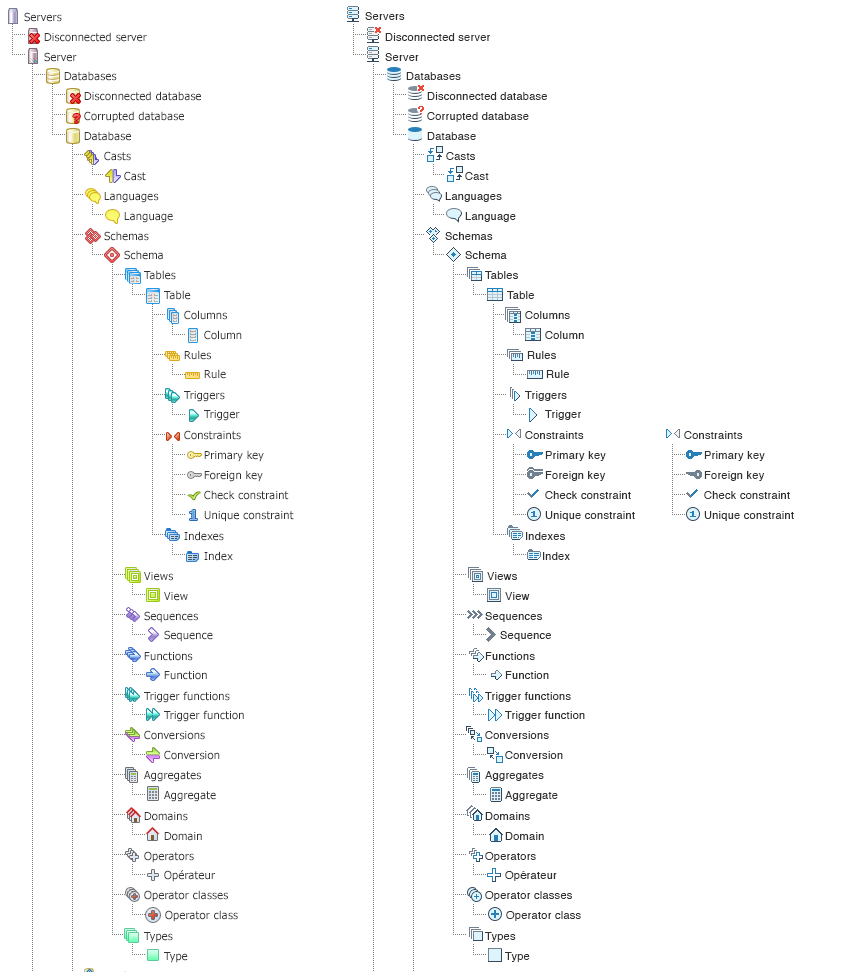
Hi Dave,I am attaching the updated icons along with new icons added.Also I have tried to address the issues raised in our previous review -1. Cast and Conversion: Eliminated the texty feel as you commented.Thought process: Basically cast means "Conversion between Data types" and Conversion means "Conversion between character" so I have come up with box shape concept where box means any "conversion of any data type or any character type". Ultimately "Box" plays role of a variable.
2. Primary and Foreign key: Updated as per the feedback and have come up with one more concept with slight changes in it.
Supporting content for the concept:As Primary key cannot be more than one but where as Foreign key can be more than one so taking this as base point I have presented the icon so.3. Index, Function and Function Trigger : As of now I have kept it as existing one only, I cannot be more innovative here where it mis-matches with the user's mental model. I am still brainstorming on these icons.
Note: I have listed out the list of icons which will be used in pgAdmin 4 and will be working on those icons onlyRegards,Chethana kumarOn Mon, Jul 3, 2017 at 3:01 PM, Dave Page <dpage@pgadmin.org> wrote:Hi
On Friday, June 30, 2017, Strauch, Sheldon <sstrauch@enova.com> wrote:Dave et al,Might I suggest flipping the foreign key icon left for right? That way, the key "points" to the left, back toward something pre-existing whilst the primary key "points" to the right, forward towards something new?I like that idea.Also, for me, the updated index icon loses its intuitiveness as it suggests an ordinal list or an enumeration. I think the clue in the old icon was the index tab at the top of the illustration.Yeah. Maybe something that looks like a diagram of a btree?Finally, the new trigger icon suggests, to me, that one is trying to do something with a document, maybe copying it. Whereas the old icon suggests an action to be taken.I see what you mean. I don't think the old one is any better though. Chethana; do you have any alternative ideas?Just my two cents...On Fri, Jun 30, 2017 at 9:57 AM, Dave Page <dpage@pgadmin.org> wrote:Hi- The Primary Key and Foreign Key icons should have more differentiation than just colour. Maybe add a 1 to Primary Key?- Did you get a list of the other icons that aren't on that sheet yet?- I'm not sure I like the Casts and Conversions icons (mis-spelt as Converts by the previous owner). The text on the makes them seem textual than graphical.Thanks!--On Fri, Jun 30, 2017 at 12:56 PM, Chethana Kumar <chethana.kumar@enterprisedb.com> wrote: Hi Team, Attachment was missing.On Fri, Jun 30, 2017 at 5:24 PM, Chethana Kumar <chethana.kumar@enterprisedb.com> wrote: Hello Team,Below are the updates for TreeView Icons -1. Fine tuned the icons - Database, Language, Primary and Foreign key, Unique Constraint2. Designed new concept for - Casts and Converts, Trigger3. Attached the color blind test result for "Primary and Foreign key", now I feel it is pretty evident to differentiate for blind user4. Attached "thought_process.png" where I have explained the thought process for newly proposed icons (referred:www.postgresql.org)5. Added little depth to all icons to provide the Afforance of ClickOn Thu, Jun 29, 2017 at 10:21 AM, Ashesh Vashi <ashesh.vashi@enterprisedb.com> wrote: On Thu, Jun 29, 2017 at 9:09 AM, Chethana Kumar <chethana.kumar@enterprisedb.com> wrote: Hi Ashesh,I tried to eliminate the colour blind issue which might occur with the primary & foregin key icons.But still I will use the app to test the colors, just let me know your opinion now.Please do.One more point: :-)Icons for some nodes are missing here.i.e. Partition table (introduced in 'Declarative Partition' patch), Materialized View, etc.-- Thanks, AsheshRegards,Chethana kumar--On Wed, Jun 28, 2017 at 11:13 PM, Ashesh Vashi <ashesh.vashi@enterprisedb.com> wrote: On Jun 28, 2017 22:32, "Robert Eckhardt" <reckhardt@pivotal.io> wrote:I like them as well. The only comment I have is that the red icon on disconnected DB and corrupted DB are difficult to make out. They are clearly differentiable but the icon itself is unclear.A colour blind person may not be able to differentiate the primary & foreign key icons.-- Ashesh-- RobOn Wed, Jun 28, 2017 at 12:49 PM, Dave Page <dpage@pgadmin.org> wrote:Hi
> On 28 Jun 2017, at 12:41, Chethana Kumar <chethana.kumar@enterprisedb.com> wrote:
>
> Hi Team,
>
> I am coming up with some sample icons for Tree View Control.
>
> Thought process behind the concept -
>
> 1. Included EDB color brand feel (gray and blue colors)
You mean pgAdmin colour brand :-). EDB is orange & black.
> 2. Eliminated the distraction of too many colors and provided consistency through the icons
> 3. User will recognize the icon shapes rather than recalling it by their colors (like in existing icons) so focused more on shapes
> 4. It also adds value to the brand since it has EDB color tones in it
>
>
> So please feel free to share your views on the same
I like them - they look much more modern and stylish, but still fit with what they represent.
Other opinions please?
Good work!Chethana KumarPrincipal UI/UX DesignerEnterpriseDB CorporationThe Postgres Database Company--Chethana KumarPrincipal UI/UX DesignerEnterpriseDB CorporationThe Postgres Database Company--Chethana KumarPrincipal UI/UX DesignerEnterpriseDB CorporationThe Postgres Database CompanyDave Page
Blog: http://pgsnake.blogspot.com
Twitter: @pgsnake
EnterpriseDB UK: http://www.enterprisedb.com
The Enterprise PostgreSQL Company--Assumptions validated by consistent data from actual experiments enable the creation of real value.
Sheldon E. Strauch
Data Architect, Data Services
O 312-676-1556
M 224-723-3878Enova International, Inc.
This transmission is confidential and may be privileged or proprietary. If you are not the intended recipient, you are not authorized to use the information in this transmission in any way. Please inform the sender immediately if you have received this transmission in error and permanently delete and destroy the original and any copies of the information.
--
Dave Page
Blog: http://pgsnake.blogspot.com
Twitter: @pgsnake
EnterpriseDB UK: http://www.enterprisedb.com
The Enterprise PostgreSQL Company--Chethana KumarPrincipal UI/UX DesignerEnterpriseDB CorporationThe Postgres Database Company
Blog: http://pgsnake.blogspot.com
Twitter: @pgsnake
EnterpriseDB UK: http://www.enterprisedb.com
The Enterprise PostgreSQL Company
HiOn Mon, Jul 3, 2017 at 8:53 AM, Chethana Kumar <chethana.kumar@enterprisedb.com> wrote: Hi Dave,I am attaching the updated icons along with new icons added.Also I have tried to address the issues raised in our previous review -1. Cast and Conversion: Eliminated the texty feel as you commented.Thought process: Basically cast means "Conversion between Data types" and Conversion means "Conversion between character" so I have come up with box shape concept where box means any "conversion of any data type or any character type". Ultimately "Box" plays role of a variable.For Conversion, how about we make it a triangle and circle instead of two squares?2. Primary and Foreign key: Updated as per the feedback and have come up with one more concept with slight changes in it.Cool. I like the double-key for Foreign Key.Supporting content for the concept:As Primary key cannot be more than one but where as Foreign key can be more than one so taking this as base point I have presented the icon so.3. Index, Function and Function Trigger : As of now I have kept it as existing one only, I cannot be more innovative here where it mis-matches with the user's mental model. I am still brainstorming on these icons.For index, how about a tree, like the bottom one at https://upload.wikimedia.org/wikipedia/commons/3/33/B_ tree_insertion_example.png. Leave out the numbers of course. For function, something with { } in there?And for Trigger Function, a mashup of function and trigger?Note: I have listed out the list of icons which will be used in pgAdmin 4 and will be working on those icons onlyRegards,Chethana kumarOn Mon, Jul 3, 2017 at 3:01 PM, Dave Page <dpage@pgadmin.org> wrote:Hi
On Friday, June 30, 2017, Strauch, Sheldon <sstrauch@enova.com> wrote:Dave et al,Might I suggest flipping the foreign key icon left for right? That way, the key "points" to the left, back toward something pre-existing whilst the primary key "points" to the right, forward towards something new?I like that idea.Also, for me, the updated index icon loses its intuitiveness as it suggests an ordinal list or an enumeration. I think the clue in the old icon was the index tab at the top of the illustration.Yeah. Maybe something that looks like a diagram of a btree?Finally, the new trigger icon suggests, to me, that one is trying to do something with a document, maybe copying it. Whereas the old icon suggests an action to be taken.I see what you mean. I don't think the old one is any better though. Chethana; do you have any alternative ideas?Just my two cents...On Fri, Jun 30, 2017 at 9:57 AM, Dave Page <dpage@pgadmin.org> wrote:Hi- The Primary Key and Foreign Key icons should have more differentiation than just colour. Maybe add a 1 to Primary Key?- Did you get a list of the other icons that aren't on that sheet yet?- I'm not sure I like the Casts and Conversions icons (mis-spelt as Converts by the previous owner). The text on the makes them seem textual than graphical.Thanks!--On Fri, Jun 30, 2017 at 12:56 PM, Chethana Kumar <chethana.kumar@enterprisedb.com> wrote: Hi Team, Attachment was missing.On Fri, Jun 30, 2017 at 5:24 PM, Chethana Kumar <chethana.kumar@enterprisedb.com> wrote: Hello Team,Below are the updates for TreeView Icons -1. Fine tuned the icons - Database, Language, Primary and Foreign key, Unique Constraint2. Designed new concept for - Casts and Converts, Trigger3. Attached the color blind test result for "Primary and Foreign key", now I feel it is pretty evident to differentiate for blind user4. Attached "thought_process.png" where I have explained the thought process for newly proposed icons (referred:www.postgresql.org)5. Added little depth to all icons to provide the Afforance of ClickOn Thu, Jun 29, 2017 at 10:21 AM, Ashesh Vashi <ashesh.vashi@enterprisedb.com> wrote: On Thu, Jun 29, 2017 at 9:09 AM, Chethana Kumar <chethana.kumar@enterprisedb.com> wrote: Hi Ashesh,I tried to eliminate the colour blind issue which might occur with the primary & foregin key icons.But still I will use the app to test the colors, just let me know your opinion now.Please do.One more point: :-)Icons for some nodes are missing here.i.e. Partition table (introduced in 'Declarative Partition' patch), Materialized View, etc.-- Thanks, AsheshRegards,Chethana kumar--On Wed, Jun 28, 2017 at 11:13 PM, Ashesh Vashi <ashesh.vashi@enterprisedb.com> wrote: On Jun 28, 2017 22:32, "Robert Eckhardt" <reckhardt@pivotal.io> wrote:I like them as well. The only comment I have is that the red icon on disconnected DB and corrupted DB are difficult to make out. They are clearly differentiable but the icon itself is unclear.A colour blind person may not be able to differentiate the primary & foreign key icons.-- Ashesh-- RobOn Wed, Jun 28, 2017 at 12:49 PM, Dave Page <dpage@pgadmin.org> wrote:Hi
> On 28 Jun 2017, at 12:41, Chethana Kumar <chethana.kumar@enterprisedb.com> wrote:
>
> Hi Team,
>
> I am coming up with some sample icons for Tree View Control.
>
> Thought process behind the concept -
>
> 1. Included EDB color brand feel (gray and blue colors)
You mean pgAdmin colour brand :-). EDB is orange & black.
> 2. Eliminated the distraction of too many colors and provided consistency through the icons
> 3. User will recognize the icon shapes rather than recalling it by their colors (like in existing icons) so focused more on shapes
> 4. It also adds value to the brand since it has EDB color tones in it
>
>
> So please feel free to share your views on the same
I like them - they look much more modern and stylish, but still fit with what they represent.
Other opinions please?
Good work!Chethana KumarPrincipal UI/UX DesignerEnterpriseDB CorporationThe Postgres Database Company--Chethana KumarPrincipal UI/UX DesignerEnterpriseDB CorporationThe Postgres Database Company--Chethana KumarPrincipal UI/UX DesignerEnterpriseDB CorporationThe Postgres Database CompanyDave Page
Blog: http://pgsnake.blogspot.com
Twitter: @pgsnake
EnterpriseDB UK: http://www.enterprisedb.com
The Enterprise PostgreSQL Company--Assumptions validated by consistent data from actual experiments enable the creation of real value.
Sheldon E. Strauch
Data Architect, Data Services
O 312-676-1556
M 224-723-3878Enova International, Inc.
This transmission is confidential and may be privileged or proprietary. If you are not the intended recipient, you are not authorized to use the information in this transmission in any way. Please inform the sender immediately if you have received this transmission in error and permanently delete and destroy the original and any copies of the information.
--
Dave Page
Blog: http://pgsnake.blogspot.com
Twitter: @pgsnake
EnterpriseDB UK: http://www.enterprisedb.com
The Enterprise PostgreSQL Company--Chethana KumarPrincipal UI/UX DesignerEnterpriseDB CorporationThe Postgres Database Company--Dave Page
Blog: http://pgsnake.blogspot.com
Twitter: @pgsnake
EnterpriseDB UK: http://www.enterprisedb.com
The Enterprise PostgreSQL Company
Attachment
Hi Dave,I have updated the icons "Conversions, Function and Function Trigger" as per you suggestions.
I feel the curved shapes won't look clear in 16px measurement which is happening with 'Conversions' icons'.We might have to rework on 'Conversions', what do you say ?
Regards,Chethana kumarOn Mon, Jul 3, 2017 at 6:35 PM, Dave Page <dpage@pgadmin.org> wrote:HiOn Mon, Jul 3, 2017 at 8:53 AM, Chethana Kumar <chethana.kumar@enterprisedb.com> wrote: Hi Dave,I am attaching the updated icons along with new icons added.Also I have tried to address the issues raised in our previous review -1. Cast and Conversion: Eliminated the texty feel as you commented.Thought process: Basically cast means "Conversion between Data types" and Conversion means "Conversion between character" so I have come up with box shape concept where box means any "conversion of any data type or any character type". Ultimately "Box" plays role of a variable.For Conversion, how about we make it a triangle and circle instead of two squares?2. Primary and Foreign key: Updated as per the feedback and have come up with one more concept with slight changes in it.Cool. I like the double-key for Foreign Key.Supporting content for the concept:As Primary key cannot be more than one but where as Foreign key can be more than one so taking this as base point I have presented the icon so.3. Index, Function and Function Trigger : As of now I have kept it as existing one only, I cannot be more innovative here where it mis-matches with the user's mental model. I am still brainstorming on these icons.For index, how about a tree, like the bottom one at https://upload.wikimedia.org/wikipedia/commons/3/33/B_tre e_insertion_example.png. Leave out the numbers of course. For function, something with { } in there?And for Trigger Function, a mashup of function and trigger?Note: I have listed out the list of icons which will be used in pgAdmin 4 and will be working on those icons onlyRegards,Chethana kumarOn Mon, Jul 3, 2017 at 3:01 PM, Dave Page <dpage@pgadmin.org> wrote:Hi
On Friday, June 30, 2017, Strauch, Sheldon <sstrauch@enova.com> wrote:Dave et al,Might I suggest flipping the foreign key icon left for right? That way, the key "points" to the left, back toward something pre-existing whilst the primary key "points" to the right, forward towards something new?I like that idea.Also, for me, the updated index icon loses its intuitiveness as it suggests an ordinal list or an enumeration. I think the clue in the old icon was the index tab at the top of the illustration.Yeah. Maybe something that looks like a diagram of a btree?Finally, the new trigger icon suggests, to me, that one is trying to do something with a document, maybe copying it. Whereas the old icon suggests an action to be taken.I see what you mean. I don't think the old one is any better though. Chethana; do you have any alternative ideas?Just my two cents...On Fri, Jun 30, 2017 at 9:57 AM, Dave Page <dpage@pgadmin.org> wrote:Hi- The Primary Key and Foreign Key icons should have more differentiation than just colour. Maybe add a 1 to Primary Key?- Did you get a list of the other icons that aren't on that sheet yet?- I'm not sure I like the Casts and Conversions icons (mis-spelt as Converts by the previous owner). The text on the makes them seem textual than graphical.Thanks!--On Fri, Jun 30, 2017 at 12:56 PM, Chethana Kumar <chethana.kumar@enterprisedb.com> wrote: Hi Team, Attachment was missing.On Fri, Jun 30, 2017 at 5:24 PM, Chethana Kumar <chethana.kumar@enterprisedb.com> wrote: Hello Team,Below are the updates for TreeView Icons -1. Fine tuned the icons - Database, Language, Primary and Foreign key, Unique Constraint2. Designed new concept for - Casts and Converts, Trigger3. Attached the color blind test result for "Primary and Foreign key", now I feel it is pretty evident to differentiate for blind user4. Attached "thought_process.png" where I have explained the thought process for newly proposed icons (referred:www.postgresql.org)5. Added little depth to all icons to provide the Afforance of ClickOn Thu, Jun 29, 2017 at 10:21 AM, Ashesh Vashi <ashesh.vashi@enterprisedb.com> wrote: On Thu, Jun 29, 2017 at 9:09 AM, Chethana Kumar <chethana.kumar@enterprisedb.com> wrote: Hi Ashesh,I tried to eliminate the colour blind issue which might occur with the primary & foregin key icons.But still I will use the app to test the colors, just let me know your opinion now.Please do.One more point: :-)Icons for some nodes are missing here.i.e. Partition table (introduced in 'Declarative Partition' patch), Materialized View, etc.-- Thanks, AsheshRegards,Chethana kumar--On Wed, Jun 28, 2017 at 11:13 PM, Ashesh Vashi <ashesh.vashi@enterprisedb.com> wrote: On Jun 28, 2017 22:32, "Robert Eckhardt" <reckhardt@pivotal.io> wrote:I like them as well. The only comment I have is that the red icon on disconnected DB and corrupted DB are difficult to make out. They are clearly differentiable but the icon itself is unclear.A colour blind person may not be able to differentiate the primary & foreign key icons.-- Ashesh-- RobOn Wed, Jun 28, 2017 at 12:49 PM, Dave Page <dpage@pgadmin.org> wrote:Hi
> On 28 Jun 2017, at 12:41, Chethana Kumar <chethana.kumar@enterprisedb.com> wrote:
>
> Hi Team,
>
> I am coming up with some sample icons for Tree View Control.
>
> Thought process behind the concept -
>
> 1. Included EDB color brand feel (gray and blue colors)
You mean pgAdmin colour brand :-). EDB is orange & black.
> 2. Eliminated the distraction of too many colors and provided consistency through the icons
> 3. User will recognize the icon shapes rather than recalling it by their colors (like in existing icons) so focused more on shapes
> 4. It also adds value to the brand since it has EDB color tones in it
>
>
> So please feel free to share your views on the same
I like them - they look much more modern and stylish, but still fit with what they represent.
Other opinions please?
Good work!Chethana KumarPrincipal UI/UX DesignerEnterpriseDB CorporationThe Postgres Database Company--Chethana KumarPrincipal UI/UX DesignerEnterpriseDB CorporationThe Postgres Database Company--Chethana KumarPrincipal UI/UX DesignerEnterpriseDB CorporationThe Postgres Database CompanyDave Page
Blog: http://pgsnake.blogspot.com
Twitter: @pgsnake
EnterpriseDB UK: http://www.enterprisedb.com
The Enterprise PostgreSQL Company--Assumptions validated by consistent data from actual experiments enable the creation of real value.
Sheldon E. Strauch
Data Architect, Data Services
O 312-676-1556
M 224-723-3878Enova International, Inc.
This transmission is confidential and may be privileged or proprietary. If you are not the intended recipient, you are not authorized to use the information in this transmission in any way. Please inform the sender immediately if you have received this transmission in error and permanently delete and destroy the original and any copies of the information.
--
Dave Page
Blog: http://pgsnake.blogspot.com
Twitter: @pgsnake
EnterpriseDB UK: http://www.enterprisedb.com
The Enterprise PostgreSQL Company--Chethana KumarPrincipal UI/UX DesignerEnterpriseDB CorporationThe Postgres Database Company--Dave Page
Blog: http://pgsnake.blogspot.com
Twitter: @pgsnake
EnterpriseDB UK: http://www.enterprisedb.com
The Enterprise PostgreSQL Company--Chethana KumarPrincipal UI/UX DesignerEnterpriseDB CorporationThe Postgres Database Company
Blog: http://pgsnake.blogspot.com
Twitter: @pgsnake
EnterpriseDB UK: http://www.enterprisedb.com
The Enterprise PostgreSQL Company
Hi,
Hi Dave,I have updated the icons "Conversions, Function and Function Trigger" as per you suggestions.
I feel the curved shapes won't look clear in 16px measurement which is happening with 'Conversions' icons'.We might have to rework on 'Conversions', what do you say ?
Regards,Chethana kumar
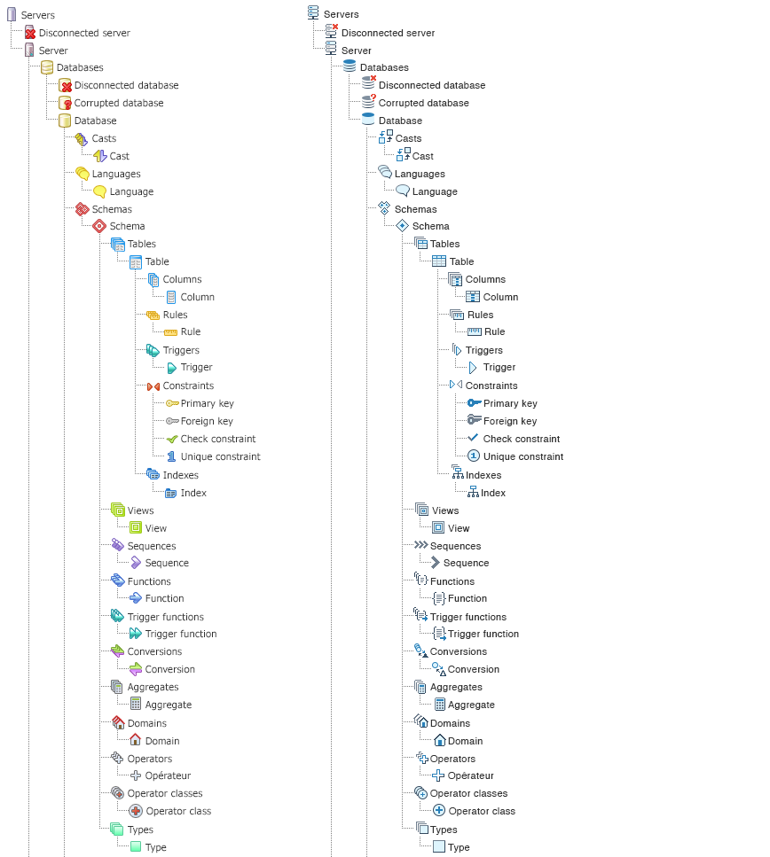
Hi,Looking forward to this and the other design updates coming! Regarding the PNG examples, I was wondering whether that is meant to show all the new icons being developed or no? When I expand the tree view in pgAdmin v1.4 I see quite a few not shown here, including Extensions, Foreign Data Wrappers, etc.
Also, as a bonus question, I wonder whether there’s a way to make Views and Materialized Views closer to each other in the tree? I know because of alphabetization they’re separated but logically they deserve to be near each other, I feel.
Thanks for all your work on this project!
AnthonyOn July 3, 2017 at 10:40:50 AM, Dave Page (dpage@pgadmin.org) wrote:
HiOn Mon, Jul 3, 2017 at 10:25 AM, Chethana Kumar <chethana.kumar@enterprisedb.com> wrote: Hi Dave,I have updated the icons "Conversions, Function and Function Trigger" as per you suggestions.Nice.I feel the curved shapes won't look clear in 16px measurement which is happening with 'Conversions' icons'.We might have to rework on 'Conversions', what do you say ?Hmm, we could use a square and triangle if it works better.Regards,Chethana kumar
Blog: http://pgsnake.blogspot.com
Twitter: @pgsnake
EnterpriseDB UK: http://www.enterprisedb.com
The Enterprise PostgreSQL Company