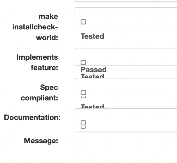
I noticed in Commitfest App Add Review form's checkbox layout seems
broken as you can see in the attached snapshot. I see the same layout
in Google Chrome and FireFox.
For Frequent Reviewers I guess it's fine as they can just guess how
many and which check boxes to click without a clear layout but for new
users it seems confusing.

- Is this the right list to discuss or is there some other mailing
list covering CommitFest App development?
- Is this a known issue and should it be improved ?

Regards
Umar Hayat