Thread: pgarchives new design review
Hello everyone,
I have been working on the pgarchives project. I have made some changes in the UI and would love to have community review/feedback on it.
I have been working on the pgarchives project. I have made some changes in the UI and would love to have community review/feedback on it.
So far I covered following pages
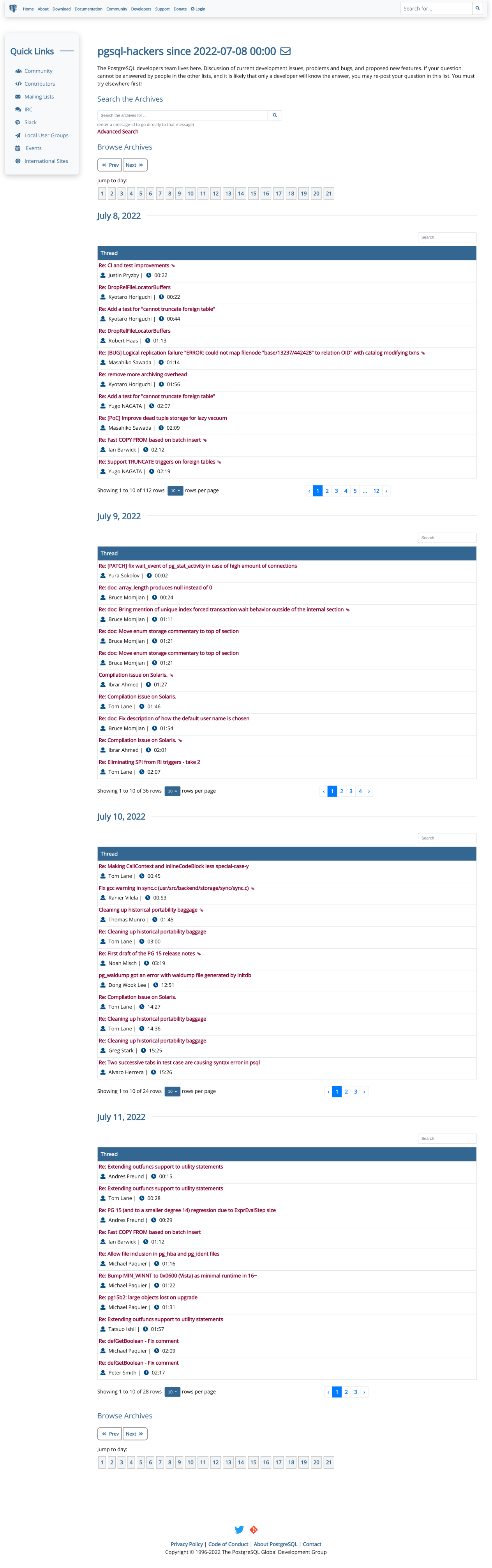
- Home page - http://140.211.168.145:88/list/
- Month & year list page - http://140.211.168.145:88/list/pgsql-hackers/
- Day list - http://140.211.168.145:88/list/pgsql-hackers/2022-07/
Thanks,
Sahil Harpal
Hello,
I'm attaching following patches for pgarchives project.
0001-Add-bootstrap-table-static-files.patch
- This is to add CSS and JS files that are required for bootstrap tables
0001-Import-css-js-files-of-bootstrap-table-in-the-base.h.patch
- Imported required files in the base.html file
- Currently we have Your account nav option. This Your account text is quite confusing. When the user is not logged in , showing Your account is a bit incorrect. Ideally it should be Sign in/Login etc. So I added a condition which checks whether the user is logged in or not. If logged in it displays Username else Login. Also added a profile icon which helps to clearly and quickly distinguish account.profile option from other navigation options.
0001-Changed-side-nav-bar-s-style-and-fixed-its-position-.patch
- Used accordion for general info which saves page size and prevents scrolling for initial points that are not required every time (The interested person can simply click on the accordion and read about it).
- Changed table's design and added search for each table to quickly search for a specific list of that group and pagination to configure max entries to be displayed for user's accessibility.
- Added horizontal line to separate two list groups.
- Also added hover effect for links which clearly shows what the user has selected or the position of the cursor.
- Updated side navbar
- Changed background color to make the side navbar distinguishable from the main page content.
- Added hover effect for links and changed display of <a> tag to block, which makes links clickable for the entire outer <li> tag. It gives the user a feel of the button and so users don’t need to move the cursor carefully over text.
- Also, the current quick links section/side nav disappears on scrolling the page. To access that side nav user again needs to scroll up. it won’t give users an experience of accessing things quickly as they need to scroll up and down every time. To improve this, I fixed the side-nav position to the left. So the side nav will remain at the same place after scrolling.
- Added appropriate icons for each quick link.
0001-Changed-month-list-page-Added-filter-to-search-speci.patch
- Used a different color for the header of the table.
- In the current design, years are not clearly visible. It has been dissolved in all reddish text.
- Used accordion for each year which contains a month list.
- In the current design, we have a separate table for each year containing a month list and action to view the archives and download mbox. This representation will affect user experience in the coming years as there will be too many tables. If we think about the next couple of years, much scrolling will be required to look at archives of a particular year and month. Use of accordion will definitely prevent long scrolling.
- Added search box.
- We don’t have any option to go to a specific year quickly. This search box will allow users to enter a year and it will display only that particular year's accordion.
- Replaced text with icons.
- Currently, we are using view archives and download mbox text repeatedly, which is not giving a good feel. So to avoid this repetition of text, I used appropriate icons
0001-Changed-day-list-page-Redesigned-table-Added-search-.patch
- Changed day list page
- Redesigned table and handled responsiveness.
- Added search box, so that one can quickly search a specific thread by key word or by the sender's name.
- Added pagination to configure max entries to be displayed.
Thanks,
Sahil Harpal
Attachment
Hi
On Thu, 28 Jul 2022 at 10:26, Sahil Harpal <sahilharpal1234@gmail.com> wrote:
Hello everyone,
I have been working on the pgarchives project. I have made some changes in the UI and would love to have community review/feedback on it.So far I covered following pages
- Home page - http://140.211.168.145:88/list/
- Month & year list page - http://140.211.168.145:88/list/pgsql-hackers/
- Day list - http://140.211.168.145:88/list/pgsql-hackers/2022-07/
I have a few comments, based on a quick look:
- The site is unusable if Javascript is disabled in the browser. PostgreSQL websites have a general requirement that JS should be optional, not a requirement.
- There is different styling on different buttons. For example, the numbered buttons for by-day paging look quite different from the previous/next buttons, which have a thicker border and what appears to be a different background colour.
- The thread paging buttons have different styling again (and are using a shade of blue which is outside of our normal palette I believe).
- The blue used for the on-hover row highlighting also seems unnatural. Perhaps a light grey would work better here?
- Perhaps the Previous/Next buttons should be at either end of the "per-day" buttons, rather than on a separate row?
- The lists of messages are (intentionally) a lot more compact in the current design. The new design looks nice, but would require a *lot* more scrolling as each row is now at least two lines of text. I wonder if there's a way to keep at least some of the compact-ness, whilst still making it look nicer.
Thanks!
Hi Dave,
On Fri, 29 Jul 2022 at 15:49, Dave Page <dpage@pgadmin.org> wrote:
I have a few comments, based on a quick look:- The site is unusable if Javascript is disabled in the browser. PostgreSQL websites have a general requirement that JS should be optional, not a requirement.
Oh! I was not actually aware of this. There are JS files that are already in use and present in the media/js directory so I thought it won't be a problem. Otherwise we need to use normal tables only. Do you have any suggestions for this?
- There is different styling on different buttons. For example, the numbered buttons for by-day paging look quite different from the previous/next buttons, which have a thicker border and what appears to be a different background colour.- The thread paging buttons have different styling again (and are using a shade of blue which is outside of our normal palette I believe).- The blue used for the on-hover row highlighting also seems unnatural. Perhaps a light grey would work better here?- Perhaps the Previous/Next buttons should be at either end of the "per-day" buttons, rather than on a separate row?
Alright, the above points can be resolved easily. I will make changes accordingly.
- The lists of messages are (intentionally) a lot more compact in the current design. The new design looks nice, but would require a *lot* more scrolling as each row is now at least two lines of text. I wonder if there's a way to keep at least some of the compact-ness, whilst still making it look nicer.
I think users would not require to scroll much. Like in the new design we have an option to set max entries to be displayed. So we can set max entries to lets say 10 and then just jump/switch to different pages one by one.
But still I am open to any new layout that we can use to keep at least some of the compact-ness.
Thanks
Sahil Harpal
Hi
On Fri, 29 Jul 2022 at 14:55, Sahil Harpal <sahilharpal1234@gmail.com> wrote:
Hi Dave,On Fri, 29 Jul 2022 at 15:49, Dave Page <dpage@pgadmin.org> wrote:I have a few comments, based on a quick look:- The site is unusable if Javascript is disabled in the browser. PostgreSQL websites have a general requirement that JS should be optional, not a requirement.Oh! I was not actually aware of this. There are JS files that are already in use and present in the media/js directory so I thought it won't be a problem. Otherwise we need to use normal tables only. Do you have any suggestions for this?
We can (and do) use Javascript for a nicer experience for the majority of users. However, we need it to still be usable if a user does not have Javascript enabled.
The buttons on https://www.postgresql.org/download/ are a good example. If Javascript is disabled, they act as regular links that will take you to a new page with the same content that you would see inline if Javascript were enabled. Of course, that's not the only way to handle the problem. One way might be to leave regions expanded by default, and to collapse them if JS is enabled (if you can do that before the full page renders, so it doesn't look weird).
- There is different styling on different buttons. For example, the numbered buttons for by-day paging look quite different from the previous/next buttons, which have a thicker border and what appears to be a different background colour.- The thread paging buttons have different styling again (and are using a shade of blue which is outside of our normal palette I believe).- The blue used for the on-hover row highlighting also seems unnatural. Perhaps a light grey would work better here?- Perhaps the Previous/Next buttons should be at either end of the "per-day" buttons, rather than on a separate row?Alright, the above points can be resolved easily. I will make changes accordingly.
Thanks.
- The lists of messages are (intentionally) a lot more compact in the current design. The new design looks nice, but would require a *lot* more scrolling as each row is now at least two lines of text. I wonder if there's a way to keep at least some of the compact-ness, whilst still making it look nicer.I think users would not require to scroll much. Like in the new design we have an option to set max entries to be displayed. So we can set max entries to lets say 10 and then just jump/switch to different pages one by one.But still I am open to any new layout that we can use to keep at least some of the compact-ness.
Maybe :-). That setting seems to be per-day though, and is not persisted (and is at the bottom of each day, so you'd have to scroll to change it).
One pattern I often use is to visit a page and use the browsers search function to find a message (if I know it was from the last couple of days for example). The current design would break that, so I'm not in favour of hiding rows anyway.
Hi,

Before my additional comments, thank you for proposing this.

On 7/29/22 10:53 AM, Dave Page wrote:
> Hi
>
> On Fri, 29 Jul 2022 at 14:55, Sahil Harpal <sahilharpal1234@gmail.com
> <mailto:sahilharpal1234@gmail.com>> wrote:
>
>     Hi Dave,
>
>     On Fri, 29 Jul 2022 at 15:49, Dave Page <dpage@pgadmin.org
>     <mailto:dpage@pgadmin.org>> wrote:
>
>         I have a few comments, based on a quick look:
>         - The site is unusable if Javascript is disabled in the browser.
>         PostgreSQL websites have a general requirement that JS should be
>         optional, not a requirement.
>
>
>     Oh! I was not actually aware of this. There are JS files that are
>     already in use and present in the media/js directory so I thought it
>     won't be a problem. Otherwise we need to use normal tables only. Do
>     you have any suggestions for this?
>
>
> We can (and do) use Javascript for a nicer experience for the majority
> of users. However, we need it to still be usable if a user does not have
> Javascript enabled.
>
> The buttons on https://www.postgresql.org/download/
> <https://www.postgresql.org/download/> are a good example. If Javascript
> is disabled, they act as regular links that will take you to a new page
> with the same content that you would see inline if Javascript were
> enabled. Of course, that's not the only way to handle the problem. One
> way might be to leave regions expanded by default, and to collapse them
> if JS is enabled (if you can do that before the full page renders, so it
> doesn't look weird).
>
>
>         - There is different styling on different buttons. For example,
>         the numbered buttons for by-day paging look quite different from
>         the previous/next buttons, which have a thicker border and what
>         appears to be a different background colour.
>
>         - The thread paging buttons have different styling again (and
>         are using a shade of blue which is outside of our normal palette
>         I believe).
>
>         - The blue used for the on-hover row highlighting also seems
>         unnatural. Perhaps a light grey would work better here?
>
>         - Perhaps the Previous/Next buttons should be at either end of
>         the "per-day" buttons, rather than on a separate row?
>
>
>       Alright, the above points can be resolved easily. I will make
>     changes accordingly.
>
>
> Thanks.
>
>
>         - The lists of messages are (intentionally) a lot more compact
>         in the current design. The new design looks nice, but would
>         require a *lot* more scrolling as each row is now at least two
>         lines of text. I wonder if there's a way to keep at least some
>         of the compact-ness, whilst still making it look nicer.
>
>
>     I think users would not require to scroll much. Like in the new
>     design we have an option to set max entries to be displayed. So we
>     can set max entries to lets say 10 and then just jump/switch to
>     different pages one by one.
>     But still I am open to any new layout that we can use to keep at
>     least some of the compact-ness.
>
>
> Maybe :-). That setting seems to be per-day though, and is not persisted
> (and is at the bottom of each day, so you'd have to scroll to change it).

>
> One pattern I often use is to visit a page and use the browsers search
> function to find a message (if I know it was from the last couple of
> days for example). The current design would break that, so I'm not in
> favour of hiding rows anyway.


I don't think some of these changes are an improvement for the target
users of the archives, which are predominately PostgreSQL
hackers/developers. Specifically:

* Hiding messages in the day view (as Dave mentions). On a high-traffic
list like -hackers, this makes it very difficult to scan or find a
specific message. The current format, which was designed with the input
of several power users (after I broke their workflow with the redesign),
makes it easy to scan and/or use browser tools (ctrl-f) to find messages.

* Similarly, I'm a -1 for the search fields in all of the days.

* Quick Links: I'm on the fence if that should be floating around.
Looking into those + what you see when you scroll through the archives,
I don't know if a user is tempted to click on any of those.

I think if we were to invest in anything around "linking" in the message
archives, it would be towards making it easier for folks to figure out
how to subscribe to a mailing list.

Thanks,

Jonathan
Attachment
Hello Jonathan,
Thanks for your suggestions. These are helpful. I would look for a better design or some kind of improvement that won't disturb the typical workflow of the majority and look nicer.
If you have a cool design in mind, I would love to work on it.
If you have a cool design in mind, I would love to work on it.
On Sun, 31 Jul 2022 at 01:44, Jonathan S. Katz <jkatz@postgresql.org> wrote:
I think if we were to invest in anything around "linking" in the message
archives, it would be towards making it easier for folks to figure out
how to subscribe to a mailing list.
Could you please describe the above point a bit? A solid example would be helpful.
Thanks,
Sahil Harpal
On 2022-Jul-29, Sahil Harpal wrote:

> On Fri, 29 Jul 2022 at 15:49, Dave Page <dpage@pgadmin.org> wrote:

> > - The lists of messages are (intentionally) a lot more compact in the
> > current design. The new design looks nice, but would require a *lot* more
> > scrolling as each row is now at least two lines of text. I wonder if
> > there's a way to keep at least some of the compact-ness, whilst still
> > making it look nicer.
>
> I think users would not require to scroll much. Like in the new design we
> have an option to set max entries to be displayed. So we can set max
> entries to lets say 10 and then just jump/switch to different pages one by
> one.

As a heavy user of the archives, I am completely against the idea of
having only 10 entries per page and forced to jump to different pages.

Looking at the site just now
http://140.211.168.145:88/list/pgsql-hackers/2022-07/
I see that you now have 10 entries for July 1st, with buttons for
further pages of more posts that day; then 10 entries for July 2nd; and
so on.  Screenshot attached.  This doesn't seem a good idea to me; an
arbitrary date change line means nothing in the flow of mailing list
messages, and the result of this paging is unusable.

In my opinion, the list of messages shown for a period of time has to be
a continuum of *all* messages in that period, without these paging breaks.

I prefer to scroll.

--
Álvaro Herrera         PostgreSQL Developer  —  https://www.EnterpriseDB.com/
Attachment
> On 5 Aug 2022, at 12:25, Alvaro Herrera <alvherre@alvh.no-ip.org> wrote:

> In my opinion, the list of messages shown for a period of time has to be
> a continuum of *all* messages in that period, without these paging breaks.
>
> I prefer to scroll.

Using the archives a fair bit as well, I agree with that.  I don't mind there
being an option for paging but I would prefer if "All" was the default or if
it's saved as a setting in my profile such that I get it when being logged in.

--
Daniel Gustafsson        https://vmware.com/
On Fri, Aug 05, 2022 at 12:52:42PM +0200, Daniel Gustafsson wrote:
> > On 5 Aug 2022, at 12:25, Alvaro Herrera <alvherre@alvh.no-ip.org> wrote:
>
> > In my opinion, the list of messages shown for a period of time has to be
> > a continuum of *all* messages in that period, without these paging breaks.
> >
> > I prefer to scroll.
>
> Using the archives a fair bit as well, I agree with that.  I don't mind there
> being an option for paging but I would prefer if "All" was the default or if
> it's saved as a setting in my profile such that I get it when being logged in.

I'm a heavy user of the archives too, and I'm definitely against having to go
through pagination.

Note that I'm not always logged in when I browse the archives (work laptop,
auth expired...), so I'd highly prefer to have all messages displayed by
default rather than being an account preference.
On Fri, Aug 5, 2022 at 12:52 PM Daniel Gustafsson <daniel@yesql.se> wrote:
>
> > On 5 Aug 2022, at 12:25, Alvaro Herrera <alvherre@alvh.no-ip.org> wrote:
>
> > In my opinion, the list of messages shown for a period of time has to be
> > a continuum of *all* messages in that period, without these paging breaks.
> >
> > I prefer to scroll.
>
> Using the archives a fair bit as well, I agree with that.  I don't mind there
> being an option for paging but I would prefer if "All" was the default or if
> it's saved as a setting in my profile such that I get it when being logged in.

Right now the archives operate entirely without logged in users for
browsing. We do *not* want to change that, because we use that to
build some geographical redundancy in the caching for example. A
configurable like that could be done in client side javascript with a
browser cookie if really wanted though -- as long as All is the
default, meaning all the data is sent to the browser, local pagination
can be done in the browser.

//Magnus
On Sat, 6 Aug 2022 at 16:37, Magnus Hagander <magnus@hagander.net> wrote:
A configurable like that could be done in client side javascript with a
browser cookie if really wanted though -- as long as All is the
default, meaning all the data is sent to the browser, local pagination
can be done in the browser.
Yeah right. I am doing the same thing. All the data is being loaded only once, and all the pagination is happening on the client side. Also, I changed the default pagination value to All and changed the table's structure to make it a bit more compact.
//Sahil
On Sat, 6 Aug 2022 at 16:37, Magnus Hagander <magnus@hagander.net> wrote:
On Fri, Aug 5, 2022 at 12:52 PM Daniel Gustafsson <daniel@yesql.se> wrote:
>
> > On 5 Aug 2022, at 12:25, Alvaro Herrera <alvherre@alvh.no-ip.org> wrote:
>
> > In my opinion, the list of messages shown for a period of time has to be
> > a continuum of *all* messages in that period, without these paging breaks.
> >
> > I prefer to scroll.
>
> Using the archives a fair bit as well, I agree with that. I don't mind there
> being an option for paging but I would prefer if "All" was the default or if
> it's saved as a setting in my profile such that I get it when being logged in.
Right now the archives operate entirely without logged in users for
browsing. We do *not* want to change that, because we use that to
build some geographical redundancy in the caching for example. A
configurable like that could be done in client side javascript with a
browser cookie if really wanted though -- as long as All is the
default, meaning all the data is sent to the browser, local pagination
can be done in the browser.
//Magnus
> On 7 Aug 2022, at 17:02, Sahil Harpal <sahilharpal1234@gmail.com> wrote:
>
> On Sat, 6 Aug 2022 at 16:37, Magnus Hagander <magnus@hagander.net <mailto:magnus@hagander.net>> wrote:
> A configurable like that could be done in client side javascript with a
> browser cookie if really wanted though -- as long as All is the
> default, meaning all the data is sent to the browser, local pagination
> can be done in the browser.
>
> Yeah right. I am doing the same thing. All the data is being loaded only once, and all the pagination is happening on
theclient side. Also, I changed the default pagination value to All and changed the table's structure to make it a bit
morecompact.

The more compact layout is better IMHO since it makes it easier to visually
scan the titles.  I would also drop the icons in the Author and Time columns
since they will be the identical for every row (or at least make sure they are
all aria-hidden which the clock icon isn't right now I think).

--
Daniel Gustafsson        https://vmware.com/