Thread: Logo issue ...
Morning all...

    Well, now I'm finally on something better then a 14.4, I rear my
head again :)  God, I can't wait to get home to *my* computer with *real*
bandwidth *sigh*

    There appears to be at least two points of view, currently, as far
as the work being done on logo's, and I'd like to somehow come to a
conclusion as to direction to take...

    Several weeks back, Jan came up with a logo proposal that revolved
around the 'diamond' concept...I liked it, but pop'd up with my 'elephant'
request, since, IMHO, the elephant concept really hits home to what we
are...strong, steady, heavy-duty...some ppl hit on slow also, but (and I
can't remember who made this comment, sorry) someone else's came up with
something like 'ability to knock down trees'..the way it was worded,
obviously not that way, brought to mind our indexing...

    To me, Jan's concept was clear and crisp...and incorporated ideas
from several ppl...

    Then, Daniel took and made a 'cartoon-like' logo of an elephant
that he pointed me to, and, altho its not as crisp as Jan's concept, it
had more the FreeBSD(daemon)/Linux(penguin) look to it...

    Both concepts have merit, and both, in my opinion, are well
done...and I really hate to be a critic when it comes to graphical design
:(  'Specially when I couldn't do any better, and definitely woudl do
worse :(

    So, is it possible to adopt both, somehow?  For instance, I don't
really see Daniel's design on the front of an O'Reilly book, where Jan's
would fit...but Daniel's would look great on a t-shirt.  The nice thing
about Daniel's is that it transfer's well to various media, whereas the
'elephant in diamond' of Jan's is very medium specific...ie. looks great
on the WWW pages Dmitry has worked up, but doesn't necessarily print the
greatest...

    My personal preference is to adopt both, but is this something
that is "allowed" from a market standpoint?

Marc G. Fournier                   ICQ#7615664               IRC Nick: Scrappy
Systems Administrator @ hub.org
primary: scrappy@hub.org           secondary: scrappy@{freebsd|postgresql}.org
On 23-Apr-99 The Hermit Hacker wrote:
>
>       Then, Daniel took and made a 'cartoon-like' logo of an elephant
> that he pointed me to, and, altho its not as crisp as Jan's concept, it
> had more the FreeBSD(daemon)/Linux(penguin) look to it...

I looked at Daniel's elephant too, but to me it's missing something.  The
strong, steady, etc., just isn't there.  Grab your FreeBSD CDs from 2.2.8
and 3.1.  The picture of Chuck on 3.1 seems like it's less serious of a
product than 2.2.8.  I get the same impression from Daniel's elephant.

Vince.
--
==========================================================================
Vince Vielhaber -- KA8CSH   email: vev@michvhf.com   flame-mail: /dev/null
       # include <std/disclaimers.h>                   TEAM-OS2
        Online Campground Directory    http://www.camping-usa.com
       Online Giftshop Superstore    http://www.cloudninegifts.com
==========================================================================
>
> On 23-Apr-99 The Hermit Hacker wrote:
> >
> >       Then, Daniel took and made a 'cartoon-like' logo of an elephant
> > that he pointed me to, and, altho its not as crisp as Jan's concept, it
> > had more the FreeBSD(daemon)/Linux(penguin) look to it...
>
> I looked at Daniel's elephant too, but to me it's missing something.  The
> strong, steady, etc., just isn't there.  Grab your FreeBSD CDs from 2.2.8
> and 3.1.  The picture of Chuck on 3.1 seems like it's less serious of a
> product than 2.2.8.  I get the same impression from Daniel's elephant.

Also, Jan's original elephant had a perfect dark brown color to it,
exactly like a real elephant.  The current one looks grey, but I know
Jan is not done.  The final one probably will look very nice.

--
  Bruce Momjian                        |  http://www.op.net/~candle
  maillist@candle.pha.pa.us            |  (610) 853-3000
  +  If your life is a hard drive,     |  830 Blythe Avenue
  +  Christ can be your backup.        |  Drexel Hill, Pennsylvania 19026
On Fri, 23 Apr 1999, Vince Vielhaber wrote:

>
> On 23-Apr-99 The Hermit Hacker wrote:
> >
> >       Then, Daniel took and made a 'cartoon-like' logo of an elephant
> > that he pointed me to, and, altho its not as crisp as Jan's concept, it
> > had more the FreeBSD(daemon)/Linux(penguin) look to it...
>
> I looked at Daniel's elephant too, but to me it's missing something.  The
> strong, steady, etc., just isn't there.  Grab your FreeBSD CDs from 2.2.8
> and 3.1.  The picture of Chuck on 3.1 seems like it's less serious of a
> product than 2.2.8.  I get the same impression from Daniel's elephant.

IMHO, anything "cartoonish" will be perceived as less serious then
something clear and crisp...

Marc G. Fournier                   ICQ#7615664               IRC Nick: Scrappy
Systems Administrator @ hub.org
primary: scrappy@hub.org           secondary: scrappy@{freebsd|postgresql}.org
On Fri, 23 Apr 1999, Bruce Momjian wrote:

> >
> > On 23-Apr-99 The Hermit Hacker wrote:
> > >
> > >       Then, Daniel took and made a 'cartoon-like' logo of an elephant
> > > that he pointed me to, and, altho its not as crisp as Jan's concept, it
> > > had more the FreeBSD(daemon)/Linux(penguin) look to it...
> >
> > I looked at Daniel's elephant too, but to me it's missing something.  The
> > strong, steady, etc., just isn't there.  Grab your FreeBSD CDs from 2.2.8
> > and 3.1.  The picture of Chuck on 3.1 seems like it's less serious of a
> > product than 2.2.8.  I get the same impression from Daniel's elephant.
>
> Also, Jan's original elephant had a perfect dark brown color to it,
> exactly like a real elephant.  The current one looks grey, but I know
> Jan is not done.  The final one probably will look very nice.

What I'd like to do is come up with some sort of consciencous(sp?) ... do
we want a cartoon or realism?  I don't know myself...I like the crisp
strength of Jan's...it shows a seriousness vs humor, which, IMHO, is
appropriate to an RDBMS.

The problem, as I see things right now, is we are spending too much time
going around in circles on the logo issue, and I'd like to lay things to
rest already :)

My vote is towards Jan's work...as far as "official logo"...there is
nothing wrong with working on more cartoon'd versions from a humor
perspective, but, IMHO, Jan's work displays so nicely as shown by Dmitry's
work with it...

Marc G. Fournier                   ICQ#7615664               IRC Nick: Scrappy
Systems Administrator @ hub.org
primary: scrappy@hub.org           secondary: scrappy@{freebsd|postgresql}.org
On 24-Apr-99 The Hermit Hacker wrote:
> On Fri, 23 Apr 1999, Vince Vielhaber wrote:
>
>>
>> On 23-Apr-99 The Hermit Hacker wrote:
>> >
>> >       Then, Daniel took and made a 'cartoon-like' logo of an elephant
>> > that he pointed me to, and, altho its not as crisp as Jan's concept, it
>> > had more the FreeBSD(daemon)/Linux(penguin) look to it...
>>
>> I looked at Daniel's elephant too, but to me it's missing something.  The
>> strong, steady, etc., just isn't there.  Grab your FreeBSD CDs from 2.2.8
>> and 3.1.  The picture of Chuck on 3.1 seems like it's less serious of a
>> product than 2.2.8.  I get the same impression from Daniel's elephant.
>
> IMHO, anything "cartoonish" will be perceived as less serious then
> something clear and crisp...

You missed my point.  Both Chucks are cartoonish - 3.1's version makes
the product look less serious than 2.2.8's.  But only the one on the front
cover - the one on the back (reading the paper) is back to the level of
the old (2.2.8) one.  That make sense?

Vince.
--
==========================================================================
Vince Vielhaber -- KA8CSH   email: vev@michvhf.com   flame-mail: /dev/null
       # include <std/disclaimers.h>                   TEAM-OS2
        Online Campground Directory    http://www.camping-usa.com
       Online Giftshop Superstore    http://www.cloudninegifts.com
==========================================================================
> The problem, as I see things right now, is we are spending too much time
> going around in circles on the logo issue, and I'd like to lay things to
> rest already :)
>
> My vote is towards Jan's work...as far as "official logo"...there is
> nothing wrong with working on more cartoon'd versions from a humor
> perspective, but, IMHO, Jan's work displays so nicely as shown by Dmitry's
> work with it...

Agreed.

--
  Bruce Momjian                        |  http://www.op.net/~candle
  maillist@candle.pha.pa.us            |  (610) 853-3000
  +  If your life is a hard drive,     |  830 Blythe Avenue
  +  Christ can be your backup.        |  Drexel Hill, Pennsylvania 19026
> > The problem, as I see things right now, is we are spending too much time
> > going around in circles on the logo issue, and I'd like to lay things to
> > rest already :)
> > My vote is towards Jan's work...as far as "official logo"...there is
> > nothing wrong with working on more cartoon'd versions from a humor
> > perspective, but, IMHO, Jan's work displays so nicely as shown by Dmitry's
> > work with it...
At least a couple of people have tried to point out the criteria which
we should apply to a logo selection, and imho a *single* choice can
not fullfill all of them. We would like a nice, "rich" logo for the
web page, cover art, etc, but that same logo, without changes,
*cannot* shrink down to a suitable 16x16 pixmap button on a GUI.
Scrappy's desire to somehow incorporate both concepts is *important*,
and should not be ignored. We have the theme (elephant) and a good
candidate for a rich logo, but we shouldn't discourage the discussion
of simpler logos for other uses.
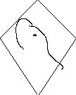
The last time we were discussing logos and branding someone had posted
a very good, short, treatise on the subject which pointed out that
once you have chosen a "base" logo then you can derive logos and other
art from that without having to propagate the exact image or all
details. For example, istm that if we used Jan's logo as the cover art
for the web page, then our "cartoon" logo might consist of line art
which traces the outline of the elephant's head profile. Or has a
diamond with a single line through it which evokes our elephant's head
and nose. The important thing is that the content of the image is
clearly derived from the same theme.
Cheesy example included...
- Tom
--
Thomas Lockhart lockhart@alumni.caltech.edu
South Pasadena, California