Re: Syntax diagrams in user documentation - Mailing list pgsql-hackers
| From | Corey Huinker |
|---|---|
| Subject | Re: Syntax diagrams in user documentation |
| Date | |
| Msg-id | CADkLM=cBiWtzPBrMxi5jAeYeRu71Q_2CQ_nhp8Oje3OYNiJ=nQ@mail.gmail.com Whole thread |
| In response to | Re: Syntax diagrams in user documentation (Peter Geoghegan <pg@bowt.ie>) |
| Responses |
Re: Syntax diagrams in user documentation
|
| List | pgsql-hackers |
On Thu, Mar 28, 2019 at 6:49 PM Peter Geoghegan <pg@bowt.ie> wrote:
On Thu, Mar 28, 2019 at 3:46 PM Jeremy Schneider <schnjere@amazon.com> wrote:
> We're just gearing up for the Google Season of Docs and I think this
> would be a great task for a doc writer to help with. Any reason to
> expect serious objections to syntax diagram graphics in the docs?
It might be hard to come to a consensus, because it's one of those
things that everybody can be expected to have an opinion on. It
probably won't be hard to get something committed that's clearly more
informative than what we have right now, though.
There is a question about how we maintain consistency between the
syntax diagrams in psql if we go this way, though. Not sure what to do
about that.
This discussion is highly relevant to an upcoming talk I have called "In Aid Of RTFM", and the work I hope would follow from it.
While I personally like these bubble charts because they remind me of my misspent youth at IBM, they have some drawbacks:
1. They look like something out of an IBM manual
2. Images conceal information from visually impaired people
3. They aren't copy paste-able text
4. They aren't easily comparable
5. They bake in the language of the comments
The merits of #1 can be argued forever, and it's possible that a more modern bubble chart theme is possible.
#2 is problematic, because things like ADA compliance and the EU Accessibility Requirements frown upon conveying text inside images. The way around this might be to have the alt-text of the image be the original syntax as we have it now.
#3 is important when attempting to relay the relevant excerpt of a very large documentation page via email or slack. Yes, I could right click and copy the URL of the image (in this case https://www.sqlite.org/images/syntax/insert-stmt.gif and others), but that's more work that copy-paste. We could add an HTML anchor to each image (my talk discusses our current lack of reference anchors) and that would mitigate it somewhat. Making the original text available via mouse-over or a "copy text" link might work too.
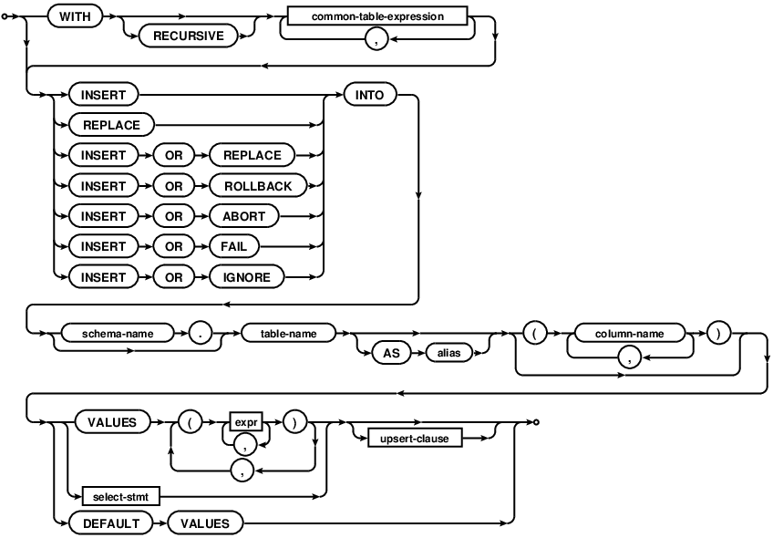
#3b As long as I live, I will never properly memorize the syntax for RANGE BETWEEN UNBOUNDED PRECEDING AND CURRENT ROW. I will google this and copy-paste it. I suspect I'm not alone. If it's available only in an image, then I can't copy paste, and I will mistype some part of that at least twice.
#4 isn't such an immediate issue, but one of my points in the talk is that right now there is no way to easily distinguish text on a page that is new in the most recent version of pgsql (i.e. a red-line markup). We could of course flag that an image changed from version X-1 to X, but it would be tougher to convey which parts of the image changed.
#5 it not such a big issue because most of what is in the diagram is pure syntax, but comments will leak in, and those snippets of English will be buried very deep in bubble-markup.
pgsql-hackers by date: