Re: pgAdmin4 - Tree view icons for final reveiw - Mailing list pgadmin-hackers
| From | Khushboo Vashi |
|---|---|
| Subject | Re: pgAdmin4 - Tree view icons for final reveiw |
| Date | |
| Msg-id | CAFOhELcHyAHMfwUEei1eEjWmPKg0pN_rGejqGecyC7OCJ05SnA@mail.gmail.com Whole thread Raw |
| In response to | Re: pgAdmin4 - Tree view icons for final reveiw (Neel Patel <neel.patel@enterprisedb.com>) |
| List | pgadmin-hackers |
Hi,
One minor thing, the trigger icon is not clearly visible in the create/update trigger dialogue header.
Please refer the screen-shot for the same.
Thanks,
Khushboo
On Mon, Sep 11, 2017 at 12:58 PM, Neel Patel <neel.patel@enterprisedb.com> wrote:
Hi Dave,As far as I know, we replaced png icons with svg icons because - it should work with all types of resolutions. The svg icon should not blur.Here in my Linux system, I am using 1440*900(16:10) resolution and most of the svg icons are blurred. Please find attach screenshot.Thoughts ?Thanks,Neel PatelOn Fri, Aug 25, 2017 at 5:14 PM, Dave Page <dpage@pgadmin.org> wrote:HiYes, that's my expectation. Hopefully they'll go in in the next week or so.--On Fri, Aug 25, 2017 at 12:40 PM, Anthony DeBarros <adebarros@gmail.com> wrote:Dave and all,Out of curiosity (because I’m writing a book that includes pgAdmin screen grabs), do you expect these icons to make it into your September release?Thanks,AnthonyOn August 23, 2017 at 4:03:42 AM, Murtuza Zabuawala (murtuza.zabuawala@enterprised
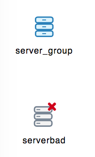
b.com) wrote: Hi Chethana,On Wed, Aug 23, 2017 at 12:51 PM, Chethana Kumar <chethana.kumar@enterprisedb.com> wrote: Hi Murtuza,Please see my reply inline along with the updated .svg file for tree view icons.On Tue, Aug 22, 2017 at 11:17 AM, Murtuza Zabuawala <murtuza.zabuawala@enterprisedb.com> wrote: Hi Chethana,- The icons for Server node is missing, we will need given set of icons for server.1) Basic Server icon (Disconnect state)2) PG (Connected state)3) EPAS (Connected state)4) GreenPlum (Connected state)[Attaching current icons for PG & EPAS, I'm not sure about GreenPlum server icon.]- I'm not sure where we will use serverbad icon from 'tree_view_Icons.svg' file as it looks like server-group icon and not individual server.The icon is there in the pgAdmin's icon folder and it is needed for the applicationYes, we need serverbad icon which indicates the server in disconnect state but what we have on svg is same icon as server-group icon, we need icon for individual server.Something like this below which will differentiate individual server icon from server-group icon,
- Icon set for Schema & Catalog (both collection and individual) looks very similar to each other with minor colour difference, we have to look very carefully to identify them each.Agree with this point and come up with some updations on it. This time I have made it pretty differentiable between Schema and Catalog.- Why do we require two different set of icons for Tables & Columns, I mean one for Schema and one for Catalog?Agreed, I have kept single icon for tables and columns.- Icons for Partition node is same for collection and individual.Working on it- Icons for Event trigger node and Trigger node are very different from each other despite both are triggers.Agreed, done the changes accordingly.This is still different.Current Event trigger icon:NewEvent triggerIcon:
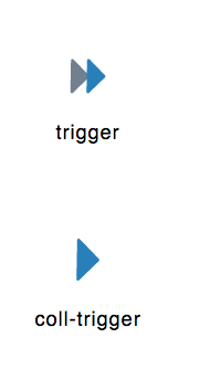
Current Trigger icon:New Trigger Icon:If you see both icons are same.[Suggestion: Can we do similar to what we have done with View & Materialized view icons, we have added M in the icon for materialized view, Same way we can have Trigger icon and for Event trigger we can add E in the icon]I know this is out of context but in my own opinion these icons have resemblance with Flat design where as rest of our application is in 2d design, for example buttons, dialogs etc.Yes, the icons look and feel are more towards flat and stylish now as it represents the current trend. You treat this as a first step towards making the whole application flat design from the current design. But this will happen in a long run, not on a quick basis.--Regards,On Tue, Aug 22, 2017 at 9:37 AM, Chethana Kumar <chethana.kumar@enterprisedb.com> wrote: Yes Shirley, I have already thought through on it.Basically, we need to have one more set of icons in white color mode so that we can use it on dialog headers as well.As the blue theme icons won't fit there.Please share your thoughts.Regards,Chethana kumarOn Tue, Aug 22, 2017 at 4:32 AM, Shirley Wang <swang@pivotal.io> wrote:Hi Chethana,I just thought of something with these icons. What happens with the ones that appear in dialog headers? In the blue bar?On Mon, Aug 21, 2017 at 8:31 AM Chethana Kumar <chethana.kumar@enterprisedb.com> wrote: Hello Team,I have applied labels for each icon for identification purpose. So please consider this copy for your feedback.Note: The "icon_demo.png" is attached to show case the view on webpage.Regards,Chethana kumarOn Mon, Aug 21, 2017 at 3:57 PM, Chethana Kumar <chethana.kumar@enterprisedb.com> wrote: Hello Team,Here are the revised and final icons for tree view control.I have attached in .svg file format as well so that you can do zoom in view at any level.Please share your feedback on the same.Thanks and regards,Chethana KumarPrincipal UI/UX DesignerEnterpriseDB Corporation--Chethana KumarPrincipal UI/UX DesignerEnterpriseDB Corporation--Chethana KumarPrincipal UI/UX DesignerEnterpriseDB Corporation--Chethana KumarPrincipal UI/UX DesignerEnterpriseDB CorporationDave Page
Blog: http://pgsnake.blogspot.com
Twitter: @pgsnake
EnterpriseDB UK: http://www.enterprisedb.com
The Enterprise PostgreSQL Company
Attachment
pgadmin-hackers by date:


