Hi
I took a quick look at this and have a couple of thoughts:
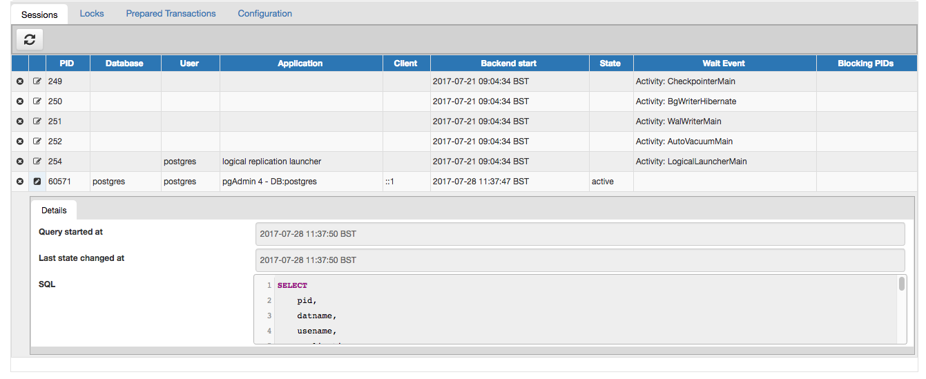
- Instead of the "edit" icon to open the subnode, we should use something more appropriate - a "properties" icon perhaps.
- There seems to be a lot of different shades of grey on there (maybe a subnode design in general that just shows up with the disabled controls), and the subnode control looks a bit messy as a result.
Can you work with Chethana to improve the look and feel please?
Input from others welcome of course - screenshot attached.
Thanks.